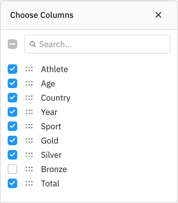
The Column Chooser is a dialog that displays the grid's columns, allowing users to show, hide and reorder them. When column definitions contain groups, these are displayed as expandable rows containing their child columns.
Open the Column Chooser by selecting Choose Columns from the Column Menu or by calling api.showColumnChooser(). The same column selection panel is also available docked to the side of the grid as part of the Columns Tool Panel.
Customising the Column Chooser Copy Link
The behaviour and appearance of the Column Chooser can be customised with ColumnChooserParams. Set colDef.columnChooserParams to configure the chooser opened from that column, or set defaultColDef.columnChooserParams to apply the same configuration to every column. When opening the chooser through the Grid API, the same options can instead be passed to api.showColumnChooser(params). These options are unset by default.
ColumnChooserParams extends the shared IColumnSelectionPanelParams interface, so the same column selection options apply to the Columns Tool Panel, where they are set through toolPanelParams instead.
Properties available on the ColumnChooserParams interface.
Custom Columns Panel layout |
To suppress updating the layout of columns as they are rearranged in the grid. |
To suppress the column search. |
To suppress the Select / Unselect All widget. |
To suppress the Expand / Collapse All widget. |
By default, column groups start expanded. Pass true to start with groups collapsed. |
Component used to render column and column group labels. The checkbox, drag handle and expand controls remain grid managed.
|
Additional parameters passed to the columnLabelRenderer. |
Callback to select which renderer to use for an individual column or column group label. |
The following example demonstrates the suppression and contractColumnSelection options above; the column label renderer options and columnLayout are covered in the sections below. Note the following:
- Launch the Column Chooser by selecting Choose Columns from any column menu.
- The Column Chooser opened from any column ignores column moves in the grid because
suppressSyncLayoutWithGrid=trueis set on the default column definition. - The Name column's chooser does not show the column search, Select / Unselect All or Expand / Collapse All controls because
suppressColumnFilter,suppressColumnSelectAllandsuppressColumnExpandAllare all set totrue. - The Age column's chooser starts with column groups collapsed because
contractColumnSelection=true.
import { Component } from "@angular/core";
import { HttpClient } from "@angular/common/http";
import { AgGridAngular } from "ag-grid-angular";
import {
  ClientSideRowModelModule,
  ColDef,
  ColGroupDef,
  GridApi,
  GridOptions,
  GridReadyEvent,
  ModuleRegistry,
  enableDevValidations,
} from "ag-grid-community";
import {
  ColumnMenuModule,
  ColumnsToolPanelModule,
  ContextMenuModule,
} from "ag-grid-enterprise";

if (process.env.NODE_ENV !== "production") {
  // Enable extended validations only for development
  enableDevValidations();
}

ModuleRegistry.registerModules([
  ClientSideRowModelModule,
  ColumnsToolPanelModule,
  ColumnMenuModule,
  ContextMenuModule,
]);
import { IOlympicData } from "./interfaces";

@Component({
  selector: "my-app",
  standalone: true,
  imports: [AgGridAngular],
  template: `<ag-grid-angular
    style="width: 100%; height: 100%;"
    [columnDefs]="columnDefs"
    [defaultColDef]="defaultColDef"
    [rowData]="rowData"
    (gridReady)="onGridReady($event)"
  /> `,
})
export class AppComponent {
  columnDefs: (ColDef | ColGroupDef)[] = [
    {
      groupId: "athleteGroupId",
      headerName: "Athlete",
      children: [
        {
          headerName: "Name",
          field: "athlete",
          minWidth: 200,
          columnChooserParams: {
            // hides the Column Filter section
            suppressColumnFilter: true,
            // hides the Select / Un-select all widget
            suppressColumnSelectAll: true,
            // hides the Expand / Collapse all widget
            suppressColumnExpandAll: true,
          },
        },
        {
          field: "age",
          minWidth: 200,
          columnChooserParams: {
            // contracts all column groups
            contractColumnSelection: true,
          },
        },
      ],
    },
    {
      groupId: "medalsGroupId",
      headerName: "Medals",
      children: [{ field: "gold" }, { field: "silver" }, { field: "bronze" }],
    },
  ];
  defaultColDef: ColDef = {
    flex: 1,
    columnChooserParams: {
      // suppresses updating the layout of columns as they are rearranged in the grid
      suppressSyncLayoutWithGrid: true,
    },
  };
  rowData!: IOlympicData[];

  constructor(private http: HttpClient) {}

  onGridReady(params: GridReadyEvent<IOlympicData>) {
    this.http
      .get<
        IOlympicData[]
      >("https://www.ag-grid.com/example-assets/olympic-winners.json")
      .subscribe((data) => (this.rowData = data));
  }
}
import '@angular/compiler';
import { provideHttpClient } from '@angular/common/http';
import { enableProdMode } from '@angular/core';
import { bootstrapApplication } from '@angular/platform-browser';

import { AppComponent } from './app.component';

if (new URLSearchParams(window.location.search).get('prod') !== 'false') {
    enableProdMode();
}

const app = bootstrapApplication(AppComponent, {
    providers: [provideHttpClient()],
});
export interface IOlympicData {
    athlete: string,
    age: number,
    country: string,
    year: number,
    date: string,
    sport: string,
    gold: number,
    silver: number,
    bronze: number,
    total: number
}
Custom Column Labels Copy Link
Use columnLabelRenderer in ColumnChooserParams to replace the text shown for columns and column groups. The checkbox, drag handle and group expand controls remain grid managed. Additional properties can be supplied through columnLabelRendererParams.
Use columnLabelRendererSelector to select different renderers for individual columns or column groups. The selector can also provide renderer-specific params; returning undefined falls back to columnLabelRenderer.
<ag-grid-angular
    [components]="components"
    [defaultColDef]="defaultColDef"
    /* other grid options ... */ />

this.components = {
    customColumnLabel: CustomColumnLabel,
};
this.defaultColDef = {
    columnChooserParams: {
        columnLabelRenderer: 'customColumnLabel',
        columnLabelRendererParams: {
            columnIcon: '●',
            columnGroupIcon: '◆',
        },
    },
};
For each label in the Column Chooser, the renderer receives the resolved displayName and either column or columnGroup, depending on the item being rendered. The source is always 'columnChooser'. Setting these options on defaultColDef.columnChooserParams applies them to the chooser regardless of which column it is opened from. They can also be supplied when calling api.showColumnChooser(params).
The Column Chooser does not automatically inherit a renderer configured for the Columns Tool Panel. To use the same presentation in both places, register the component once and reference its name from both configurations. Both ColumnChooserParams and IToolPanelColumnCompParams extend the shared IColumnSelectionPanelParams interface.
Column search and accessibility announcements continue to use displayName, rather than text extracted from the renderer. Column selection rows have a fixed height, so renderer content should remain inline and fit within the configured list item height.
import { Component } from "@angular/core";
import { AgGridAngular } from "ag-grid-angular";
import "./styles.css";
import {
  ClientSideRowModelModule,
  ColDef,
  ColGroupDef,
  Components,
  GridApi,
  GridOptions,
  GridReadyEvent,
  ModuleRegistry,
  enableDevValidations,
} from "ag-grid-community";
import { ColumnMenuModule, ColumnsToolPanelModule } from "ag-grid-enterprise";

if (process.env.NODE_ENV !== "production") {
  enableDevValidations();
}

ModuleRegistry.registerModules([
  ClientSideRowModelModule,
  ColumnMenuModule,
  ColumnsToolPanelModule,
]);
import { CustomColumnLabel } from "./custom-column-label.component";

@Component({
  selector: "my-app",
  standalone: true,
  imports: [AgGridAngular, CustomColumnLabel],
  template: `<div class="example-wrapper">
    <ag-grid-angular
      style="width: 100%; height: 100%;"
      [columnDefs]="columnDefs"
      [components]="components"
      [rowData]="rowData"
      [defaultColDef]="defaultColDef"
    />
  </div> `,
})
export class AppComponent {
  columnDefs: (ColDef | ColGroupDef)[] = [
    {
      headerName: "Athlete Details",
      groupId: "athleteDetails",
      children: [
        { field: "athlete" },
        { field: "country" },
        { field: "sport" },
      ],
    },
    {
      headerName: "Results",
      groupId: "results",
      children: [{ field: "gold" }, { field: "silver" }, { field: "bronze" }],
    },
  ];
  components: Components = {
    customColumnLabel: CustomColumnLabel,
  };
  rowData: any[] | null = [
    {
      athlete: "Michael Phelps",
      country: "United States",
      sport: "Swimming",
      gold: 8,
      silver: 0,
      bronze: 0,
    },
  ];
  defaultColDef: ColDef = {
    flex: 1,
    minWidth: 120,
    columnChooserParams: {
      columnLabelRenderer: "customColumnLabel",
      columnLabelRendererParams: {
        columnIcon: "●",
        columnGroupIcon: "◆",
      },
    },
  };
}
.example-wrapper {
    display: flex;
    flex-direction: column;
    height: 100%;
}

#myGrid {
    flex: 1 1 0px;
    width: 100%;
}

.custom-column-label {
    display: inline-flex;
    min-width: 0;
    align-items: center;
    gap: 6px;
}

.custom-column-label-icon {
    color: var(--ag-accent-color);
}

.custom-column-label-text {
    overflow: hidden;
    text-overflow: ellipsis;
    white-space: nowrap;
}
import { ChangeDetectionStrategy, Component, signal } from '@angular/core';

import type { IColumnSelectionLabelRendererAngularComp } from 'ag-grid-angular';
import type { IColumnSelectionLabelRendererParams } from 'ag-grid-community';

interface CustomColumnLabelParams {
    columnIcon: string;
    columnGroupIcon: string;
}

@Component({
    standalone: true,
    changeDetection: ChangeDetectionStrategy.OnPush,
    template: `
        <span class="custom-column-label">
            <span class="custom-column-label-icon">{{ icon() }}</span>
            <span class="custom-column-label-text">{{ displayName() }}</span>
        </span>
    `,
})
export class CustomColumnLabel implements IColumnSelectionLabelRendererAngularComp {
    readonly displayName = signal<string | null>(null);
    readonly icon = signal('');

    public agInit(params: IColumnSelectionLabelRendererParams & CustomColumnLabelParams): void {
        this.update(params);
    }

    public refresh(params: IColumnSelectionLabelRendererParams & CustomColumnLabelParams): boolean {
        this.update(params);
        return true;
    }

    private update(params: IColumnSelectionLabelRendererParams & CustomColumnLabelParams): void {
        const isGroup = params.columnGroup != null;
        this.displayName.set(params.displayName);
        this.icon.set(isGroup ? params.columnGroupIcon : params.columnIcon);
    }
}
import '@angular/compiler';
import { provideHttpClient } from '@angular/common/http';
import { enableProdMode } from '@angular/core';
import { bootstrapApplication } from '@angular/platform-browser';

import { AppComponent } from './app.component';

if (new URLSearchParams(window.location.search).get('prod') !== 'false') {
    enableProdMode();
}

const app = bootstrapApplication(AppComponent, {
    providers: [provideHttpClient()],
});
Renderer Parameters Copy Link
Properties available on the IColumnSelectionLabelRendererParams<TData = any, TContext = any> interface.
The text value resolved from the column or column group definition. |
The column being rendered, or null when rendering a column group. |
The column group being rendered, or null when rendering a column. |
The panel in which the label is rendered. |
The grid api. |
Application context as set on gridOptions.context. |
Custom Column Layout Copy Link
By default, the order of columns in the Column Chooser is derived from the columnDefs supplied in the grid options and is kept in sync when columns are moved in the grid.
A custom layout can instead be provided through colDef.columnChooserParams.columnLayout.
<ag-grid-angular
    [columnDefs]="columnDefs"
    /* other grid options ... */ />

// original column definitions supplied to the grid
this.columnDefs = [
    {
        columnChooserParams: {
            columnLayout: [{
                headerName: 'Group 1', // group doesn't appear in grid
                children: [
                    { field: 'c' }, // custom column order with column "b" omitted
                    { field: 'a' }
                ]
            }]
        }
    },
    { field: 'b' },
    { field: 'c' }
];
Providing columnLayout automatically enables suppressSyncLayoutWithGrid. Reordering columns in the grid therefore does not reorder the custom layout displayed in the Column Chooser.
The following example demonstrates custom Column Chooser layouts. Note the following:
- Open the Column Chooser for the Name column and note that it uses the order specified by
columnLayout. - Open the Column Chooser for the Age column and note that it uses the current column order from the grid.
- Drag the Age column to the left of the Name column in the grid.
- Open the Column Chooser for the Age column and note that Age now appears before Name.
- Open the Column Chooser for the Name column and note that its custom layout remains unchanged.
import { Component } from "@angular/core";
import { HttpClient } from "@angular/common/http";
import { AgGridAngular } from "ag-grid-angular";
import {
  ClientSideRowModelModule,
  ColDef,
  ColGroupDef,
  GridApi,
  GridOptions,
  GridReadyEvent,
  ModuleRegistry,
  enableDevValidations,
} from "ag-grid-community";
import {
  ColumnMenuModule,
  ColumnsToolPanelModule,
  ContextMenuModule,
} from "ag-grid-enterprise";

if (process.env.NODE_ENV !== "production") {
  // Enable extended validations only for development
  enableDevValidations();
}

ModuleRegistry.registerModules([
  ClientSideRowModelModule,
  ColumnsToolPanelModule,
  ColumnMenuModule,
  ContextMenuModule,
]);
import { IOlympicData } from "./interfaces";

@Component({
  selector: "my-app",
  standalone: true,
  imports: [AgGridAngular],
  template: `<ag-grid-angular
    style="width: 100%; height: 100%;"
    [columnDefs]="columnDefs"
    [defaultColDef]="defaultColDef"
    [rowData]="rowData"
    (gridReady)="onGridReady($event)"
  /> `,
})
export class AppComponent {
  columnDefs: (ColDef | ColGroupDef)[] = [
    {
      groupId: "athleteGroupId",
      headerName: "Athlete",
      children: [
        {
          headerName: "Name",
          field: "athlete",
          minWidth: 150,
          columnChooserParams: {
            columnLayout: [
              {
                headerName: "Group 1", // Athlete group renamed to "Group 1"
                children: [
                  // custom column order with columns "gold", "silver", "bronze" omitted
                  { field: "sport" },
                  { field: "athlete" },
                  { field: "age" },
                ],
              },
            ],
          },
        },
        {
          field: "age",
          minWidth: 120,
        },
        {
          field: "sport",
          minWidth: 150,
          columnChooserParams: {
            // contracts all column groups
            contractColumnSelection: true,
          },
        },
      ],
    },
    {
      groupId: "medalsGroupId",
      headerName: "Medals",
      children: [{ field: "gold" }, { field: "silver" }, { field: "bronze" }],
    },
  ];
  defaultColDef: ColDef = {
    flex: 1,
  };
  rowData!: IOlympicData[];

  constructor(private http: HttpClient) {}

  onGridReady(params: GridReadyEvent<IOlympicData>) {
    this.http
      .get<
        IOlympicData[]
      >("https://www.ag-grid.com/example-assets/olympic-winners.json")
      .subscribe((data) => (this.rowData = data));
  }
}
import '@angular/compiler';
import { provideHttpClient } from '@angular/common/http';
import { enableProdMode } from '@angular/core';
import { bootstrapApplication } from '@angular/platform-browser';

import { AppComponent } from './app.component';

if (new URLSearchParams(window.location.search).get('prod') !== 'false') {
    enableProdMode();
}

const app = bootstrapApplication(AppComponent, {
    providers: [provideHttpClient()],
});
export interface IOlympicData {
    athlete: string,
    age: number,
    country: string,
    year: number,
    date: string,
    sport: string,
    gold: number,
    silver: number,
    bronze: number,
    total: number
}
Column Chooser API Copy Link
The Column Chooser can be opened and closed through the Grid API.
Show the column chooser. |
Hide the column chooser if visible. |
The following example demonstrates opening and closing the Column Chooser through the Grid API.
import { Component } from "@angular/core";
import { HttpClient } from "@angular/common/http";
import { AgGridAngular } from "ag-grid-angular";
import "./styles.css";
import {
  ClientSideRowModelModule,
  ColDef,
  ColGroupDef,
  GridApi,
  GridOptions,
  GridReadyEvent,
  ModuleRegistry,
  enableDevValidations,
} from "ag-grid-community";
import { ColumnMenuModule } from "ag-grid-enterprise";

if (process.env.NODE_ENV !== "production") {
  // Enable extended validations only for development
  enableDevValidations();
}

ModuleRegistry.registerModules([ClientSideRowModelModule, ColumnMenuModule]);
import { IOlympicData } from "./interfaces";

@Component({
  selector: "my-app",
  standalone: true,
  imports: [AgGridAngular],
  template: `<div class="example-wrapper">
    <div class="button-group">
      <button (click)="showColumnChooser()">Show Column Chooser</button>
      <button (click)="hideColumnChooser()">Hide Column Chooser</button>
    </div>

    <ag-grid-angular
      style="width: 100%; height: 100%;"
      [columnDefs]="columnDefs"
      [defaultColDef]="defaultColDef"
      [rowData]="rowData"
      (gridReady)="onGridReady($event)"
    />
  </div> `,
})
export class AppComponent {
  private gridApi!: GridApi<IOlympicData>;

  columnDefs: ColDef[] = [
    { field: "athlete", minWidth: 200 },
    { field: "age" },
    { field: "country", minWidth: 200 },
    { field: "year" },
    { field: "sport", minWidth: 200 },
    { field: "gold" },
    { field: "silver" },
    { field: "bronze" },
    { field: "total" },
  ];
  defaultColDef: ColDef = {
    flex: 1,
    minWidth: 100,
  };
  rowData!: IOlympicData[];

  constructor(private http: HttpClient) {}

  showColumnChooser() {
    this.gridApi.showColumnChooser();
  }

  hideColumnChooser() {
    this.gridApi.hideColumnChooser();
  }

  onGridReady(params: GridReadyEvent<IOlympicData>) {
    this.gridApi = params.api;

    this.http
      .get<
        IOlympicData[]
      >("https://www.ag-grid.com/example-assets/olympic-winners.json")
      .subscribe((data) => (this.rowData = data));
  }
}
.example-wrapper {
    display: flex;
    flex-direction: column;
    height: 100%;
}

#myGrid {
    flex: 1 1 0px;
    width: 100%;
}

.button-group {
    padding-bottom: 4px;
    display: inline-block;
    font-family: Verdana, Geneva, Tahoma, sans-serif;
    font-size: 13px;
}
import '@angular/compiler';
import { provideHttpClient } from '@angular/common/http';
import { enableProdMode } from '@angular/core';
import { bootstrapApplication } from '@angular/platform-browser';

import { AppComponent } from './app.component';

if (new URLSearchParams(window.location.search).get('prod') !== 'false') {
    enableProdMode();
}

const app = bootstrapApplication(AppComponent, {
    providers: [provideHttpClient()],
});
export interface IOlympicData {
    athlete: string,
    age: number,
    country: string,
    year: number,
    date: string,
    sport: string,
    gold: number,
    silver: number,
    bronze: number,
    total: number
}
Legacy Tabbed Column Menu Copy Link
With the Legacy Tabbed Column Menu, a column selection panel is displayed within the columnsMenuTab instead of a separate dialog. It supports the same customisation options through columnChooserParams, but columns cannot be dragged to reorder them or to move them between sections.