AG Grid is a high-performance Angular Data Grid library for building Angular Tables with unbeatable performance and hundreds of features. Available in Community and Enterprise editions. Visit Community vs. Enterprise to learn more.
Create an Angular Data Grid Copy Link
Add AG Grid to your application in 60 seconds:
NPM Install Copy Link
Install the ag-grid-angular package, which also installs ag-grid-community:
npm install ag-grid-angularRegister Modules Copy Link
Register the AllCommunityModule to access all Community features:
import { AllCommunityModule, ModuleRegistry } from 'ag-grid-community';

// Register all Community features
ModuleRegistry.registerModules([AllCommunityModule]);
To minimize bundle size, only register the modules you want to use. See the Modules page for more information.
Import the Angular Data Grid Copy Link
import { AgGridAngular } from 'ag-grid-angular'; // Angular Data Grid Component
import type { ColDef } from 'ag-grid-community'; // Column Definition Type InterfaceDefine Rows and Columns Copy Link
@Component({
    selector: 'app-root',
    standalone: true,
    imports: [AgGridAngular], // Add Angular Data Grid Component
    styleUrls: ['./app.component.css'],
    template: ``
})

export class AppComponent {
    // Row Data: The data to be displayed.
    rowData = [
        { make: "Tesla", model: "Model Y", price: 64950, electric: true },
        { make: "Ford", model: "F-Series", price: 33850, electric: false },
        { make: "Toyota", model: "Corolla", price: 29600, electric: false },
    ];

    // Column Definitions: Defines the columns to be displayed.
    colDefs: ColDef[] = [
        { field: "make" },
        { field: "model" },
        { field: "price" },
        { field: "electric" }
    ];
}Angular Data Grid Component Copy Link
Set Rows and Columns as ag-grid-angular component attributes:
template:
`
    <!-- The AG Grid component -->
    <ag-grid-angular
        [rowData]="rowData"
        [columnDefs]="colDefs" />
`Example Angular Data Grid Copy Link
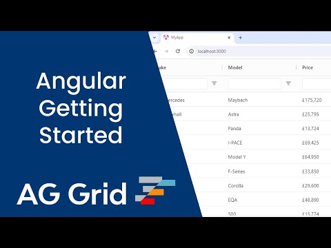
Below is a live example of the application running. Click </> Code to see the code.
To live-edit the code, open the example in CodeSandbox or Plunker using the buttons to the lower-right.
Next Steps Copy Link
Now that you have a basic Angular Data Grid running, choose one of the following options to continue your learning journey: