AG Grid is a high-performance JavaScript Data Grid library for building JavaScript Tables with unbeatable performance and hundreds of features. Available in Community and Enterprise editions. Visit Community vs. Enterprise to learn more.
Create a JavaScript Data Grid Copy Link
Add AG Grid to your application in 60 seconds:
Provide a Container Copy Link
Load the AG Grid library and create a container div. The div should have a height because the Data Grid will fill the size of the parent container:
<html lang="en">
    <head>
        <!-- Includes all JS & CSS for the JavaScript Data Grid -->
        <script src="https://cdn.jsdelivr.net/npm/ag-grid-community/dist/ag-grid-community.min.js"></script>
    </head>
    <body>
        <!-- Your Data Grid container -->
        <div id="myGrid" style="height: 500px"></div>
    </body>
</html>
If you're using TypeScript you need to import and register the modules you want to use. See the NPM Installation docs for more information.
Instantiating the JavaScript Data Grid Copy Link
Create the Data Grid inside of your container div using createGrid.
// Grid Options: Contains all of the Data Grid configurations
const gridOptions = {};

// Your Javascript code to create the Data Grid
const myGridElement = document.querySelector('#myGrid');
agGrid.createGrid(myGridElement, gridOptions);
Define Rows and Columns Copy Link
// Grid Options: Contains all of the Data Grid configurations
const gridOptions = {
    // Row Data: The data to be displayed.
    rowData: [
        { make: "Tesla", model: "Model Y", price: 64950, electric: true },
        { make: "Ford", model: "F-Series", price: 33850, electric: false },
        { make: "Toyota", model: "Corolla", price: 29600, electric: false },
    ],
    // Column Definitions: Defines the columns to be displayed.
    columnDefs: [
        { field: "make" },
        { field: "model" },
        { field: "price" },
        { field: "electric" }
    ]
};
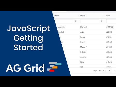
Example JavaScript Data Grid Copy Link
Below is a live example of the application running. Click </> Code to see the code.
To live-edit the code, open the example in CodeSandbox or Plunker using the buttons to the lower-right.
Next Steps Copy Link
Now that you have a basic JavaScript Data Grid running, choose one of the following options to continue your learning journey: