

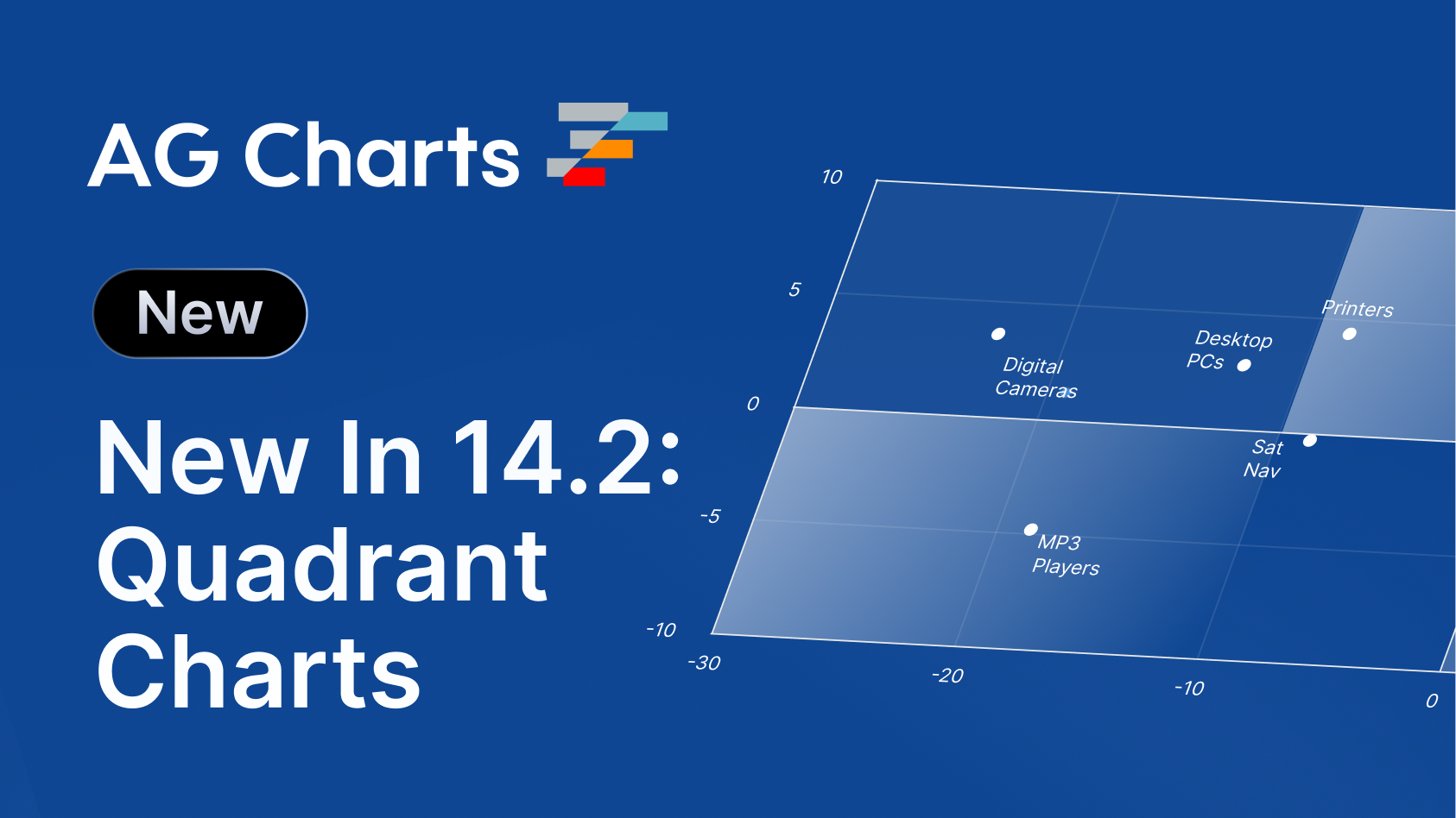
Our latest release, AG Charts 14.2, provides developers with new ways to visualise, contextualise and interact with their data, including new chart types, events and validations.
Read on for demos, code snippets, and full details on what's new.
Key features
- Quadrant Charts - Create quadrant charts to compare data across four regions using configurable axes, labels and styling.
- Background Regions - Highlight meaningful ranges or areas of a chart with configurable background regions.
- Additional Click Events - Respond to more chart interactions with additional click events across chart elements.
- Development-time Validation - Catch invalid configuration earlier with development-time validation and clearer diagnostic messages for developers and AI Agents.
Quadrant Charts
AG Charts 14.2 now supports Quadrant Charts - a chart divided into four independently styled regions around a pivot point - perfect for comparing data points or ideas across two specific variables.
In the example below, we've used AG Charts to build an operational risk register to weigh potential impact against the likelihood of certain risks, making it easy to identify the correct course of action:
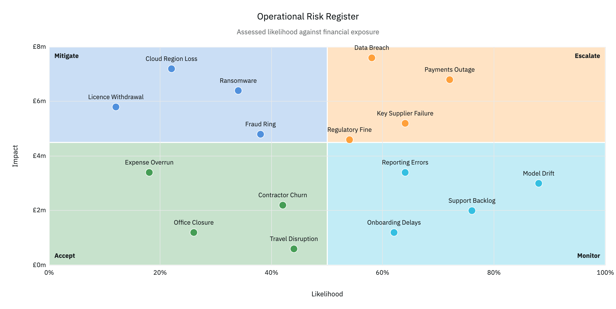
Quadrant charts are created via the createQuadrantChart API which requires both x and y keys, along with an optional labelKey:
const [options, setOptions] = useState({
    data: getData(),
    title: { text: 'Operational Risk Register' },
    xKey: 'likelihoodPercent',
    yKey: 'impactCost',
    labelKey: 'category',
    xAxis: { title: { text: 'Likelihood' } },
    yAxis: { title: { text: 'Impact' } },
});

return <AgQuadrantChart options={options} />;
The Quadrant Charts documentation provides more information, including how to use the extensive customisation options, such as marker size, pivot coordinates, axes and regions.
Background Regions
Charts often require additional visual context to help users quickly interpret them; Crosslines are often used to this effect as they allow developers to highlight specific ranges on either the x or y axis.
AG Charts 14.2 takes this one step further with the introduction of Background Regions which also allow you to draw shaded rectangular areas in a cartesian chart. Crucially, however, these regions are bound by value ranges on both the x and y axes, allowing you to precisely highlight the relevant points on the chart.
In the example below, we've used a background region to indicate when reservoir capacity is entering risk of drought (which will be a familiar theme to any UK based readers in 2026):
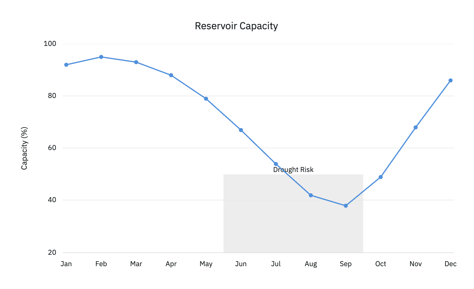
Regions are defined via the backgroundRegions property, which supports providing both an x and y range:
{
  seriesArea: {
    backgroundRegions: [
      {
        xRange: { start: new Date(2025, 5, 1), end: new Date(2025, 8, 1) },
        yRange: { start: 0, end: 50 },
        label: { text: 'Drought Risk' },
      },
    ],
  },
}
The Background Region documentation provides more information on the configuration options available for the region itself, including styling.
Additional Click Events
Interacting with visualisations is a key part of data analysis, which is why AG Charts has shipped with extensive click-event support since its initial release.
AG Charts 14.2 builds on this foundation with a host of new click events, including:
- Axes: e.g. click a numeric axis to select all points in that axis band or open a range picker.
- Crosslines: e.g. click a target or threshold line to edit it inline.
- Captions (titles, labels, etc...): e.g. click the subtitle a link to a data source or methodology note.
All events are registered via the listeners property, which can be defined as a root-level option, or as an option underneath the respective element, e.g. title.listeners or axes.listeners, to trigger more specific events:
{
    // ...
    listeners: {
        // Caption events
        captionClick: (event) => console.log('[chart caption click]', event),
        captionDoubleClick: (event) => console.log('[chart caption double click]', event),

        // Crossline events
        crossLineClick: (event) => console.log('[chart cross line click]', event),
        crossLineDoubleClick: (event) => console.log('[chart cross line double click]', event),

        // Axes events
        axisClick: (event) => console.log('[chart axis click]', event),
        axisDoubleClick: (event) => console.log('[chart axis double click]', event),
    },
}
We've also added an additional property, allMatchedParams, to allow you to view all click events when clicking on overlapping items (e.g. a line series that renders on top of a bar series).
Our Events API documentation contains examples for each of the different click-events, along with how to configure them, and the data that each event provides.
Development-time Validation
At AG Grid, we've always had a keen-eye on developer experience, and of course AG Charts is no different.
With our latest release, we now offer the ability to enable development-time validation, which reports option misconfiguration and catches runtime errors, long before they make it to production.
These reports can be displayed via an overlay or within the console, with an option to throw an error and halt execution, as well as raising events each time an issue is found:
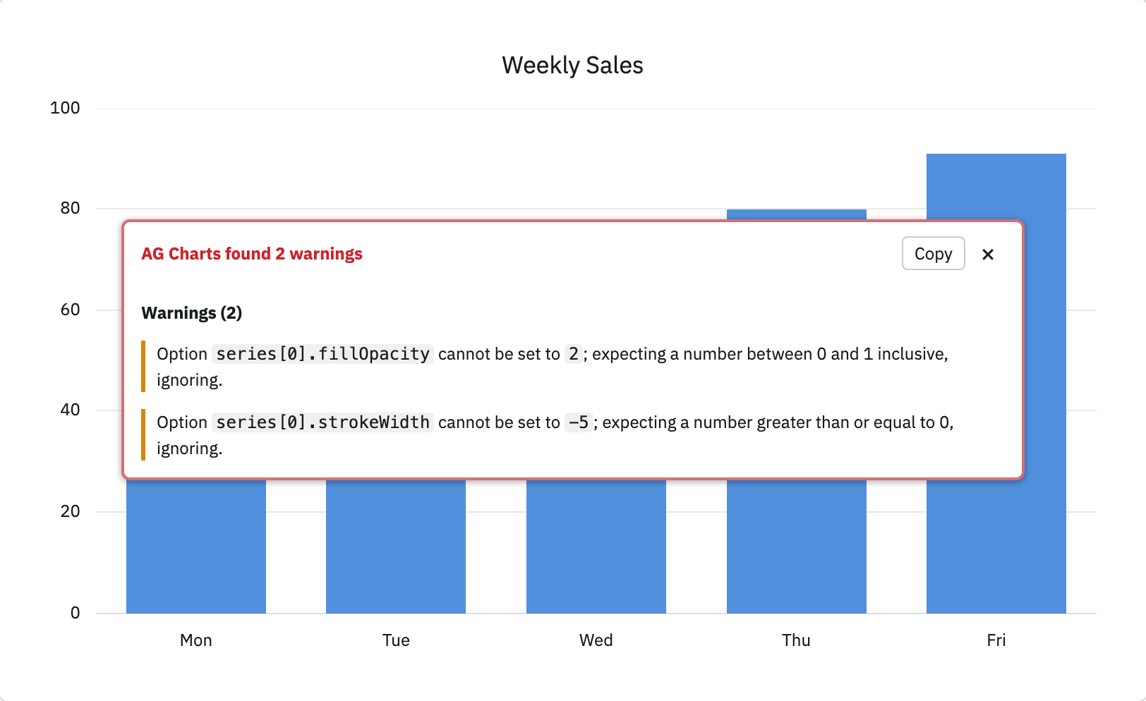
These validations are also useful for AI Agents as potential configuration issues (particularly for the latest versions that the AI may be unfamiliar with) will be surfaced immediately, with clear instructions on how to resolve them.
Validations are enabled by providing one or more of error, warning and deprecation options to the relevant validations property:
{
  validations: {
    showOverlayOn: ['error', 'warning', 'deprecation'],
    consoleOn: ['warning', ... ],
    throwOn: ['error', ... ],
  },
}
Our Development Validation docs contain more information on each option, as well as how to programmatically handle validation issues, for example to log them to a custom system.
Summary
AG Charts 14.2 focuses on new visualisation types, contextual highlighting and richer developer interactions. This release:
- Adds Quadrant Charts for comparing data across two variables using four configurable regions.
- Introduces Background Regions for highlighting rectangular value ranges across both the
xandyaxes. - Expands chart interactivity with click and double-click events for axes, cross lines and captions, plus
allMatchedParamsfor overlapping elements. - Adds development-time validation for configuration issues, warnings and deprecations, with support for overlays, console output, thrown errors and validation events.
As always, we welcome feedback. Enterprise customers can contact us via Zendesk; Alternatively, please submit a GitHub issue or complete our contact form.
Next steps
New to AG Charts? Get started in minutes, for free, with your favourite framework:




Considering AG Charts Enterprise? Request a free 30-day trial licence to test your application in production and get direct access to our support team.
Happy coding!