I work in Business Systems and Technology in the media and entertainment space. My team builds internal applications that connect operational systems and support many of the workflows behind creative production and the business.
A lot of that work sits somewhere between traditional enterprise software and custom application development. We integrate platforms, build APIs and data pipelines, and create purpose-built tools for the people actually doing the work.
Reporting and analytics naturally become part of many of those applications.
The challenge is that building a good analytical experience can quickly become its own software project. Charts, filters, pivots, layouts, exports, state management, and all of the other pieces that make a dashboard useful take significant time to build and maintain.
That is what originally led me to experiment with AG Studio.
A few weeks ago, I wrote about our early experience embedding it into some of our internal applications. What initially impressed me was fairly straightforward: a small development team could build sophisticated analytical experiences without also having to build and maintain the visualization framework behind them.
Since then, I have had the opportunity to use it on a much more interesting production problem, and my thinking has evolved.
The development speed is still impressive, but I now think the bigger opportunity is what happens when the dashboard itself becomes part of the application architecture.
Using production history as a test bed
One of the projects I have been working on recently involves production tracking data from ShotGrid, a platform commonly used in film and animation production to manage the huge number of tasks and relationships involved in making a project.
We have several years of production history, which gives us a large and complicated dataset to work with. Like any operational dataset that spans that much time, the way the information was captured has evolved. Processes change, schemas change, new fields are introduced, and teams get better at tracking certain things.
I do not look at the historical data as one perfectly consistent analytical model. In some ways, that is what makes it useful. It gives us an opportunity to understand which information ended up being important, what became difficult to reconstruct later, and what we might want to approach differently in future productions.
The first part of the project had nothing to do with dashboards. I built a process to take production tracking data and transform it into something easier to analyze. Instead of working directly against a very large collection of individual production tasks, we can organize the information around concepts that make sense to production: time, departments, people, sequences, shots, assets, stages, and other parts of the workflow.
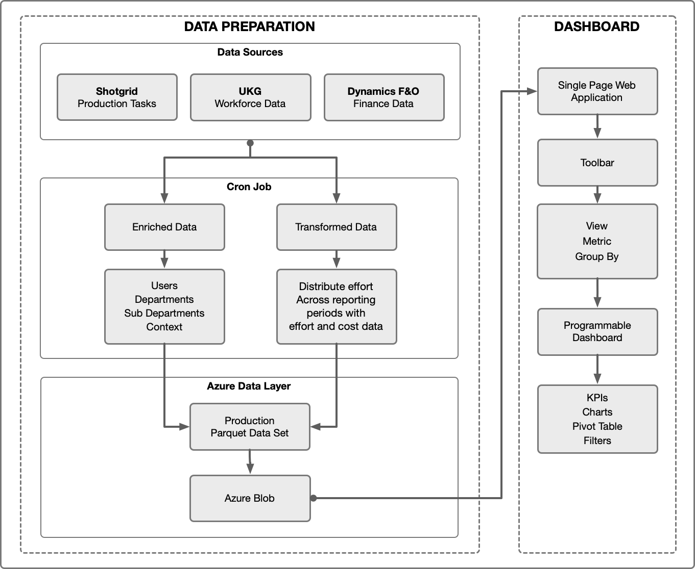
Once that dataset existed, the next question was how people should interact with it.
Normally this is where I would start thinking about Power BI, Tableau, Domo, or another BI platform. We use those kinds of tools, and I remain a big believer in them. There are plenty of problems where a traditional business intelligence platform is exactly the right solution.
This problem felt a little different. I was not really trying to publish a report. I wanted to build an application where people could explore production from several different operational perspectives.
Using Studio, the same underlying dataset can support an overall production view along with more focused views around sequences, assets, stages, or areas such as VFX. Each view can have its own filters, KPIs, charts, rankings, and pivoted data while still working from the same source underneath.
That was useful, but it also led me to something I had not really appreciated when I wrote my initial linked post.
The interesting part was not just the dashboard. It was the fact that the application was building it.
When the dashboard becomes code
Most business intelligence tools I have worked with are centered around a visual authoring experience. That is one of their biggest strengths. An analyst can drag a field onto a canvas, add a chart, create a filter, arrange a page, and get to a useful result quickly.
As a developer, though, I have increasingly found myself wanting the application to be able to define that experience.
With Studio, I can create a method that builds a KPI, another that creates a ranked chart, and another that creates a pivot table. A relatively small amount of configuration can describe what a page is supposed to analyze, and the application can build the rest.
That has been a bigger deal than I expected.
# A simplified version of the pattern

def build_ranked_chart(
    group_by,
    metric,
    limit=10,
):
    return {
        "type": "bar-chart",
        "data": {
            "category": group_by,
            "value": metric,
            "aggregation": "sum",
        },
        "sort": "descending",
        "limit": limit,
        "title": f"Top {limit} {group_by}",
    }
The dashboard can live in the same development workflow as the application. I can keep its definition in Git, review changes through a pull request, reuse common patterns, and change the analytical experience alongside the data model that supports it.
If I find a better way to build a particular visualization, I can improve the code that generates it instead of manually changing several separate reports. If the underlying data model evolves, the application and dashboard can evolve together.
It starts to feel less like reporting attached to an application and more like another application component.
That also fits pretty naturally with how I think about buy versus build. I am still a big believer that if a good solution already exists, you should buy it and focus your development resources somewhere else. But sometimes the thing worth buying is not the finished application. Sometimes it is a really good component.
We did not need to build a dashboard framework. We needed a dashboard capability that could become part of our application framework.
That lets us spend more of our time on the things that are actually specific to the problem we are trying to solve: understanding the data, connecting systems, shaping the workflow, and building the experience around the people using it.
For a small Business Systems team, that is a useful middle ground.
Where AI starts to get interesting
This is also where my thinking about AI and reporting has started to change.
A lot of the current conversation around AI and analytics is about asking questions of data. Give a model access to a dataset and let someone ask, “What changed last month?” or “Where is the workload increasing?”
That is useful, and it is an obvious place to start.
But if the application can already create and modify the dashboard, then AI can potentially do more than answer a question about the data. It could help build the view someone needs.
Imagine having a well-structured production dataset and asking, “Show me the next six months of work by department.”
There is no reason the answer has to end as a paragraph in a chat window. The application could create the appropriate time filter, build a department chart, add a few useful KPIs, and put a pivot table underneath it.
If the next question is, “Break this down by sequence,” the dashboard could change with the question. Ask to look at a particular part of production, and the application could build a different view of the same underlying information.
The important part is that the application already understands how to construct the dashboard. AI becomes another way of determining what should be constructed.
# Define what the page should analyze
page = {
    "metric": "days",
    "pivot": "department",
    "rank_by": "department"
}

# Build the dashboard from the configuration
dashboard = build_dashboard(
    metric = page.metric,
    widgets = [
        build_kpi(metric),
        build_trend_chart(pivot, metric),
        build_breakdown_chart(pivot, metric),
        build_ranked_chart(rank_by, metric),
        build_ranked_chart(rank_by, metric),
        build_pivot_table(metric)
    ]
)

# Change the analytical question
page.metric = "cost"
page.pivot = "sequence"
page.rank_by = "shot"

# The application rebuilds the dashboard
dashboard = build_dashboard(page)
That idea is much more interesting to me than simply putting a chatbot next to a report.
We are not all the way there, but working with programmatically defined dashboards makes the path much easier to see.
Building the foundation earlier
The dashboard we are building today is useful, but I think the more important outcome is what we are learning from the process.
Working with several years of real production history shows us which questions eventually become important, where consistency matters, and what we might want to structure differently in the future.
That creates an opportunity to think about analytics much earlier in the lifecycle of future productions.
Instead of waiting until years of history have accumulated and then deciding how to make sense of it, we can think about the analytical model closer to the beginning. We can establish better data structures and pipelines earlier and make useful operational analytics available while the work is happening.
We can also build that foundation knowing that the consumers of the data will not always be people opening traditional reports. They may also be applications, automated processes, and increasingly AI.
That is probably the biggest thing I have taken away from this work.
When I first started experimenting with AG Studio, I thought it was a very good way for a small development team to build sophisticated dashboards without building the dashboard framework ourselves.
I still think that.
But I now think the more interesting idea is programmable analytics.
Once the dashboard becomes something the application can create and modify, it is no longer simply the place where the data ends up. It becomes another part of the software architecture.
For the kind of Business Systems work my team does, that opens up a much more interesting set of possibilities.
Michael Romey is a technology leader with more than 25 years of experience building software, production pipelines, and enterprise systems for animation, visual effects, entertainment, and media organizations. He currently leads Business Systems at LAIKA, where he focuses on enterprise architecture, cloud platforms, data and analytics, and practical applications of AI across studio operations and production. Throughout his career, Michael has worked at the intersection of creative and technical teams, helping organizations turn emerging technologies into practical tools and workflows for production.