
Having built AG Grid and AG Charts, we know how much you can achieve with these tools - but we also know that building a dashboard around them involves a substantial amount of additional development - which is where we think AG Studio slots in.
In this post, we'll look at what's involved in building dashboards with AG Grid and AG Charts, and how AG Studio can massively simplify this process.
The loop
Most dashboard projects don't start as dashboard projects.
Let's say you have a data grid in your app that displays your financials per quarter. Finance loves it, but wouldn't it be better if it included a chart alongside? Probably, yeah.
That's easy enough - you can just install AG Charts and build a bar chart showing revenue per quarter.
Great. Finance loves the changes. But wouldn't it even be better if...
- Clicking the chart filters the data in the grid, or
- Grid filters apply to the chart, or
- It had another chart showing ARR growth per quarter, or
- We could filter by quarter across every widget, or
- The widgets were adjustable and resizable, or
- We're missing a data point for X, or...
And so begins the loop. Next thing you know, your team now owns a whole dashboarding framework: persistence, cross-filtering, layout, theming, data - everything.
None of these requirements are particularly egregious. They're all things users have come to expect from a dashboard. Implementing them, however, takes considerably more time and energy than adding the original chart, and the backlog of requests tends to scale exponentially as adoption increases.
TL;DR
- AG Grid gives you a grid in ~40 LOC and AG Charts a chart in ~30. Neither gives you a dashboard, though: the layout, the filters, the cross-filtering, the saved state, the edit mode and the configuration UI.
- Implementing these dashboarding features is straight forward at first, but as requests keep coming in, you end up owning a dashboarding framework by accident.
- The same dashboard in AG Studio is ~45 lines, mostly just handing your data to Studio. The dashboard itself is then built by the people who asked for it.
- The bigger cost isn't the build. It's that every change to a hand-rolled dashboard is a developer ticket, forever. Studio moves those changes to report authors and leaves developers the data model and the guardrails.
A grid and two charts is not a dashboard
Well, technically it is. Maybe a dashboard v0.1. But once your users get it in their hands, inevitably you'll be asked about all of the things that they have come to expect from a dashboard, that aren't just grids and charts:
- Layout. Widgets have positions and sizes. Users drag and resize them. It works on a laptop and on the TV in the sales office.
- Global filters. A date range, a supplier, a material. Every widget responds to them, and they work in combination with each other.
- Cross-filtering. Clicking a bar filters everything else - except the chart the bar is in, which stays whole and highlights the selection instead.
- State. The whole thing is serialisable. It saves per user, loads on return, and still loads after you've added a widget type and renamed a field.
- Edit and view modes. Some users rearrange; most just look. The difference is enforced, not suggested.
- A configuration UI. Which field, which aggregation, which chart type, which sort, which number format. For every widget type. This is a small product in and of itself.
- Calculated fields. Users have their revenue and their cost, but they need to know their margin and can't wait on engineering to deploy a new build.
- AI. Users increasingly want to ask AI about their data, and even let it build reports for them.
- Accessibility. The dashboard is public facing and needs to meet strict guidelines before deployment.
- Everything else. Export to PDF for the board pack. Time bucketing by week and quarter. Dark mode. Undo & redo. Keyboard navigation of the canvas.
AG Grid and AG Charts do a great deal of work inside each widget - filtering, grouping, pivoting, formatting, tooltips, theming - but all of the features listed above live outside of the widgets themselves, which is where the custom development (or AG Studio) comes in.
Building a Dashboard by hand
Instead of speaking in hypotheticals, let's take a look at what's actually involved in implementing each of these features by building a procurement dashboard for a manufacturing company using AG Grid & AG Charts.
We'll create two KPI cards to show totals, a bar chart to show monthly spend, and a grouped table to aggregate spend by supplier & material.
If you're eager, you can skip straight to the bit where we talk about AG Studio instead.
The dataset
For this demo, we'll be using a dataset that contains ~1,000 purchase orders for various materials and suppliers, with associated volumes and costs:
[
    {
        "poId": "PO-100001",
        "day": "2025-02-06",
        "month": "2025-02",
        "material": "Cold-Rolled Coil",
        "supplier": "Great Lakes Steel",
        "quantity": 93,
        "unitCost": 814.7133,
        "spend": 75768.3369
    }
    ...
]
To actually render this data in the components, there's a bit of work needed. The grid is straightforward and just receives the row data as is. For the chart, we need to aggregate spend per month across all of the orders. Finally, the KPIs need to calculate the total order count and spend across the entire data set:
/** Grid: return all orders **/
export function getGridRows() {
  return orders;
}

/** Chart: Aggregate spend across all orders by month */
export function getChartData() {
  return spendPerMonth(orders);
}

/** KPIs: Calculate total order count & spend */
export function getKpis() {
  return totals(orders);
}
The functions themselves have been left out for brevity.
The Easy Part: Grid & Charts Components
Configuring AG Grid to render the data couldn't be simpler; we just pass the row data through, and define some column definitions to configure the grouping and aggregation on the relevant columns:
const columnDefs: ColDef<Order>[] = [
    { field: 'poId', headerName: 'PO', filter: false, ... },
    { field: 'day', headerName: 'Order date', filter: false, ... },
    { field: 'material', rowGroup: true, hide: true, ... },
    { field: 'supplier', rowGroup: true, hide: true, ... },
    { field: 'quantity', aggFunc: 'sum', ... },
    { field: 'unitCost', aggFunc: 'avg', ... },
    { field: 'spend', aggFunc: 'sum', ... },
];

export function OrdersGrid({ rows }: OrdersGridProps) {
  return (
    <AgGridReact<Order>
      theme={theme}
      rowData={rows}
      getRowId={getRowId}
      columnDefs={columnDefs}
      defaultColDef={defaultColDef}
    />
  );
}
Configuring AG Charts is also straightforward - just pass the pre-grouped & aggregated data to the chartOptions and define a single bar series:
export function SpendChart({ data }: SpendChartProps) {
  const options = useMemo<AgCartesianChartOptions<MonthSpend>>(() => ({
    data: data,
    series: [
      {
        type: 'bar',
        xKey: 'month',
        yKey: 'spend',
      },
    ]
  }), [data]);

  return <AgCharts options={options} />;
}
Finally, we need to build a custom component to house the KPI values; we'll just define a simple component that displays a label and caption in h2 and p elements, respectively:
export function KpiCard({ label, value, caption, title }: KpiCardProps) {
    return (
        <section className="card kpi-card">
            <header className="kpi-header">
                <h2 className="kpi-label">{label}</h2>
                <p className="hint">{caption}</p>
            </header>
            <p className="kpi-value" title={title}>
                {value}
            </p>
        </section>
    );
}
With that, we now have the makings of a dashboard:
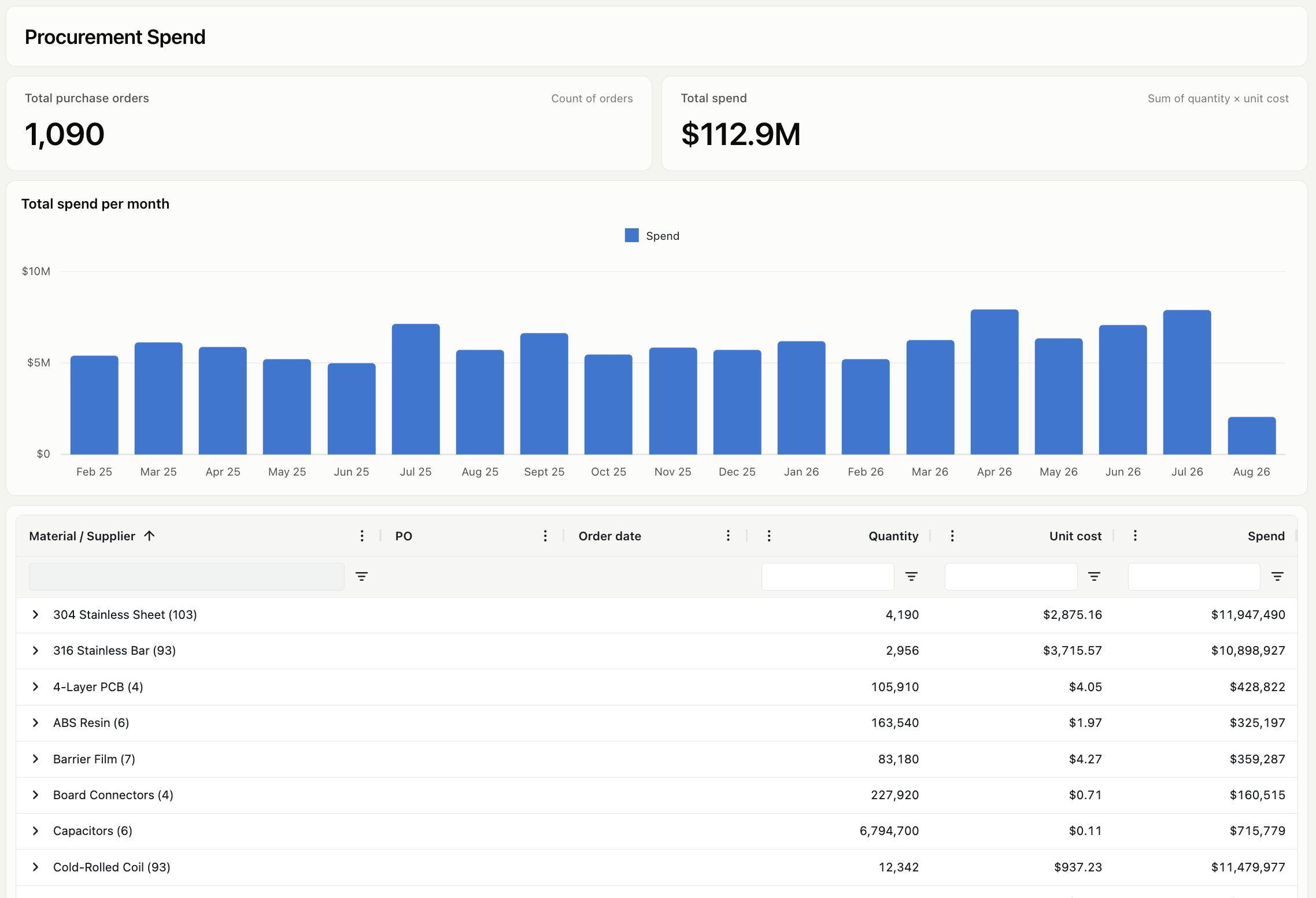
Whilst this looks reasonable, it doesn't do much. Let's add some functionality...
Global filtering
The first thing we'll implement is a global date filter that applies across all of the components on the page. To do this, we've created a DateRangeFilter component that allows users to select a date range which is stored in a state variable, and passed to the data getters to apply the filter and return the sliced dataset:
// Store date range filter
const [dateRange, setDateRange] = useState<DateRange>(fullDateRange);

// Supply dateRange to getters and update on date range changes
const gridRows = useMemo(() => getGridRows({ dateRange }), [dateRange]);
const chartData = useMemo(() => getChartData({ dateRange }), [dateRange]);
const kpis = useMemo(() => getKpis({ dateRange }), [dateRange]);

// Update date range when filters change
const handleDateRangeChange = useCallback((next: DateRange) => {
    setDateRange(next.start > next.end ? { start: next.start, end: next.start } : next);
}, []);

return (
    <DateRangeFilter
      value={dateRange}
      min={fullDateRange.start}
      max={fullDateRange.end}
      onChange={handleDateRangeChange}
    />
);
All that's left to do is update the getter functions to check if the data isInDateRange, which will filter the data in response to date range changes:
// data.ts

/** Days are YYYY-MM-DD strings, so plain string comparison puts them in the right order. */
function isInDateRange(order: Order, { start, end }: DateRange) {
    return order.day >= start && order.day <= end;
}

/** Grid: the date range. The grid applies its own column filters. */
export function getGridRows({ dateRange }: Filters) {
    return orders.filter((order) => isInDateRange(order, dateRange));
}

/** Chart: the date range. Its months follow the range too. */
export function getChartData({ dateRange }: Filters) {
    const chartOrders = orders.filter((order) => isInDateRange(order, dateRange));
    return spendPerMonth(chartOrders, dateRange);
}

/** KPIs: the date range. */
export function getKpis({ dateRange }: Filters) {
    return totals(orders.filter((order) => isInDateRange(order, dateRange)));
}
And that's it, now we can filter across all components based on the order date:
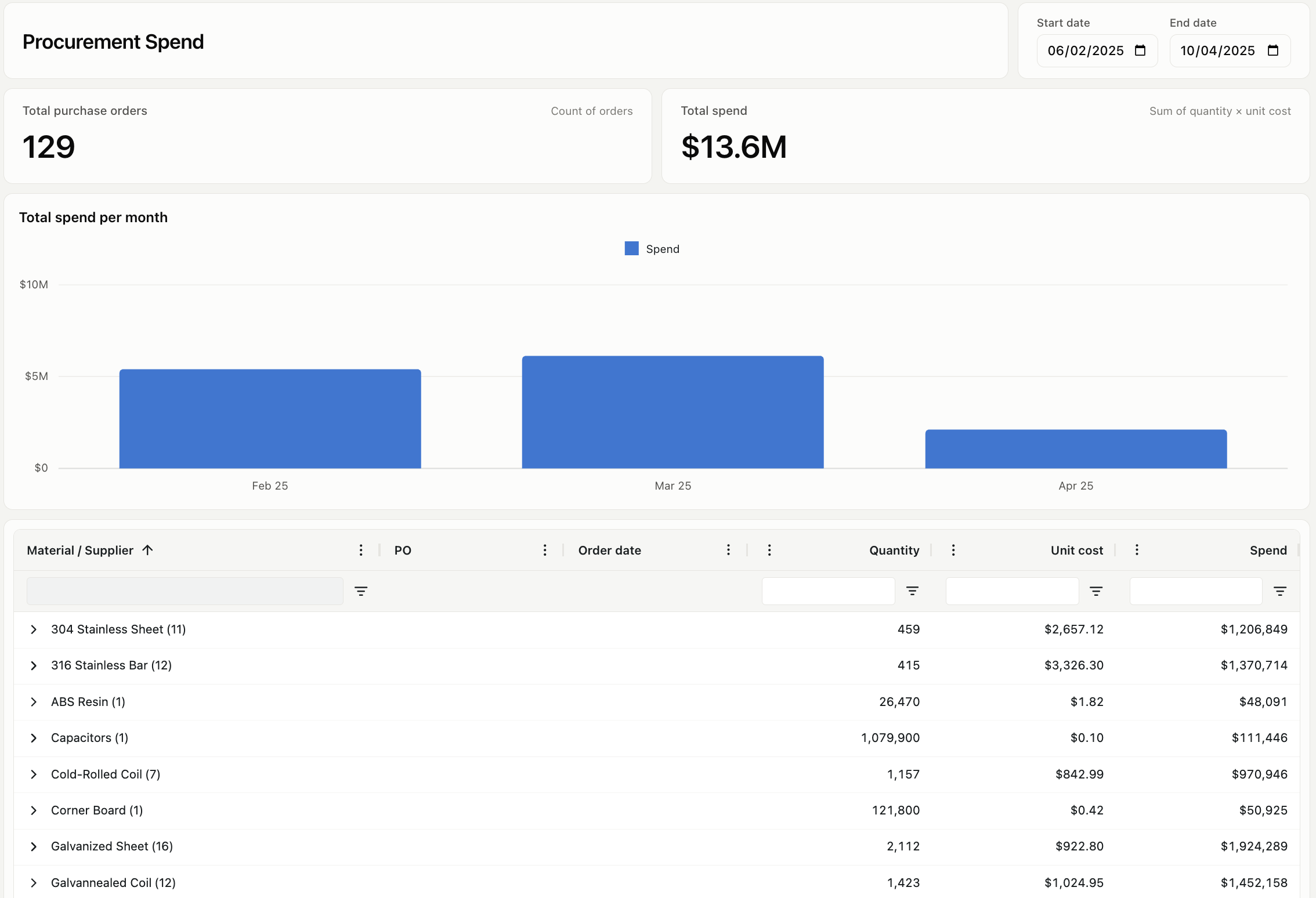
Great, it's now interactive. Let's extend it so that interacting with the components also filters the data, whilst respecting any global filters that have been applied.
Cross-filtering
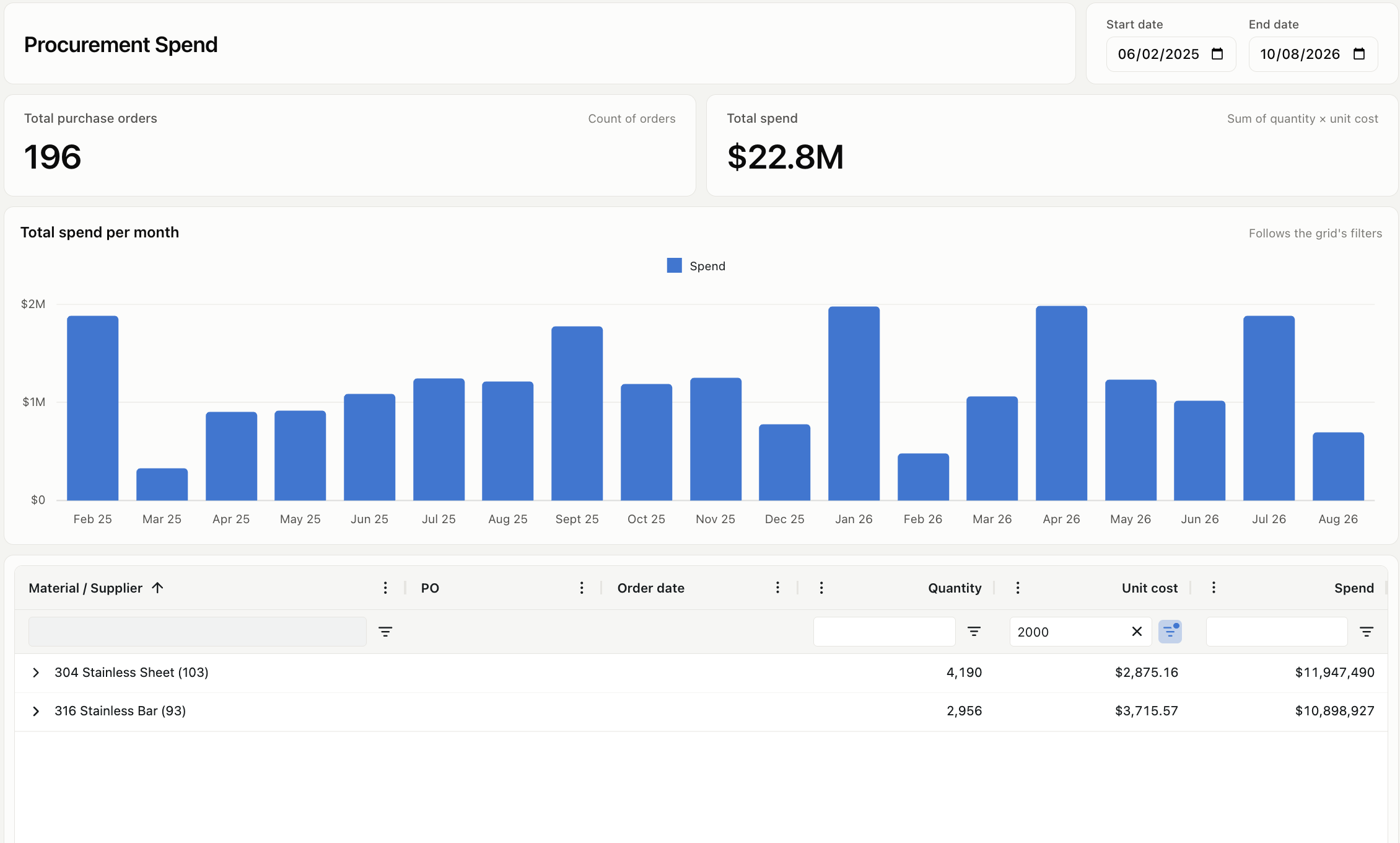
There are two ways users can cross-filter in this example: Applying filters to the grid, or interacting with the bar series in the chart. This means that data needs to flow both ways, and the filters need to work in tandem.
Grid → Charts & KPI Filtering
We'll start by allowing the grid to filter the chart. To do this, we can hook into the grids onFilterChanged event and simply pass the grid's filters up to the parent component, which can then share this with the data getters, and ultimately the Charts and KPI components:
export function OrdersGrid({ rows, onFilterModelChange }: OrdersGridProps) {
    const handleFilterChanged = useCallback(
        (event: FilterChangedEvent<Order>) => {
            // Copy the grid's filters up to App; an empty model means no filters.
            const model = event.api.getFilterModel();
            onFilterModelChange(Object.keys(model).length ? model : null);
        },
        [onFilterModelChange],
    );

    return (
        <AgGridReact<Order>
            onFilterChanged={handleFilterChanged}
        />
    );
}
Once the filter is applied and the filter model is passed up, this can be stored in a state variable and passed down to the data getters to apply the relevant filtering:
// Store grid's filter model
const [gridFilterModel, setGridFilterModel] = useState<FilterModel>;

// Get chart data within date range, and grid's filters
const chartData = useMemo(() =>
  getChartData({ dateRange, gridFilterModel }),
                  [dateRange, gridFilterModel],);

// Get KPI data within date range, and grid's filters
const kpis = useMemo(() => getKpis({ dateRange, gridFilterModel }), [dateRange, gridFilterModel]);

// Pass filter setter to grid
<OrdersGrid onFilterModelChange={setGridFilterModel} />
Lastly, we'll need to update the data getters to respect the grids filters:
// Use the grid filter model to filter the order dataset
function passesGridFilters(order: Order, filterModel: FilterModel | null) {
    if (!filterModel) return true;
    return Object.entries(filterModel).every(([field, model]) => {
        const value = order[field as keyof Order];
        if (model.filterType === 'set') return model.values.includes(value);
        if (model.filterType === 'number') return passesNumberFilter(value as number, model);
        return true;
    });
}

/** Grid: the date range. The grid applies its own column filters. */
export function getGridRows({ dateRange }: Pick<Filters, 'dateRange'>) {
    return orders.filter((order) => isInDateRange(order, dateRange));
}

/** Chart: the date range and the grid's filters. */
export function getChartData({ dateRange, gridFilterModel }: Filters) {
    const chartOrders = orders.filter(
        (order) => isInDateRange(order, dateRange) && passesGridFilters(order, gridFilterModel),
    );
    return spendPerMonth(chartOrders, dateRange);
}

/** KPIs: the date range and the grid's filters, so they total exactly the orders the grid is showing. */
export function getKpis({ dateRange, gridFilterModel }: Filters) {
    const gridRows = getGridRows({ dateRange });
    return totals(gridRows.filter((order) => passesGridFilters(order, gridFilterModel)));
}
Excellent. Now applying filters to the data grid applies the same filters to the other components, too:
Charts → Grid & KPI filtering
Finally, let's implement the same logic to connect chart interactions to the Grid and KPI components.
Firstly, we can add a seriesNodeClick handler to our bar series, which calls an onMonthClick callback to pass the data up to the parent:
export function SpendChart({ data, onMonthClick }: SpendChartProps) {
  // Only rebuild the options when the data or the click handler changes.
  const options = useMemo<AgCartesianChartOptions<MonthSpend>>(
    () => ({
        series: [
          {
            // A bar click tells App which month was clicked.
            listeners: {
                seriesNodeClick: (event) => onMonthClick(event.datum.month),
            },
            // Other props ...
          },
        ],
        // Other props ...
    }),
    [data, onMonthClick],
  );

  return <AgCharts options={options} style={{ height: '100%' }} />;
}
Once the data is available within the parent, we can pass the selected month down to the data getters to apply the filters
// Store month selected in a chart
const [selectedMonth, setSelectedMonth] = useState<string | null>(null);

// Pass selectedMonth to getters
const gridRows = useMemo(() => getGridRows({ dateRange, selectedMonth }), [dateRange, selectedMonth]);
const chartData = useMemo(
    () => getChartData({ dateRange, gridFilterModel, selectedMonth }),
    [dateRange, gridFilterModel, selectedMonth],
);
const kpis = useMemo(
    () => getKpis({ dateRange, gridFilterModel, selectedMonth }),
    [dateRange, gridFilterModel, selectedMonth],
);

// Clicking the selected bar again clears the selection.
const handleMonthClick = useCallback(
    (month: string) => setSelectedMonth((current) => (current === month ? null : month)),
    [],
);


return (
  <SpendChart data={chartData} onMonthClick={handleMonthClick} />
)
And update the getters to respect these filters:
/** Grid: the date range and the chart's selected month. The grid applies its own column filters. */
export function getGridRows({ dateRange, selectedMonth }: Pick<Filters, 'dateRange' | 'selectedMonth'>) {
    const inRange = orders.filter((order) => isInDateRange(order, dateRange));
    return selectedMonth ? inRange.filter((order) => order.month === selectedMonth) : inRange;
}

/**
 * Chart: the date range and the grid's filters. The chart's own month selection doesn't remove
 * any data, it only dims the other bars, so every month stays visible and clickable.
 */
export function getChartData({ dateRange, gridFilterModel, selectedMonth }: Filters) {
    const chartOrders = orders.filter(
        (order) => isInDateRange(order, dateRange) && passesGridFilters(order, gridFilterModel),
    );
    return spendPerMonth(chartOrders, dateRange, selectedMonth);
}

/** KPIs: every filter, so they total exactly the orders the grid is showing. */
export function getKpis({ dateRange, gridFilterModel, selectedMonth }: Filters) {
    const gridRows = getGridRows({ dateRange, selectedMonth });
    return totals(gridRows.filter((order) => passesGridFilters(order, gridFilterModel)));
}
And that's it... we've built a dashboard with four components, a global filter, and cross-filtering wired up between a simple grid and chart:
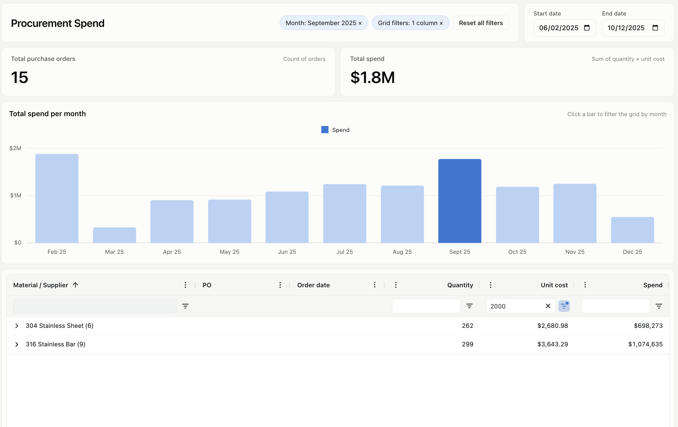
If the requests had stopped here, this post (and AG Studio) wouldn't exist.
Spoiler: The requests didn't stop here.
That's great, but can you add...
Naturally, after sharing the dashboard with the procurement team, they want you to "just make a few small changes":
- Add another KPI card showing total accepted orders as a percentage.
- Add another filter to select a material category, which should work in combination with the existing filters.
- Add a pie chart to the left of the bar chart breaking down spend by supplier.
- Group the bars in the chart by material, and allow cross-filtering.
- Ensure the widgets are accessible and WCAG 2.1 AA compliant.
- Add a way to export the dashboard to a PDF.
- ...And what about AI? Can this be integrated with ChatGPT?
All of this is possible, of course. Add another state variable, update the data helper methods to support another filter, reconfigure AG Charts to show a breakdown by material, add another calculation to the dataset... But what about next week, when the finance team see the report and decide they'd like to make some changes, too?
Before you know it, you're maintaining a dashboarding framework you never really intended to build in the first place - but that's where AG Studio comes in.
Replicating the dashboard in AG Studio
Instead of refactoring the app and layering more filtering logic onto it, we can instead just implement AG Studio, and let the user built what they need themselves - all that we need to do is the initial configuration.
Data configuration
Let's start with the data - In the initial example we only looked at the purchase orders data, but to meet these additional requirements, we need access to both suppliers and materials information as well.
AG Studio is designed to handle data from different data sources - all we need to do is add the relevant files to a sources array, and define any relationships that exist between them so that users can query across all of the datasets:
// AG Studio works with arrays of plain objects. Each entry in `sources`
// becomes a data source (a table).
export const data: AgDataSourcesDefinition = {
    sources: [
        {
            id: 'purchase-orders',
            name: 'Purchase Orders',
            data: purchaseOrders,
        },
        {
            id: 'suppliers',
            name: 'Suppliers',
            data: suppliers,
        },
        {
            id: 'materials',
            name: 'Materials',
            data: materials,
        }
    ],
    relationships: [
        {
            id: 'purchase-orders-to-suppliers',
            source: {tableId: 'purchase-orders', fieldId: 'supplierId'},
            target: {tableId: 'suppliers', fieldId: 'supplierId'},
            type: 'many-to-one'
        },
        {
            id: 'materials-to-purchase-orders',
            source: {tableId: 'materials', fieldId: 'materialId'},
            target: {tableId: 'purchase-orders', fieldId: 'materialId'},
            type: 'one-to-many'
        }
    ]
};
Studio Component
Once the data is configured, all you need to do is pass it to the AG Studio component:
<AgStudio data={data} />At this point, you have a blank canvas that users can interact with to build reports - ready to hand off to Procurement:
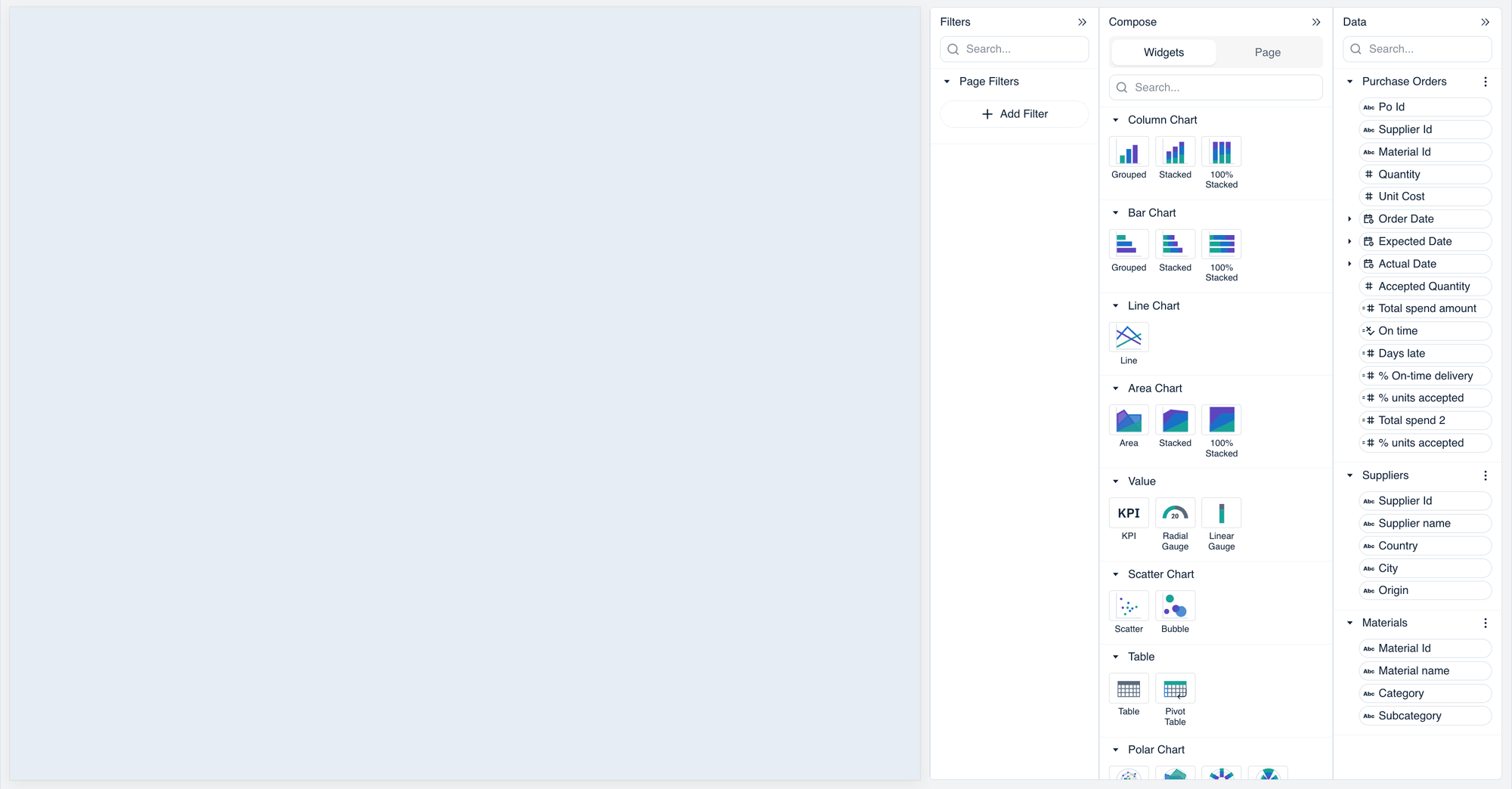
By default, AG Studio contains a drag-and-drop canvas alongside filter, compose and data panels:
- Filters: Apply global and cross-filters using any of the fields from the three tables
- Compose: A selection of 30+ AG Grid and AG Charts components to choose from to build visualisations
- Data: All of the fields available to the user to build their visualisations from.
Pre-building, saving and restoring reports
Whilst we could leave things here, wouldn't it be nice if we could hand-off the same dashboard we've already built, but within AG Studio? This way, procurement just need to implement their additional requirements, rather than straight from scratch.
To do this, we can use AG Studio's state API to define an initial state that matches the dashboard we just created, and pass this to AG Studio:
const initialState = {
    "pages": [
        {
            "id": "page-1",
            "widgetLayout": { ... },
            "widgets": { ... },
            "selection": { ... },
            "filter": { ... }
        }
    ],
    "schema": {
        "expressions": [ ... ],
        "fields": { ... }
    },
    "panels": { ... },
    "selectedPageId": "page-1",
}

<AgStudio
    data={data}
    initialState={initialState}
/>
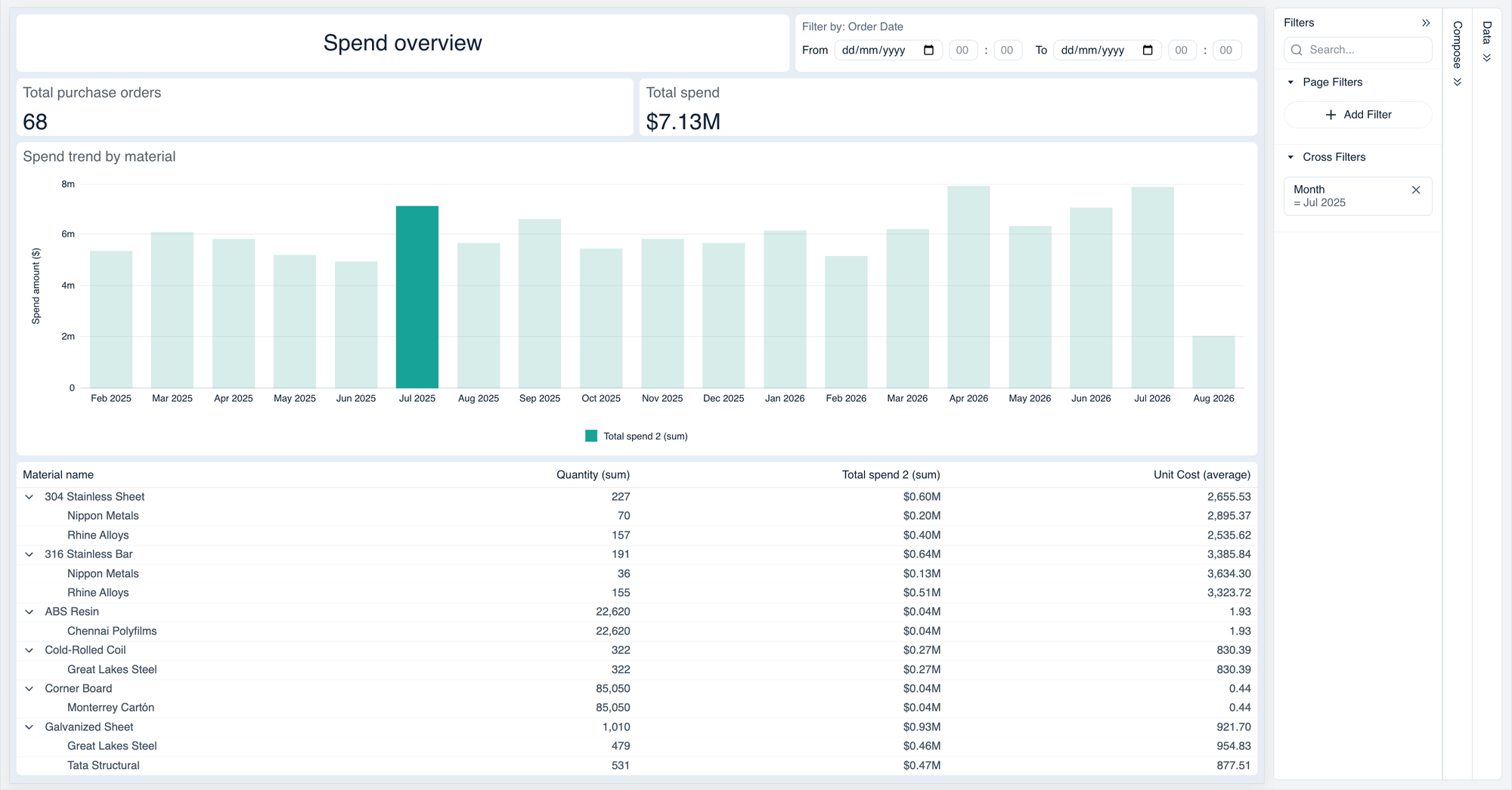
Now our dashboard looks pretty much like it did before, with cross-filtering, global filters and four components, without needing to build any of the logic behind it:
Let users build the report
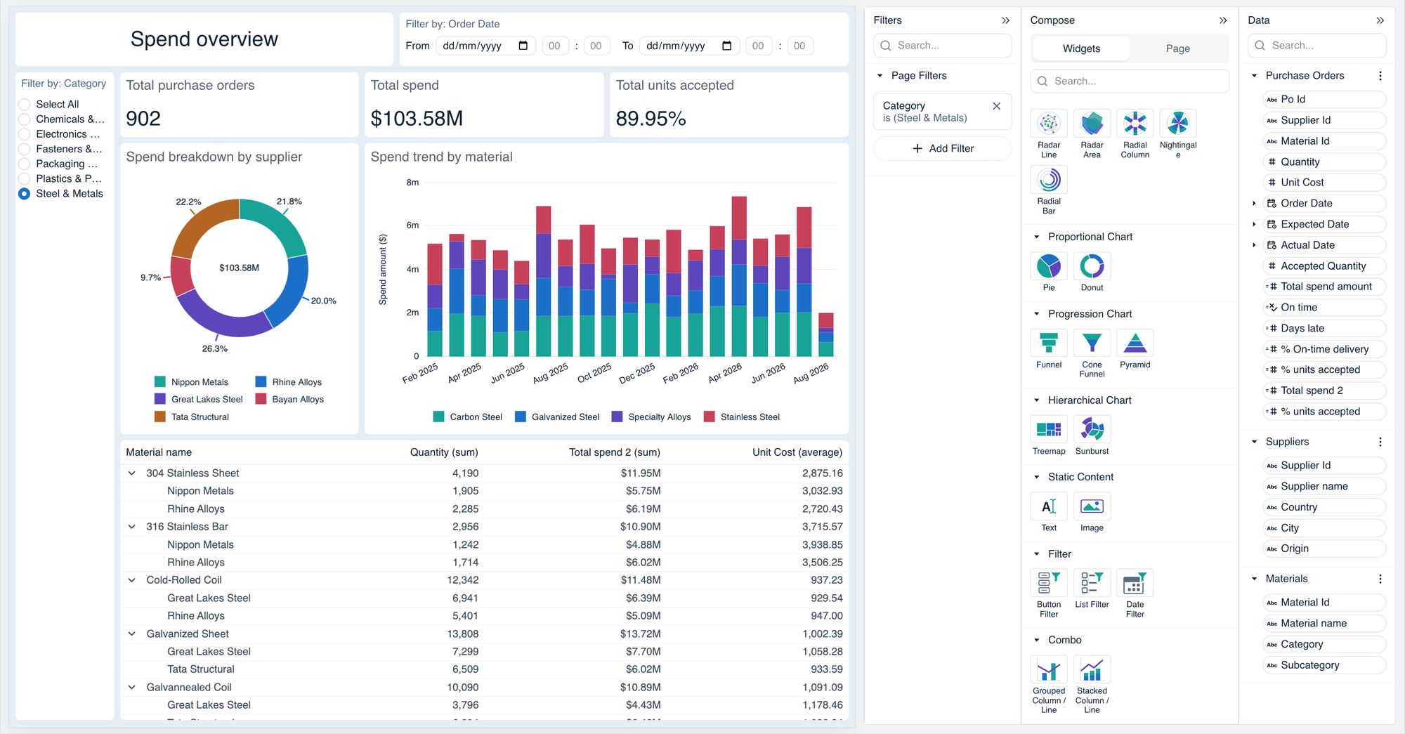
Now that everything has been configured, we can simply hand the dashboard off to the user to implement the additional filters, fields, and components:
Summary
In the blog, we've taken a fairly simple use-case and contrasted the effort between building dashboards with AG Grid and AG Charts vs. AG Studio. Both approaches work, but the former required us to own all of the logic, and means any changes to the report have to flow through engineering and the full SDLC. Not to mention the compounding complexity. AG Studio, on the other hand, requires minimal configuration to achieve the same result, all whilst handing-off responsibility for the creation of the reports to the users themselves.
We've only covered a fraction of AG Studio in this post; there's a whole lot more to explore, including:
- Custom components: Need a visualisation that's not included by default? Bring your own components and wire them into AG Studios data engine.
- Configuring guardrails: Configure exactly what users see, and what they can & can't do within AG Studio. Designed to slot into your existing role-based permissioning.
- Server-side data: For datasets with millions of rows, run a data engine on your server instead.
- Studio Agent Framework: Integrate your own LLM into AG Studio to allow users to build reports with natural language.
What's next
AG Studio 3 is here. Calculations in the UI, undo and redo, the agent framework, server-side pagination and a Figma design system - see the release notes for everything and Launch Week for the sessions.
If there's a specific capability you need that's not on our roadmap, we want to hear about it. Use the contact form, open a discussion on GitHub, or join our Discord. Enterprise customers can reach our engineering team directly via Zendesk.
Get started
AG Studio is available now with a 45-day free trial, including technical support via Zendesk. Start with the quick start, or follow the tutorial to build a multi-page dashboard from scratch.
See what's new in our other releases: AG Grid 36.2 & AG Charts 14.2.