


Our latest release, AG Grid 36.3, focuses on making the grid more dependable for everyone who uses it: filters that remember what your users chose, calculated columns you can confidently hand over to end users and a grid that's more accessible to everyone.
There are no breaking changes, no behaviour changes and no removed APIs in this release, so upgrading is straightforward - read on for demos, code snippets, and full details on what's new.
Key features in AG Grid 36.3
- Set Filter persistent selection: Keep Set Filter values, and whether they were selected, when the data in the grid changes.
- Calculated columns improvements: Read-only columns, custom validation, restricted references, aggregation and a new change event.
- High-contrast / Forced colour mode support: Selection, focus, icons and controls stay visible under Windows High Contrast and other forced colour modes.
- Accessibility improvements: Richer ARIA semantics for hierarchies, hidden and spanned columns, plus better screen reader announcements and menu-based column moving.
- Performance improvements: Faster column model updates, plus refinements across the grid.
Set Filter persistent selection
By default, once a value is removed the from the grid's data set, it's also removed from the Set Filter list. This means that when rows are reloaded, replaced or removed by live updates, users' selections are silently lost - even if the value re-appears later.
With AG Grid 36.3, you can now enable Persistent Selection for Set Filters which makes them keep a reference to their values, so when a value disappears and then reappears its selected state is restored automatically. This is particularly useful when applying a saved filter model before its rows have loaded, replacing the row data, or handling live updates that remove and later re-add a value's rows:
Persistent Selection is opt-in per column via preservePreviousValues:
const gridOptions = {
  columnDefs: [
    {
      field: 'country',
      filter: 'agSetColumnFilter',
      filterParams: {
        preservePreviousValues: true,
        // Shown after each value that is no longer in the data
        preservePreviousValuesLabel: '(not in rows)',
      },
    },
  ],
};
Persistent Selection is an AG Grid Enterprise feature. Visit the Set Filter Data Updates docs for more information, including guidance on memory usage for high-churn columns.
Calculated Columns improvements
Calculated Columns, introduced in AG Grid 36, let users create their own columns using expressions such as [colA] - [colB]. Handing that power to end users is only half the story, though - in a real application, you also need to decide what they can change, what they can reference and what counts as a valid column.
AG Grid 36.3 gives developers that control, with:
- Read-only calculated columns: let users view a column's definition without editing or removing it.
- Restricted column references: control which columns an expression is allowed to reference.
- Custom validation: apply your own rules and messages to a column's title, type and expression.
- Customising user-created columns: give the columns your users create the same features as your own, such as filtering and aggregation.
- Change event: respond to any change to a calculated column's title, type or expression from a single event.
Read-only columns
Some calculated columns are part of your application and shouldn’t be rewritten by users. You can now mark these as read-only, so users can’t edit or remove them.
Read-only columns can still be inspected via the View Calculated Column option, but users can't change their title, type or expression, and the Remove Calculated Column option is disabled:
To make a column read-only, set calculatedColumnReadOnly to true:
{
    colId: 'grossMargin',
    calculatedExpression: '([revenue] - [cost]) / [revenue]',
    calculatedColumnReadOnly: true,
}
See the Read-only calculated columns documentation
Restricting column references
Not every column should be available to every expression. AG Grid 36.3 now lets you restrict which columns can be referenced in expressions, giving you more control over how the data set can be adjusted and extended by the user.
Restricted columns are hidden from the dialog's column picker, and if a user types one in manually, they'll see an error against the expression and #REF! in the cell:
The isColumnReferenceable property is used to determine when a column can be referenced:
const gridOptions = {
    calculatedColumns: {
        // Only allow Salary to be referenced from the Bonus column
        isColumnReferenceable: ({ colDef, calculatedColumn }) =>
            colDef.field !== 'salary' || calculatedColumn?.getColId() === 'bonus',
    },
};
See the Restricting column references documentation.
Custom validation
The grid already checks that an expression is valid, and you can now define your own custom validation rules to ensure the title, type, and expression of calculated columns also conform to your standards, such as naming conventions or length limits.
Validation rules are applied as the user types - when an invalid input is detected, the apply button will be disabled and the relevant field is highlighted:
The getValidationErrors property is used to define the validation rules for calculated columns:
const gridOptions = {
    calculatedColumns: {
        getValidationErrors: ({ colDef, internalErrors }) => ({
            ...internalErrors,
            headerName: (colDef.headerName?.length ?? 0) > 30
                ? ['Use a title of at most 30 characters.']
                : internalErrors?.headerName,
        }),
    },
};
See the calculated column validation documentation.
Customising user-created columns
Columns your users create should behave like the rest of your grid, with the same filters, aggregation and formatting as the columns you define, so we've added a new option to the grid to allow you to define the features that should be enabled on user-created columns:
To configure the features available in calculated columns, define a column definition object within the processColDef property:
const gridOptions = {
    calculatedColumns: {
        // Enable filtering and aggregation on calculated columns
        processColDef: (params) => ({
            ...params.colDef,
            filter: true,
            enableValue: params.colDef.cellDataType === 'number',
        }),
    },
};
See the relevant processColDef documentation.
Change event
If you save calculated columns or sync them with other parts of your application, you need to know when they change. Or maybe you just want insights into how your users are working with your data.
To support this, we've added a new event to the grid that fires whenever a calculated column is modified; the event contains both the new and old values, allowing you to track or respond to these changes as you see fit:
const gridOptions = {
    onCalculatedColumnChanged: event => {
        const { headerName, cellDataType, calculatedExpression } = event.changes;
        if (headerName) {
            console.log('Title:', headerName.oldValue, headerName.newValue);
        }
        if (cellDataType) {
            console.log('Type:', cellDataType.oldValue, cellDataType.newValue);
        }
        if (calculatedExpression && event.expressionValidation.valid) {
            console.log('Expression:', calculatedExpression.oldValue, calculatedExpression.newValue);
        }
    },
};
In deferred mode, the onCalculatedColumnChanged event fires once when the user clicks Apply. In live mode, it fires for each applied update to headerName, cellDataType, calculatedExpression or columnGroupShow.
See the Calculated Columns events documentation.
High-contrast and forced colour mode support
When a user enables a high-contrast theme in Windows, or forced colours in their browser, the browser replaces the page's colours with a small palette of system colours.
AG Grid 36.3 now supports these modes out of the box, including the Integrated Charts panels, making the grid even more accessible for users who rely on high-contrast modes and assistive technologies:
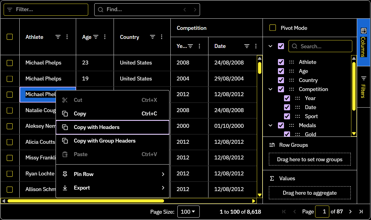
Forced colour modes are detected automatically, with no configuration needed.
Accessibility improvements
Alongside forced colour support, this release includes a range of accessibility improvements for keyboard and assistive technology users:
- Columns can now be reordered without dragging, using new Move items in the column menu, Columns Tool Panel, Column Chooser and drop zones (AG Grid Enterprise).
- Screen readers now get more accurate column positions when columns are hidden or cells span multiple columns.
- Expandable rows and rows in tree and grouped grids now report their expanded state and depth more consistently.
Visit the Accessibility docs for more information.
Performance Improvements
In addition to the new features, this release improves performance in several areas:
- Rows render more efficiently when they're created, including during first render and fast scrolling.
- Showing and hiding columns, and scrolling horizontally across columns, is faster.
- Grids created inside hidden or zero-width containers, such as inactive tabs, no longer build every column up front.
- React grids using
domLayout: 'autoHeight'with a maximum body height no longer render every row on mount.
Summary
AG Grid 36.3 focuses on keeping filters reliable as data changes, giving developers greater control over Calculated Columns and making the grid usable for more people. This release:
- Adds Set Filter persistent selection, keeping values and their selected state when they leave and return to the data.
- Expands Calculated Columns with read-only columns, restricted column references, custom validation,
processColDeffor user-created columns and a newcalculatedColumnChangedevent. - Adds forced colour mode support, keeping selection, focus, icons and controls visible under high-contrast Windows themes and similar settings.
- Improves accessibility with menu-based column moving, more accurate ARIA attributes and new screen reader announcements.
- Speeds up row rendering, showing and hiding columns, and horizontal scrolling, and avoids unnecessary work for grids in hidden containers and React grids using auto-height.
As always, we welcome feedback. Enterprise customers can contact us via Zendesk; alternatively, please submit a GitHub issue or complete our contact form.
Next steps
New to AG Grid? Get started in minutes, for free, with your favourite framework:



Considering AG Grid Enterprise? Request a free 30-day trial licence to test your application in production and get direct access to our support team.
Happy coding!