

Our latest release, AG Grid 36.2, focuses on giving your end-users more ways to control, customise and collaborate on the data contained within your grids.
Read on for demos, code snippets, and full details on what's new.
TL;DR
- PDF Export - Export AG Grid content directly to PDF, with support for configuring the exported layout and styling.
- Set Filter Support for Advanced Filter - Use Set Filter values and configuration within the Advanced Filter, bringing richer filtering to complex filter expressions.
- Custom Filter Option Support in Advanced Filter - Reuse custom filter options in Advanced Filter expressions, giving developers and users more control over application-specific filtering logic.
- Continuous Column Auto-sizing - Automatically resize columns as grid content changes, keeping column widths aligned with their contents without requiring manual resizing.
- Custom Renderers for Column Items in Columns Tool Panel - Customise how columns and column groups are displayed in the Columns Tool Panel with your own renderers.
- Quality Improvements - A range of bug fixes and refinements across the grid.
PDF Export
AG Grid now comes with built-in support for PDF Export - one of our most highly requested features - meaning you no longer need to rely on third-party libraries.
The PDF export feature follows the grid's current data state and displayed columns, meaning that your data is exported exactly as it's currently configured:
It is important to note that it is not a screenshot and does not reproduce every visual feature rendered in the browser, however, we do offer a range of options to help you control the PDF output, including: styles, languages, additional content, images, and more.
PDF Export is enabled by default, and can be triggered from the Enterprise Context Menu or via the exportDataAsPdf() Grid API:
gridApi.exportDataAsPdf();The PDF Export docs contain information on how to use the extensive configuration options.
Advanced Filter Improvements
Our Advanced Filter, released in AG Grid 30.2, allows users to build complex filter conditions with both a type-ahead input, and a visual filter builder. AG Grid 36.2 has added support for two key features into the Advanced Filter:
- Set Filter Support: allows your users to use Set Filters (e.g. a multi-select input) when using the Advanced Filter by selecting either of the new
is any oforis none ofoptions. - Custom Filter Options: Any Custom Filter Options defined for a column are now also offered in the Advanced Filter, so an expression can use the same options as the column filter.
Advanced Filter: Set Filter Support
This feature is enabled by default within the Advanced Filter for any column with a Set Filter, but can also be enabled for other columns by supplying the isAnyOf and/or isNoneOf options to the filterParams.filterOptions on the relevant column:
const gridOptions = {
    columnDefs: [
        // A Set Filter column offers the Set Options as well as those of its Cell Data Type.
        { field: 'country', filter: 'agSetColumnFilter' },
        // A Number Filter includes Set Options via filterOptions.
        {
            field: 'age',
            filter: 'agNumberColumnFilter',
            filterParams: {
                filterOptions: ['greaterThan', 'lessThan', 'isAnyOf', 'isNoneOf'],
            },
        },
        // A Set Filter column that does not include the Set Options, just its filterOptions
        {
            field: 'sport',
            filter: 'agSetColumnFilter',
            filterParams: {
                filterOptions: ['contains', 'equals'],
            },
        },
    ],
};
The Advanced Filter Set Filter docs contain more information.
Advanced Filter: Custom Filter Options
The Advanced Filter accepts Custom Filter Options the same way as Column Filters, by passing a custom object to the filterParams.filterOptions to the relevant column:
const [columnDefs, setColumnDefs] = useState([
    {
        field: 'age',
        filterParams: {
            filterOptions: [
                'equals',
                {
                    displayKey: 'evenNumbers',
                    displayName: 'Even Numbers',
                    numberOfInputs: 0,
                    predicate: (_values, cellValue) => cellValue != null && cellValue % 2 === 0,
                },
                {
                    displayKey: 'betweenExclusive',
                    displayName: 'Between (Exclusive)',
                    numberOfInputs: 2,
                    predicate: ([from, to], cellValue) => cellValue != null && cellValue > from && cellValue < to,
                },
            ],
        },
    },
]);

<AgGridReact columnDefs={columnDefs} />
The Custom Filter Options docs contain more information on configuring these options.
Continuous Column Auto-sizing
AG Grid has long provided an autoSizeStrategy property which allows you to programmatically resize the grid to fit either the cell contents or the grid itself. This strategy is applied once when the grid first renders.
AG Grid 36.2 now allows you to set these strategies to continuous, which re-applies the sizing strategy whenever the grid changes in a way that affects column widths, such as when the row data/columns change, or the grid is resized:
To enable this feature, simply set continuous: true on your autoSizeStrategy definition:
const autoSizeStrategy = useMemo(() => {
	return {
        type: 'fitCellContents',
        continuous: true,
    };
}, []);

<AgGridReact autoSizeStrategy={autoSizeStrategy} />
The Continuous Auto Sizing docs provide more information on how to use this feature, including controlling which events trigger resizing, as well as how to new rows or columns whilst scrolling.
Custom Renderers for Column Tool Panel Items
Adding to our extensive customisation options, you can now supply custom renderers to column tool panel items, allowing you to replace the text shown for columns and column groups, whilst the Grid continues to provide and manage the checkbox, drag handle and group expand controls:
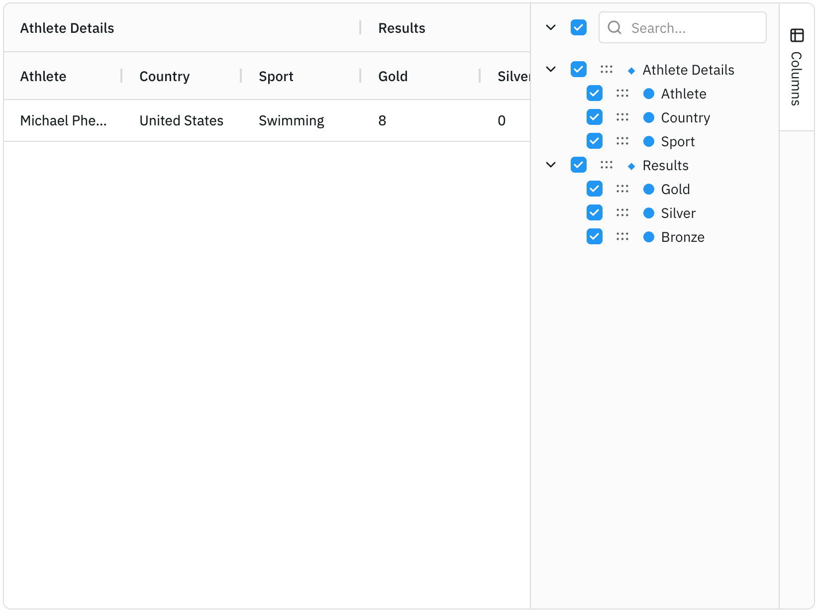
Renderers can be supplied directly or referenced by a name registered in the grid's components map, whilst additional properties can be passed through columnLabelRendererParams:
// Grid components map
const components = {
    customColumnLabel: CustomColumnLabel,
};

const sideBar = useMemo(() => {
    return {
        toolPanels: [{
            id: 'columns',
            toolPanel: 'agColumnsToolPanel',
            toolPanelParams: {
                // Use custom renderer
                columnLabelRenderer: 'customColumnLabel',
                columnLabelRendererParams: {
                    columnIcon: '●',
                    columnGroupIcon: '◆',
                },
            },
        }],
    };
}, []);

<AgGridReact
    components={components}
    sideBar={sideBar}
/>
The Custom Column Label docs provide more information on defining and configuring custom renderers.
Summary
AG Grid 36.2 focuses on export, filtering and greater control over grid presentation. This release:
- Adds built-in PDF Export that respects the grid’s current data state and displayed columns, with configurable styling, content, images and language support.
- Expands Advanced Filter with Set Filter support through
is any ofandis none of, plus support for Custom Filter Options defined on columns. - Adds continuous column auto-sizing, allowing
autoSizeStrategyto re-run automatically when data, columns or grid dimensions change. - Adds custom renderers for Column Tool Panel items, enabling custom labels for columns and column groups while retaining built-in controls.
As always, we welcome feedback. Enterprise customers can contact us via Zendesk; alternatively, please submit a GitHub issue or complete our contact form.
Next steps
New to AG Grid? Get started in minutes, for free, with your favourite framework:




Considering AG Grid Enterprise? Request a free 30-day trial licence to test your application in production and get direct access to our support team.
Happy coding!