Vue Grid | Get Started with ag-Grid and Vue
ag-Grid is the industry standard for Vue Enterprise Applications. Developers using ag-Grid are building applications that would not be possible if ag-Grid did not exist.
 StackBlitz
Getting Started
In this article, we will walk you through the necessary steps to add ag-Grid (both Community and Enterprise are covered) to an existing Vue project, configure some of the essential features of it. We will show you some of the fundamentals of the grid (passing properties, using the API, etc). As a bonus, we will also tweak the grid's visual appearance using Sass variables.
Add ag-Grid to Your Project
For the purposes of this tutorial, we are going to scaffold an Vue app with Vue CLI. Don't worry if your project has a different configuration. Ag-Grid and its Vue wrapper are distributed as NPM packages, which should work with any common Vue project module bundler setup. Let's follow the Vue CLI instructions - run the following in your terminal:
When prompted choose "Manually select features":
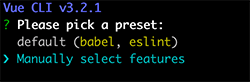
Next, select Babel and CSS Pre-processors (we've also deselected Linter here, but
this is optional):
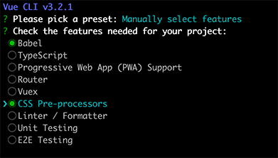
Next select SASS/SCSS as the CSS Pre-processor:

Finally choose where to store the configuration data - we've opted for dedicated config files:

We're now ready to start our application:
If everything goes well, npm run serve has started the web server. You can open the default app at localhost:8080.
As a next step, let's add the ag-Grid NPM packages. run the following command in my-project (you may need a new instance of the terminal):
After a few seconds of waiting, you should be good to go. Let's get to the actual coding! As a first step,
let's add the ag-Grid styles - import them in the style section of src/App.vue:
The code above imports the grid "structure" stylesheet (ag-grid.css), and one of the available grid themes: (ag-theme-balham.css).
The grid ships several different themes; pick one that matches your project design.
As this will be a simple example we can delete the src/components directory. Our example application will live in src/App.vue.
Let's add the component definition to our template. Edit app/App.vue and replace the scaffold code:
Next, let's declare the basic grid configuration. Edit src/App.vue:
The code above presents two essential configuration properties of the grid - the column definitions (columnDefs) and the data (rowData). In our case, the column definitions contain three columns;
each column entry specifies the header label and the data field to be displayed in the body of the table.
This is the ag-grid component definition, with two property bindings - rowData and columnDefs. The component also accepts the standard DOM style and class.
We have set the class to ag-theme-balham, which defines the grid theme.
As you may have already noticed, the CSS class matches the name of CSS file we imported earlier.
Finally, note that we've imported the ag-grid-vue component - this is actual component that will provide the ag-Grid functionality.
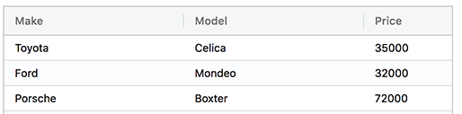
If everything works as expected, you should see a simple grid like the one on the screenshot:
Enable Sorting And Filtering
So far, so good. But wouldn't it be nice to be able to sort the data to
help us see which car is the least/most expensive? Well, enabling sorting
in ag-Grid is actually quite simple - all you need to do is set
the sortable property to the column definitions.
After adding the property, you should be able to sort the grid by clicking on the column headers. Clicking on a header toggles through ascending, descending and no-sort.
Our application doesn't have too many rows, so it's fairly easy to find data. But it's easy to imagine how a real-world application may have hundreds (or even hundreds of thousands!) of rows, with many columns. In a data set like this filtering is your friend.
As with sorting, enabling filtering is as easy as setting the filter property:
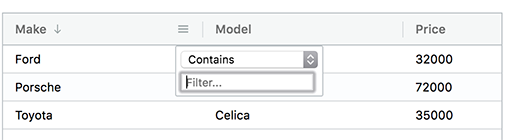
With this property set, the grid will display a small column menu icon when you hover the header. Pressing it will display a popup with a filtering UI which lets you choose the kind of filter and the text that you want to filter by.
Fetch Remote Data
Displaying hard-coded data in JavaScript is not going to get us very far. In the real world, most of the time, we are dealing with data that resides on a remote server. Thanks to React, implementing this is actually quite simple.
Notice that the actual data fetching is performed outside of the grid component - We are using the HTML5 fetch API.
Now, let's remove the hard-coded data and fetch it from a remote server. Edit the src/App.vue and add the following fetch statement:
The remote data is the same as the one we initially had, so you should not notice any actual changes to the grid. However, you will see an additional HTTP request performed if you open your developer tools.
Enable Selection
Being a programmer is a hectic job. Just when we thought that we are done with our assignment, the manager shows up with a fresh set of requirements! It turned out that we need to allow the user to select certain rows from the grid and to mark them as flagged in the system. We will leave the flag toggle state and persistence to the backend team. On our side, we should enable the selection and, afterwards, to obtain the selected records and pass them with an API call to a remote service endpoint.
Fortunately, the above task is quite simple with ag-Grid. As you may have already guessed, it is just a matter of adding and changing couple of properties.
Next, let's enable multiple row selection, so that the user can pick many rows:
We've added a checkbox to the make column with checkboxSelection: true and then enabled multiple row selection with rowSelection="multiple".
[], the assignment will pass the attribute value as a string, which is fine for our purposes.Great! Now the first column contains a checkbox that, when clicked, selects the row. The only thing we have to add is a button that gets the selected data and sends it to the server. To do this, we are
going to use the ag-Grid API - we will store a reference to both the grid and column API's in the gridReady event
To test this we'll add a button that gets the selected data and sends it to the server. Let's go ahead and make these changes:
Well, we cheated a bit. Calling alert is not exactly a call to our backend.
Hopefully you will forgive us this shortcut for the sake of keeping the article short and simple. Of course, you can substitute that bit with a real-world application logic after you are done with the tutorial.
Grouping
In addition to filtering and sorting, grouping is another effective way for the user to make sense out of large amounts of data. In our case, the data is not that much. Let's switch to a slightly larger data set:
Afterwards, let's enable the enterprise features of ag-grid. Install the additional package:
Then, add the import to src/main.js:
If everything is ok, you should see a message in the console that tells you there is no enterprise license key. You can ignore the message as we are trialing. In addition to that, the grid got a few UI improvements - a custom context menu and fancier column menu popup - feel free to look around:
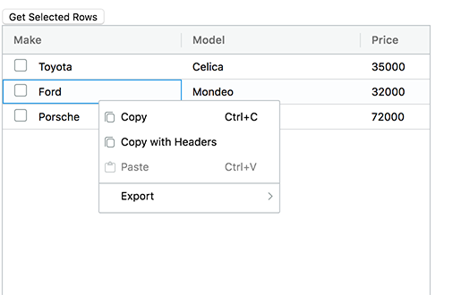
Now, let's enable grouping! Add an autoGroupColumnDef property, bind to it, and update the columnDefs with a rowGroup:
There we go! The grid now groups the data by make, while listing the model field value when expanded.
Notice that grouping works with checkboxes as well - the groupSelectsChildren property adds a group-level checkbox that selects/deselects all items in the group.
Customise the Theme Look
The last thing which we are going to do is to change the grid look and feel by modifying some of the theme's Sass variables.
By default, ag-Grid ships a set of pre-built theme stylesheets. If we want to tweak the colors and the fonts of theme, we should add a Sass preprocessor to our project, override the theme variable values, and refer the ag-grid Sass files instead of the pre-built stylesheets so that the variable overrides are applied.
The vue cli did a lot of for us including providing support for Sass. Let's switch to using the provided
ag-Grid SCSS files - replace the style block in src/App.vue with:
If everything is configured correctly, the second row of the grid will be blue. Congratulations! You now know now bend the grid look to your will - there are a few dozens more Sass variables that let you control the font family and size, border color, header background color and even the amount of spacing in the cells and columns. The full Sass variable list is available in the themes documentation section.
Summary
With this tutorial, we managed to accomplish a lot. Starting from the humble beginnings of a three row / column setup, we now have a grid that supports sorting, filtering, binding to remote data, selection and even grouping! While doing so, we learned how to configure the grid, how to access its API object, and how to change the styling of the component.