Tooltips
Default Tooltip
The default chart tooltip has the following template:
The title element may or may not exist but the content element is always present.
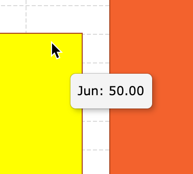
In the screenshots below the content element of both tooltips contains Jun: 50.00:
No Title
 With Title
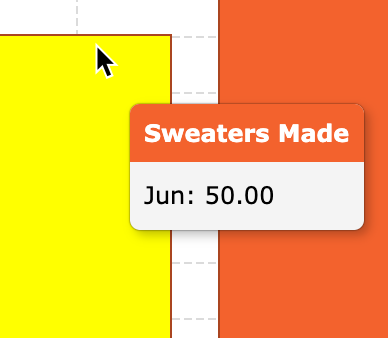
To make the tooltip title visible you need to specify the series' yName
or yNames, or labelName in the case of 'pie' series.
These configs supply the keys used to fetch the display names, because the keys themselves
may not be presentable or descriptive.
Example: Default Tooltip
In the sample data below the value1 key is not descriptive,
while hats_made is not very presentable:
Notice that when we set the yNames of the 'column' series:
-
The tooltip title is visible when
yNamesconfig is set, and hidden when theyNamesis reset. -
The
yNameschanges are reflected in the legend as well. -
The legend will use the
yKeyswhen theyNamesis not set. The tooltip however will only have a title if theyNames(ortitle) is set.
Styling the Default Tooltip
The default tooltip already uses ag-chart-tooltip, ag-chart-tooltip-title
and ag-chart-tooltip-content CSS classes, but these classes are not meant to be used
directly, unless you want to change the styling of all the tooltips in your app. Instead, users of the charting
library should provide their own tooltip class name via the chart.tooltipClass config. This class name
will be added to the class list of the tooltip element for only that particular chart instance.
For example, if we wanted to set the tooltip's content background-color
to gold, we'd add a custom class name to our chart in the code:
And then in the CSS:
This limits the styling changes to this chart instance alone (or instances that use the same
tooltipClass). We could style the title element and the container element in the same manner.
Note that your styles don't override the default tooltip styles but complement them.
Example: Tooltip Styling
Using Tooltip Renderer
chart.tooltipClass allows you to style the tooltip, but not to change its
template or its content. If you need to do either, you have to use the series
tooltipRenderer.
The tooltipRenderer is a function that receives a config object and returns an HTML
string representing the tooltip.
Let's say we wanted to remove the digits after the decimal point from the values shown in
tooltips (by default the tooltips show two digits after the decimal point for numeric values).
We could use the following tooltipRenderer to achieve that:
The tooltip renderer function receives the params object as a single parameter.
Inside that object you get a reference to the raw datum element (from the chart.data
or series.data array) that corresponds to the highlighted series item.
You also get a reference to the series' xKey and yKey, so that you could fetch
the actual values like so: params.datum[params.yKey]. You can then process the raw
values however you like before using them as a part of the returned HTML string.
Notice that stacked series (like 'column', 'bar' and 'area') that have the
yKeys property still receive a single yKey inside the tooltip renderer's
params object. This is because the tooltip renderer is only given the yKey for the
currently highlighted series item.
The effect of applying the tooltip renderer from the snippet above can be seen in the example below.
Example: Tooltip Renderer
Notice that the tooltip renderer in the example below:
-
Returns two
divelements, one for the tooltip's title and another for its content. -
The value of the title comes from
params.datum[params.xKey]which is the name of the month. -
The title element gets its background color from the
paramsobject. The provided color matches the color of the series. -
The
'Sweaters Made'value comes from theparams.datum[params.yKey], which we then stringify as an integer viatoFixed(0). -
We use the default class names on the returned
divelements, so that our tooltip gets the default styling. You could however add your own classes to the class list, or replace the default CSS classes with your own. The structure of the returned DOM is also up to you, we are just following the convention for this example.
API Reference
Bar/Column Tooltips
tooltipEnabled | Whether or not to show tooltips when the series are hovered over. Default: true |
tooltipRenderer | Function used to create the content for tooltips. |
Area Tooltips
tooltipEnabled | Whether or not to show tooltips when the series are hovered over. Default: true |
tooltipRenderer | Function used to create the content for tooltips. |
Line Tooltips
tooltipEnabled | Whether or not to show tooltips when the series are hovered over. Default: true |
tooltipRenderer | Function used to create the content for tooltips. |
Scatter/Bubble Tooltips
tooltipEnabled | Whether or not to show tooltips when the series are hovered over. Default: true |
tooltipRenderer | Function used to create the content for tooltips. |
Pie/Doughnut Tooltips
tooltipEnabled | Whether or not to show tooltips when the series are hovered over. Default: true |
tooltipRenderer | Function used to create the content for tooltips. |
Next Up
Continue to the next section to learn about axes.