Vue Charts | Get Started with ag-Charts and Vue
ag-Charts is an exciting new addition to the ag-Charts family, offering both integrated as well as standalone fully functional charting capabilities.
 StackBlitz
Getting Started
In this article we will walk you through the necessary steps to add ag-Charts to an existing Vue project and produce your first charts.
Add ag-Charts to Your Project
For the purposes of this tutorial, we are going to scaffold an Vue app with the Vue CLI.
Don't worry if your project has a different configuration. ag-Charts and its Vue wrapper are distributed as NPM packages and work with any common Vue project setup.
Let's follow the Vue CLI instructions and run the following in your terminal:
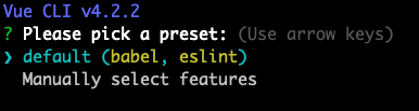
When prompted choose "default (babel, eslint)":
We're now ready to start our application:
If everything goes well, npm run serve has started the web server. You can open the default app at
localhost:8080.
Let's add the ag-Charts NPM packages. Run the following command in my-project (you may need a new
instance of the terminal):
After a few seconds of waiting, you should be good to go. Let's get to the actual coding! As a first step,
let's add the ag-Charts module. As this will be a simple example we can delete the src/components
directory. Our example application will live in src/App.vue.
Let's add the component definition to our template. Edit app/App.vue and replace the scaffold code:
Next, let's declare the basic charts configuration. Edit src/App.vue:
Here we'll provide the options we want to use for our chart, including the series to use
to plot the data.
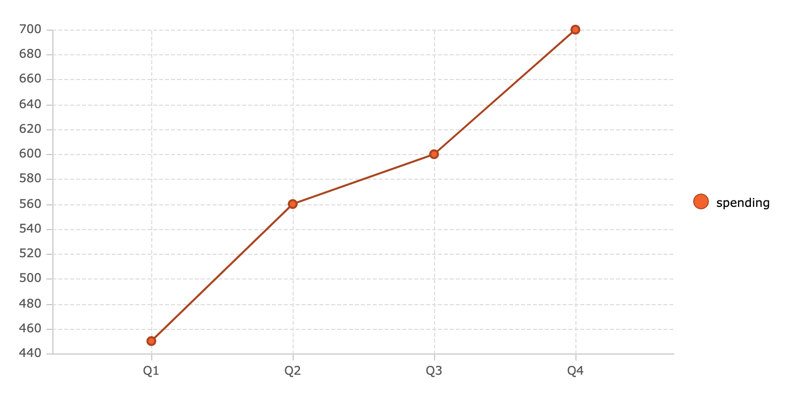
The series type defaults to 'line' so the only series configuration we
need to specify is to tell the series which keys to use to fetch the data to be
plotted along the horizontal (x) and vertical (y) axes.
The series property is an array because it is possible to supply multiple series (including mixed
kinds!) into a single chart.
The default axes configuration is a category axis
on the bottom and number axis on the left of a chart, both of which are exactly what we need, so we
don't need to supply these here.
The chart also features a legend by default which shows the yKey the series is using, in our case
'spending'.
Customising the Legend
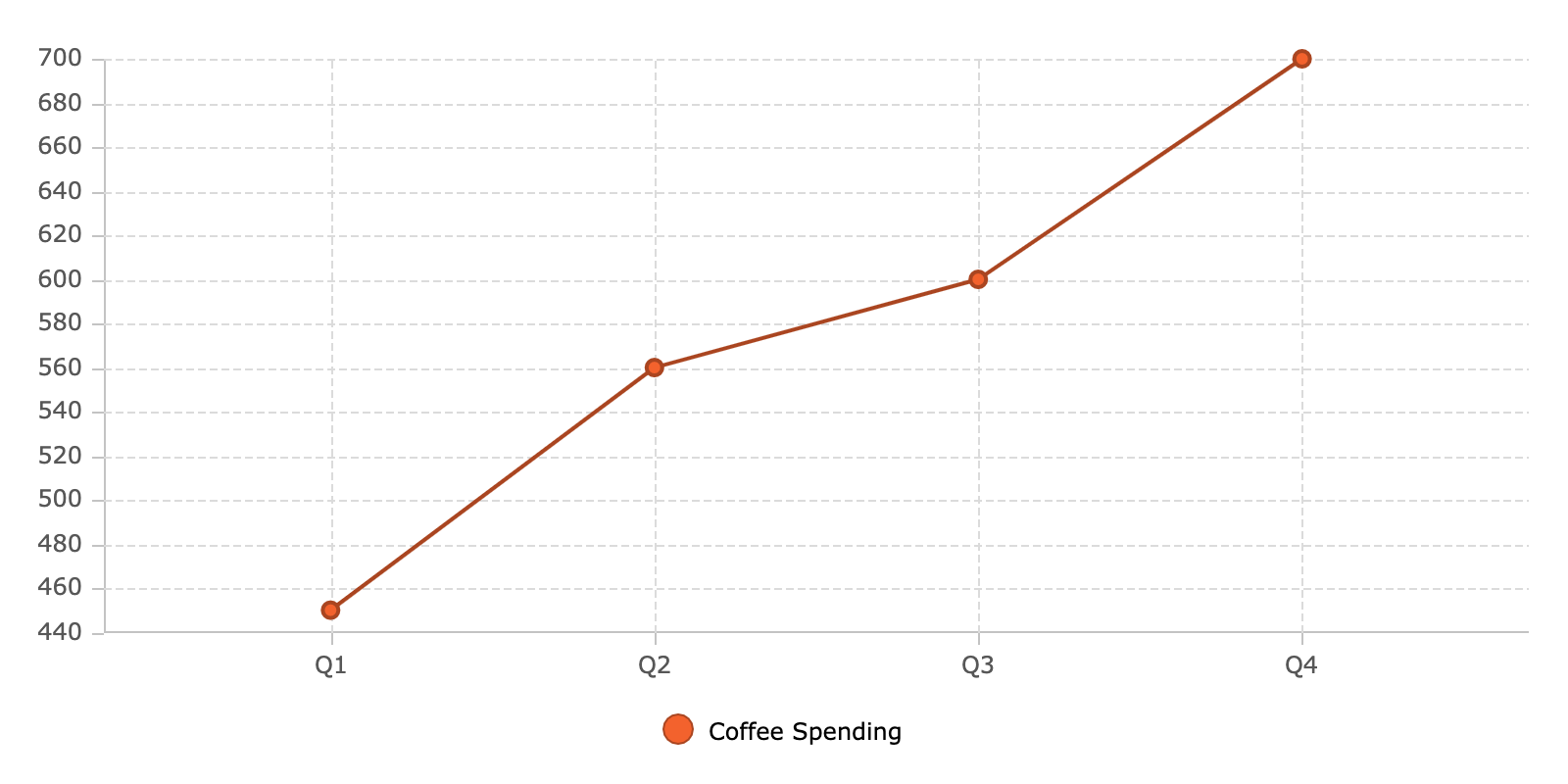
If we don't want the legend to show the value of the yKey itself we can give it a name, for example
'Coffee Spending'.
This name is more descriptive but also longer, so let's position the legend on the bottom of the chart to make more space for the series:
Basic Column Chart
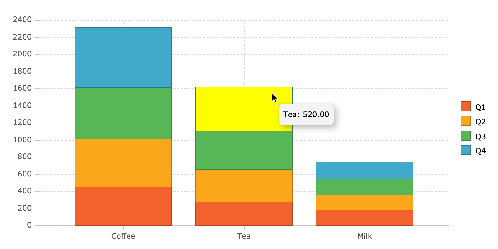
Now let's try something more interesting. Let us say you want to visualise how much is spent on coffee, milk and tea in your company each quarter and in total. Your data might look something like this:
This time, let's choose another series type to plot the data: stacked columns. Here's the chart configuration we can use to do that:
Unlike 'line' series charts, 'column' series can have multiple yKeys which
allow for stacking - in our case one block per quarter.
Chart tooltips are enabled by default so you can hover a block to see its value.
Labels and Titles
We can enhance our chart by providing a label for each block segment. We can set a label's fontSize,
fontFamily and other properties, but for now we'll just accept the default values:
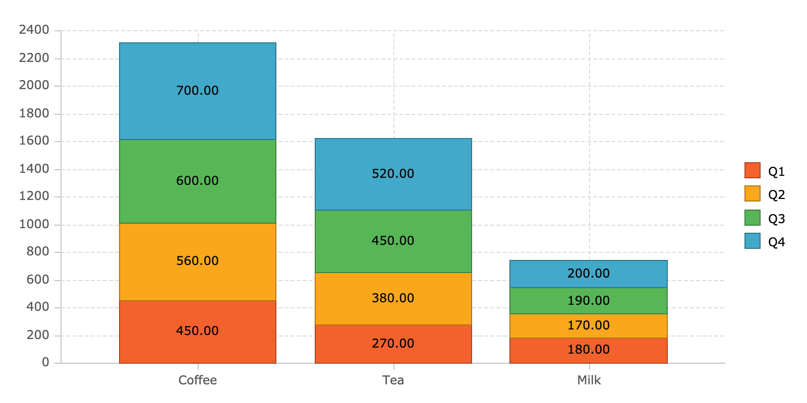
If we then want to add a title and subtitle to the chart, we can simply add this to our chart config:
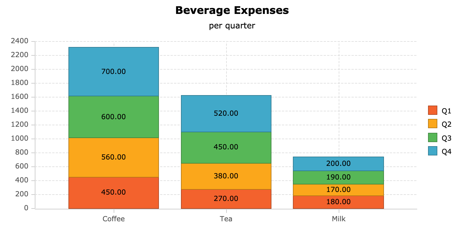
Now that you've had a taste of what it's like to use ag-Charts, we encourage you to explore our documentation to learn more.
Next Up
Continue to the next section to see the API Reference.