Our Figma design system lets designers prototype and customise AG Studio dashboards.
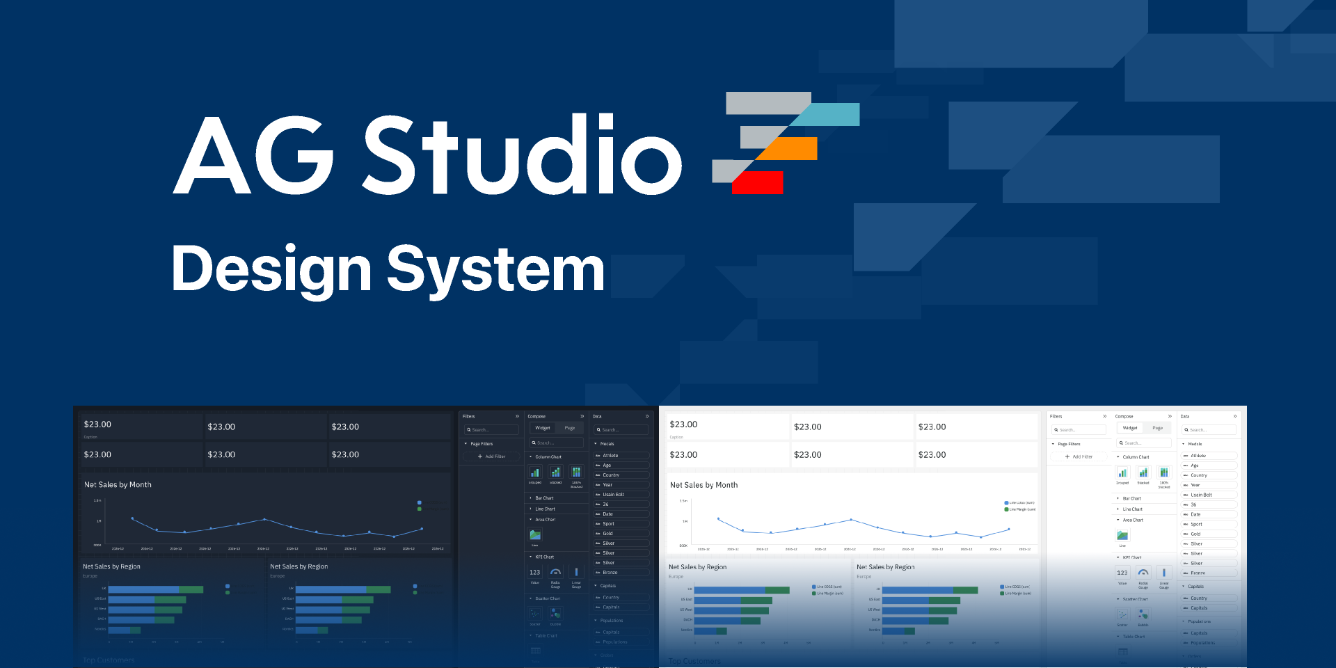
The AG Studio design system replicates the default AG Studio theme within Figma, in both light and dark modes. That default can be extended with Figma variables to match an existing visual design or to create an entirely new AG Studio theme.
The design system is built to be consistent with the JavaScript library, easing designer-to-developer handoff.
Getting Started Copy Link
To start working with the AG Studio Figma design system, visit our Figma community page and click "Open in Figma". The AG Studio design system will open directly in Figma and you're ready to start designing AG Studio dashboards.
We supply the AG Studio design system as a Figma community file. You will use the file by duplicating it to your Figma workspace. Whilst we regularly update the AG Studio design system, your duplicated files will not receive any updates automatically.
For more information about how Figma community files function, please review the Figma help pages on community files.
What's In The File Copy Link
The design system covers the AG Studio interface as a set of 1:1 Figma components:
- The dashboard canvas and its widgets, including the example widgets used throughout the file.
- The Filters, Compose and Data panels.
- The default AG Studio theme in light and dark mode.
Video Introduction & Figma Documentation Copy Link
The Figma file contains its own documentation: getting-started guides, and detail on how each component works.
Watch our short introduction video to the design system on YouTube. Our Figma Design System Tutorials playlist then covers individual features in more depth, for both AG Studio and AG Grid.
Customising the Design System Copy Link
The AG Studio design system uses Figma's native variables feature for all of its customisable attributes. The theme parameters AG Studio supports are referenced within Figma and can be extended into your own theme.
If you would rather build a theme in the browser than in Figma, the Theme Builder does the same job against a live dashboard preview.
Generating AG Studio Themes From Figma Variables Copy Link
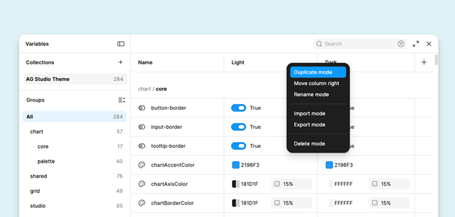
If you have created your own theme in Figma using the variables feature, you can export those variables as a .json file and transform that content into an AG Studio theme. An example transformation project and full instructions are included in our design system GitHub repo.
To export your Figma variables as JSON:
- Open the local variables panel within the AG Studio Figma Design System file.
- Select the AG Studio collection.
- Right-click on the header of the "mode" you wish to export.
- Click "Export mode" and save the tokens
.jsonfile to your computer.
The example project turns that file into a theme object you pass to withParams:
studioTheme.withParams({
    accentColor: '#2196f3',
    backgroundColor: '#1f2836',
    gridRowBorder: true,
})
The AG Studio Figma collection also holds tokens for parts of AG Grid that AG Studio does not use. These have no matching AG Studio theme parameter, so the example project skips them and lists them on the console as it converts.
Support Copy Link
AG Studio customers can request support or suggest features and improvements via Zendesk.