Themes allow you to customise the appearance of your charts. They provide defaults for different properties of the chart that will be used unless overridden by the chart options.
Using Stock Themes Copy Link
Every chart uses the 'ag-default' theme unless configured otherwise.
AgCharts.create({
    theme: 'ag-default', // optional, implied
    //...
});
Financial Charts use the ag-financial and ag-financial-dark themes only.
The following themes are provided out-of-the-box:
type AgChartThemeName =
    | 'ag-default'
    | 'ag-default-dark'
    | 'ag-sheets'
    | 'ag-sheets-dark'
    | 'ag-polychroma'
    | 'ag-polychroma-dark'
    | 'ag-vivid'
    | 'ag-vivid-dark'
    | 'ag-material'
    | 'ag-material-dark';
Select a theme in the example below to apply it to the chart.
import { Component } from "@angular/core";
import { AgCharts } from "ag-charts-angular";
import {
  AgPolarChartOptions,
  LegendModule,
  ModuleRegistry,
  PieSeriesModule,
} from "ag-charts-community";
import { getData } from "./data";
import clone from "clone";

ModuleRegistry.registerModules([LegendModule, PieSeriesModule]);

@Component({
  selector: "my-app",
  standalone: true,
  imports: [AgCharts],
  template: `<div class="example-controls">
    <div class="controls-row">
        <div class="button-group" role="group" aria-label="Theme">
            <input type="radio" id="theme-default" name="theme" value="ag-default" checked="" (change)="themeChange($event)">
            <label for="theme-default">Default Theme</label>
            <input type="radio" id="theme-sheets" name="theme" value="ag-sheets" (change)="themeChange($event)">
            <label for="theme-sheets">Sheets Theme</label>
            <input type="radio" id="theme-polychroma" name="theme" value="ag-polychroma" (change)="themeChange($event)">
            <label for="theme-polychroma">Polychroma Theme</label>
            <input type="radio" id="theme-vivid" name="theme" value="ag-vivid" (change)="themeChange($event)">
            <label for="theme-vivid">Vivid Theme</label>
            <input type="radio" id="theme-material" name="theme" value="ag-material" (change)="themeChange($event)">
            <label for="theme-material">Material Theme</label>
        </div>
    </div>
</div>
<ag-charts
        [options]="options"
    ></ag-charts>
`,
})
export class AppComponent {
  public options;

  constructor() {
    this.options = {
      theme: "ag-default",
      title: {
        text: "Chart Theme Example",
      },
      data: getData(),
      series: [
        {
          type: "pie",
          angleKey: "value",
          calloutLabelKey: "label",
        },
      ],
    };
  }

  themeChange = (event: Event) => {
    const options = clone(this.options);

    options.theme = (event.target as HTMLInputElement)
      .value as AgPolarChartOptions["theme"];

    this.options = options;
  };
}
export function getData() {
  return [
    { label: "Ubuntu", value: 25 },
    { label: "Fedora", value: 19 },
    { label: "CentOS", value: 17 },
    { label: "Mint", value: 15 },
    { label: "Manjaro", value: 14 },
    { label: "Pop!_OS", value: 12 },
    { label: "Debian", value: 10 },
    { label: "Arch", value: 8 },
    { label: "Solus", value: 6 },
    { label: "Gentoo", value: 4 },
  ];
}
// Angular entry point file
import '@angular/compiler';
import { bootstrapApplication } from '@angular/platform-browser';

import { AppComponent } from './app.component';

bootstrapApplication(AppComponent);
Making Custom Themes Copy Link
You can create your own theme, which builds upon an existing theme and allows you to change as many or as few properties as you like.
A custom theme is an object with the following optional properties:
baseTheme- The name of the theme to base this theme upon (if not specified, the'ag-default'theme is used).palette- The palette to use, replaces the palette of the base theme.params- The theme parameters to set global styles.overrides- The object to be merged with the base theme's defaults and override them.
See the Themes API page for the complete options structure.
Palette Copy Link
A palette is the array of colours used for the data, for example the bars in a bar series chart.
If there are more groups of data than colours in the palette, the colours will be repeated.
import { Component } from "@angular/core";
import { AgCharts } from "ag-charts-angular";
import {
  AgCartesianChartOptions,
  AgChartTheme,
  AnimationModule,
  BarSeriesModule,
  CategoryAxisModule,
  ContextMenuModule,
  CrosshairModule,
  LegendModule,
  ModuleRegistry,
  NumberAxisModule,
} from "ag-charts-enterprise";
import { getData } from "./data";
import clone from "clone";

const paperTheme: AgChartTheme = {
  palette: {
    fills: ["#006f9b", "#ff7faa", "#00994d", "#ff8833", "#00a0dd"],
    strokes: ["#003f58", "#934962", "#004a25", "#914d1d", "#006288"],
  },
};
const oceanTheme: AgChartTheme = {
  palette: {
    fills: ["#072B6E", "#094890", "#0B6CA8", "#0C94B6", "#0DC9C9"],
    strokes: ["#051C48", "#073569", "#095686", "#097590", "#0A9999"],
  },
};
const neonTheme: AgChartTheme = {
  palette: {
    fills: ["#00ff1e", "#ff00dd", "#00fff7", "#8f00ff", "#ff0000"],
    strokes: ["#000"],
  },
};
ModuleRegistry.registerModules([
  AnimationModule,
  BarSeriesModule,
  CategoryAxisModule,
  CrosshairModule,
  LegendModule,
  NumberAxisModule,
  ContextMenuModule,
]);

@Component({
  selector: "my-app",
  standalone: true,
  imports: [AgCharts],
  template: `<div class="example-controls">
    <div class="controls-row">
        <div class="button-group" role="group" aria-label="Theme">
            <input type="radio" id="theme-default" name="theme" value="default" (change)="themeChange($event)">
            <label for="theme-default">Default</label>
            <input type="radio" id="theme-paper" name="theme" value="paper" checked="" (change)="themeChange($event)">
            <label for="theme-paper">Paper</label>
            <input type="radio" id="theme-ocean" name="theme" value="ocean" (change)="themeChange($event)">
            <label for="theme-ocean">Ocean</label>
            <input type="radio" id="theme-neon" name="theme" value="neon" (change)="themeChange($event)">
            <label for="theme-neon">Neon</label>
        </div>
    </div>
</div>
<ag-charts
        [options]="options"
    ></ag-charts>
`,
})
export class AppComponent {
  public options;

  constructor() {
    this.options = {
      theme: paperTheme,

      data: getData(),
      series: [
        {
          type: "bar",
          xKey: "quarter",
          yKey: "iphone",
          yName: "iPhone",
          strokeWidth: 2,
        },
        {
          type: "bar",
          xKey: "quarter",
          yKey: "mac",
          yName: "Mac",
          strokeWidth: 2,
        },
        {
          type: "bar",
          xKey: "quarter",
          yKey: "ipad",
          yName: "iPad",
          strokeWidth: 2,
        },
        {
          type: "bar",
          xKey: "quarter",
          yKey: "wearables",
          yName: "Wearables",
          strokeWidth: 2,
        },
        {
          type: "bar",
          xKey: "quarter",
          yKey: "services",
          yName: "Services",
          strokeWidth: 2,
        },
      ],
    };
  }

  themeChange = (event: Event) => {
    const options = clone(this.options);

    const value = (event.target as HTMLInputElement).value;
    if (value === "default") {
      delete options.theme;
    } else if (value === "paper") {
      options.theme = paperTheme;
    } else if (value === "ocean") {
      options.theme = oceanTheme;
    } else if (value === "neon") {
      options.theme = neonTheme;
    }

    this.options = options;
  };
}
export function getData() {
  return [
    {
      quarter: "Q1'18",
      iphone: 140,
      mac: 16,
      ipad: 14,
      wearables: 12,
      services: 20,
    },
    {
      quarter: "Q2'18",
      iphone: 124,
      mac: 20,
      ipad: 14,
      wearables: 12,
      services: 30,
    },
    {
      quarter: "Q3'18",
      iphone: 112,
      mac: 20,
      ipad: 18,
      wearables: 14,
      services: 36,
    },
    {
      quarter: "Q4'18",
      iphone: 118,
      mac: 24,
      ipad: 14,
      wearables: 14,
      services: 36,
    },
  ];
}
// Angular entry point file
import '@angular/compiler';
import { bootstrapApplication } from '@angular/platform-browser';

import { AppComponent } from './app.component';

bootstrapApplication(AppComponent);
const myTheme = {
    palette: {
        fills: ['#006f9b', '#ff7faa', '#00994d', '#ff8833', '#00a0dd'],
        strokes: ['#003f58', '#934962', '#004a25', '#914d1d', '#006288'],
    },
};
Parameters Copy Link
The params object is used to set styles across the whole chart in one place.
- Set the font with
fontFamilyandfontSize. - Use
foregroundColor,backgroundColorandaccentColorto set the main colours on the chart. All other colours will default to a mix of these three. - Use specific params to adjust tooltips, menus, panels, toolbars, buttons and text inputs, for example
tooltipBackgroundColor. Please see the Themes API reference for the full list of available options.
import { Component } from "@angular/core";
import { AgCharts } from "ag-charts-angular";
import {
  AgCartesianChartOptions,
  AgChartTheme,
  AnimationModule,
  BarSeriesModule,
  CategoryAxisModule,
  ContextMenuModule,
  CrossLinesModule,
  CrosshairModule,
  ErrorBarsModule,
  LegendModule,
  ModuleRegistry,
  NumberAxisModule,
} from "ag-charts-enterprise";
import { getData } from "./data";
import clone from "clone";

const paperTheme: AgChartTheme = {
  palette: {
    fills: ["#006f9b", "#ff7faa", "#00994d", "#ff8833", "#00a0dd"],
    strokes: ["#003f58", "#934962", "#004a25", "#914d1d", "#006288"],
  },
  overrides: {
    common: {
      subtitle: {
        text: "Paper Theme",
      },
    },
  },
  params: {
    foregroundColor: "#262a33",
    backgroundColor: "#fff1e5",
    accentColor: "#0d7680",
    fontFamily: [{ googleFont: "DM Serif Text" }, "Georgia", "sans-serif"],
    fontSize: 14,
    tooltipBackgroundColor: "#fff7ef",
    tooltipTextColor: "#262a33",
  },
};
const oceanTheme: AgChartTheme = {
  palette: {
    fills: ["#072b6e", "#0c94b6", "#0b6ca8", "#094890", "#0bc9c9"],
    strokes: ["#051c48", "#073569", "#095686", "#097590", "#0a9999"],
  },
  overrides: {
    common: {
      subtitle: {
        text: "Ocean Theme",
      },
    },
  },
  params: {
    foregroundColor: "#0a54a4",
    backgroundColor: "#d9e0ed",
    accentColor: "#0ba268",
    fontFamily: [{ googleFont: "Pacifico" }, "Savoye LET", "cursive"],
    fontSize: 16,
  },
};
const neonTheme: AgChartTheme = {
  palette: {
    fills: ["#8f00ff", "#ff00dd", "#00ff1e", "#00fff7", "#ff0000"],
    strokes: ["#fff"],
  },
  overrides: {
    common: {
      subtitle: {
        text: "Neon Theme",
      },
    },
  },
  params: {
    foregroundColor: "#00ff1e",
    backgroundColor: "#000000",
    accentColor: "#ff00dd",
    fontFamily: [{ googleFont: "IBM Plex Mono" }, "monospace"],
    fontSize: 12,
    axisLineColor: "#00ff1e",
    gridLineColor: "#00ff1e",
    tooltipBackgroundColor: "#00ff1e",
    tooltipTextColor: "#000000",
  },
};
const defaultTheme: AgChartTheme = {
  baseTheme: "ag-default",
  overrides: {
    common: {
      subtitle: {
        text: "Default Theme",
      },
    },
  },
};
ModuleRegistry.registerModules([
  AnimationModule,
  BarSeriesModule,
  CategoryAxisModule,
  CrosshairModule,
  CrossLinesModule,
  ErrorBarsModule,
  LegendModule,
  NumberAxisModule,
  ContextMenuModule,
]);

@Component({
  selector: "my-app",
  standalone: true,
  imports: [AgCharts],
  template: `<div class="example-controls">
    <div class="controls-row">
        <div class="button-group" role="group" aria-label="Theme">
            <input type="radio" id="theme-default" name="theme" value="default" (change)="themeChange($event)">
            <label for="theme-default">Default</label>
            <input type="radio" id="theme-paper" name="theme" value="paper" checked="" (change)="themeChange($event)">
            <label for="theme-paper">Paper</label>
            <input type="radio" id="theme-ocean" name="theme" value="ocean" (change)="themeChange($event)">
            <label for="theme-ocean">Ocean</label>
            <input type="radio" id="theme-neon" name="theme" value="neon" (change)="themeChange($event)">
            <label for="theme-neon">Neon</label>
        </div>
    </div>
</div>
<ag-charts
        [options]="options"
    ></ag-charts>
`,
})
export class AppComponent {
  public options;

  constructor() {
    this.options = {
      theme: paperTheme,

      title: {
        text: "Dolphins & Mirrors",
      },
      subtitle: {
        enabled: true,
      },
      loadGoogleFonts: true,
      data: getData(),
      series: [
        {
          type: "bar",
          xKey: "dolphin",
          yKey: "interactionDurationTM",
          yName: "Interaction Duration - Transparent Mirror",
          legendItemName: "Interaction Duration - Transparent Mirror",
          stackGroup: "ID",
          errorBar: {
            yLowerKey: "interactionDurationTMLower",
            yUpperKey: "interactionDurationTMUpper",
          },
        },
        {
          type: "bar",
          xKey: "dolphin",
          yKey: "interactionDurationYM",
          yName: "Interaction Duration - Yellow Mirror",
          legendItemName: "Interaction Duration - Yellow Mirror",
          stackGroup: "ID",
          errorBar: {
            yLowerKey: "interactionDurationYMLower",
            yUpperKey: "interactionDurationYMUpper",
          },
        },
        {
          type: "bar",
          xKey: "dolphin",
          yKey: "numberOfLooksTM",
          yName: "Number of Looks - Transparent Mirror",
          yKeyAxis: "ySecondary",
          legendItemName: "Number of Looks - Transparent Mirror",
          stackGroup: "NOL",
        },
        {
          type: "bar",
          xKey: "dolphin",
          yKey: "numberOfLooksYM",
          yName: "Number of Looks - Yellow Mirror",
          yKeyAxis: "ySecondary",
          legendItemName: "Number of Looks - Yellow Mirror",
          stackGroup: "NOL",
        },
      ],
      axes: {
        x: {
          type: "category",
          position: "top",
          paddingInner: 0.5,
          paddingOuter: 0.2,
          crossLines: [
            {
              type: "range",
              range: ["Peter", "Peter"],
              strokeWidth: 0,
            },
            {
              type: "range",
              range: ["Mercutio", "Mercutio"],
              strokeWidth: 0,
            },
          ],
        },
        y: {
          type: "number",
          position: "left",
          title: {
            text: "Duration of Interaction (seconds)",
          },
        },
        ySecondary: {
          type: "number",
          position: "right",
          title: {
            text: "Number of Looks",
          },
        },
      },
    };
  }

  themeChange = (event: Event) => {
    const options = clone(this.options);

    const value = (event.target as HTMLInputElement).value;
    const themes: Record<string, AgChartTheme> = {
      default: defaultTheme,
      paper: paperTheme,
      ocean: oceanTheme,
      neon: neonTheme,
    };
    options.theme = themes[value];

    this.options = options;
  };
}
export function getData() {
  return [
    {
      dolphin: "Peter",
      interactionDurationTM: 1.23,
      interactionDurationTMLower: 0.8,
      interactionDurationTMUpper: 1.44,
      interactionDurationYM: 2.85,
      interactionDurationYMLower: 2.22,
      interactionDurationYMUpper: 3.61,
      numberOfLooksTM: 60,
      numberOfLooksYM: 64,
    },
    {
      dolphin: "Mary",
      interactionDurationTM: 1.35,
      interactionDurationTMLower: 0.9,
      interactionDurationTMUpper: 1.59,
      interactionDurationYM: 2.59,
      interactionDurationYMLower: 2.09,
      interactionDurationYMUpper: 2.85,
      numberOfLooksTM: 57,
      numberOfLooksYM: 93,
    },
    {
      dolphin: "Mercutio",
      interactionDurationTM: 1.4,
      interactionDurationTMLower: 1.32,
      interactionDurationTMUpper: 1.46,
      interactionDurationYM: 1.45,
      interactionDurationYMLower: 1.1,
      interactionDurationYMUpper: 1.54,
      numberOfLooksTM: 238,
      numberOfLooksYM: 217,
    },
    {
      dolphin: "Ada",
      interactionDurationTM: 1.1,
      interactionDurationTMLower: 0.89,
      interactionDurationTMUpper: 1.45,
      interactionDurationYM: 1.47,
      interactionDurationYMLower: 1.35,
      interactionDurationYMUpper: 1.64,
      numberOfLooksTM: 237,
      numberOfLooksYM: 217,
    },
  ];
}
// Angular entry point file
import '@angular/compiler';
import { bootstrapApplication } from '@angular/platform-browser';

import { AppComponent } from './app.component';

bootstrapApplication(AppComponent);
const myTheme = {
    palette: {
        fills: ['#006f9b', '#ff7faa', '#00994d', '#ff8833', '#00a0dd'],
        strokes: ['#003f58', '#934962', '#004a25', '#914d1d', '#006288'],
    },
    params: {
        foregroundColor: '#262a33',
        backgroundColor: '#fff1e5',
        accentColor: '#0d7680',
        fontFamily: [{ googleFont: 'DM Serif Text' }, 'Georgia', 'sans-serif'],
        fontSize: 14,
        tooltipBackgroundColor: '#fff7ef',
        tooltipTextColor: '#262a33',
    },
};
In the above example:
- The three main colours are defined with some additional specific colours for chrome elements.
- All text elements are set to the same font family.
- All text, except the titles and footer, are set to the same font size.
Colour References Copy Link
Any colour parameter can reference another instead of a fixed value, keeping related colours in sync. See Colours for all accepted colour value forms.
import { Component } from "@angular/core";
import { AgCharts } from "ag-charts-angular";
import {
  AgCartesianChartOptions,
  AgThemeColorParam,
  BarSeriesModule,
  CategoryAxisModule,
  LegendModule,
  ModuleRegistry,
  NumberAxisModule,
} from "ag-charts-community";
import clone from "clone";

let colorRef: AgThemeColorParam = "accentColor";
let onto: AgThemeColorParam | "none" = "none";
let mix = 0.35;
ModuleRegistry.registerModules([
  BarSeriesModule,
  CategoryAxisModule,
  NumberAxisModule,
  LegendModule,
]);

@Component({
  selector: "my-app",
  standalone: true,
  imports: [AgCharts],
  template: `<div class="example-controls">
    <div class="controls-row">
        <div class="gap-right">
            <label for="ref-select">ref:</label>
            <select id="ref-select" (change)="changeRef($event)">
                <option value="accentColor">accentColor</option>
                <option value="foregroundColor">foregroundColor</option>
                <option value="backgroundColor">backgroundColor</option>
            </select>
        </div>
        <div class="gap-right">
            <label for="onto-select">onto:</label>
            <select id="onto-select" (change)="changeOnto($event)">
                <option value="none">none</option>
                <option value="backgroundColor">backgroundColor</option>
                <option value="foregroundColor">foregroundColor</option>
                <option value="accentColor">accentColor</option>
            </select>
        </div>
        <div>
            <label for="mix-range">mix: <span id="mix-value">0.35</span></label>
            <input id="mix-range" type="range" min="0" max="1" step="0.05" value="0.35" (input)="changeMix($event)">
        </div>
    </div>
</div>
<ag-charts
        [options]="options"
    ></ag-charts>
`,
})
export class AppComponent {
  public options;

  constructor() {
    this.options = {
      theme: {
        params: {
          accentColor: "#2f6df0",
          backgroundColor: "#ffffff",
          foregroundColor: "#1b2a4a",
          // Only the text colour is derived from the controls below.
          textColor: { ref: colorRef, mix },
        },
      },
      title: {
        text: "Quarterly Revenue",
      },
      subtitle: {
        text: "Text colour derived from a parameter reference",
      },
      data: [
        { month: "Jan", revenue: 120 },
        { month: "Feb", revenue: 150 },
        { month: "Mar", revenue: 180 },
        { month: "Apr", revenue: 140 },
        { month: "May", revenue: 210 },
        { month: "Jun", revenue: 190 },
      ],
      series: [
        {
          type: "bar",
          xKey: "month",
          yKey: "revenue",
          yName: "Revenue",
          fill: "#c9d6e8",
        },
      ],
      axes: {
        x: { type: "category", position: "bottom", title: { text: "Month" } },
        y: {
          type: "number",
          position: "left",
          title: { text: "Revenue ($000s)" },
        },
      },
    };
  }

  updateTextColor = () => {
    const options = clone(this.options);

    const textColor =
      onto === "none" ? { ref: colorRef, mix } : { ref: colorRef, mix, onto };
    options.theme = {
      params: {
        accentColor: "#2f6df0",
        backgroundColor: "#ffffff",
        foregroundColor: "#1b2a4a",
        // Only the text colour is derived from the controls below.
        textColor,
      },
    };

    this.options = options;
  };

  changeRef = (event: Event) => {
    colorRef = (event.target as HTMLSelectElement).value as AgThemeColorParam;
    this.updateTextColor();
  };

  changeOnto = (event: Event) => {
    onto = (event.target as HTMLSelectElement).value as
      | AgThemeColorParam
      | "none";
    this.updateTextColor();
  };

  changeMix = (event: Event) => {
    mix = Number((event.target as HTMLInputElement).value);
    document.getElementById("mix-value")!.textContent = mix.toFixed(2);
    this.updateTextColor();
  };
}
// Angular entry point file
import '@angular/compiler';
import { bootstrapApplication } from '@angular/platform-browser';

import { AppComponent } from './app.component';

bootstrapApplication(AppComponent);
The chart textColor is derived from the controls. With no onto, mix fades the referenced colour towards transparency.
const myTheme = {
    params: {
        accentColor: '#0d7680',
        subtleTextColor: { ref: 'textColor', mix: 0.6 },
        tooltipBackgroundColor: { ref: 'accentColor', mix: 0.1, onto: 'backgroundColor' },
    },
};
{ ref: 'accentColor' }- use another parameter's value.{ ref: 'accentColor', mix: 0.5 }- that colour at50%opacity.{ ref: 'accentColor', mix: 0.1, onto: 'backgroundColor' }- blendrefontoonto, weighted bymix.{ ref: 'accentColor', mix: 0.1, ontoColor: 'var(--brand)' }- blendrefonto a literal colour or CSS variable, weighted bymix.
Borders Copy Link
Border parameters use a consistent { width, color } shape across every element.
import { Component } from "@angular/core";
import { AgCharts } from "ag-charts-angular";
import {
  AgCartesianChartOptions,
  CategoryAxisModule,
  LineSeriesModule,
  ModuleRegistry,
  NumberAxisModule,
  ZoomModule,
} from "ag-charts-enterprise";
import clone from "clone";

let width = 2;
let radius = 8;
let color = "accentColor";
ModuleRegistry.registerModules([
  LineSeriesModule,
  CategoryAxisModule,
  NumberAxisModule,
  ZoomModule,
]);

@Component({
  selector: "my-app",
  standalone: true,
  imports: [AgCharts],
  template: `<div class="example-controls">
    <div class="controls-row">
        <label for="color-select">color:</label>
        <select id="color-select" class="gap-right" (change)="changeColor($event)">
            <option value="accentColor">accentColor (ref)</option>
            <option value="#d1495b">#d1495b</option>
            <option value="#21b372">#21b372</option>
        </select>
        <label for="width-range">width:</label>
        <input id="width-range" type="range" min="0" max="8" step="1" value="2" (input)="changeWidth($event)" (change)="changeWidth($event)">
        <span id="width-value" class="gap-right">2</span>
        <label for="radius-range">radius:</label>
        <input id="radius-range" type="range" min="0" max="20" step="1" value="8" (input)="changeRadius($event)" (change)="changeRadius($event)">
        <span id="radius-value">8</span>
    </div>
</div>
<ag-charts
        [options]="options"
    ></ag-charts>
`,
})
export class AppComponent {
  public options;

  constructor() {
    this.options = {
      theme: {
        params: {
          accentColor: "#2f6df0",
          buttonBorder: {
            width,
            color: color === "accentColor" ? { ref: "accentColor" } : color,
          },
          buttonBorderRadius: radius,
        },
      },
      title: {
        text: "Adjust the border on the zoom buttons",
      },
      data: [
        { month: "Jan", revenue: 120 },
        { month: "Feb", revenue: 150 },
        { month: "Mar", revenue: 180 },
        { month: "Apr", revenue: 140 },
        { month: "May", revenue: 210 },
        { month: "Jun", revenue: 190 },
      ],
      series: [
        { type: "line", xKey: "month", yKey: "revenue", yName: "Revenue" },
      ],
      axes: {
        x: { type: "category" },
        y: { type: "number" },
      },
      zoom: {
        enabled: true,
        buttons: { visible: "always" },
      },
    };
  }

  updateBorder = () => {
    const options = clone(this.options);

    options.theme = {
      params: {
        accentColor: "#2f6df0",
        buttonBorder: {
          width,
          color: color === "accentColor" ? { ref: "accentColor" } : color,
        },
        buttonBorderRadius: radius,
      },
    };

    this.options = options;
  };

  changeWidth = (event: Event) => {
    width = Number((event.target as HTMLInputElement).value);
    document.getElementById("width-value")!.textContent = String(width);
    this.updateBorder();
  };

  changeRadius = (event: Event) => {
    radius = Number((event.target as HTMLInputElement).value);
    document.getElementById("radius-value")!.textContent = String(radius);
    this.updateBorder();
  };

  changeColor = (event: Event) => {
    color = (event.target as HTMLSelectElement).value;
    this.updateBorder();
  };
}
// Angular entry point file
import '@angular/compiler';
import { bootstrapApplication } from '@angular/platform-browser';

import { AppComponent } from './app.component';

bootstrapApplication(AppComponent);
The controls style buttonBorder, shown on the zoom buttons.
const myTheme = {
    params: {
        borderColor: '#cccccc',
        borderWidth: 1,
        borderRadius: 4,
        buttonBorder: { width: 2, color: { ref: 'accentColor' } },
        buttonBorderRadius: 8,
    },
};borderColor,borderWidth,borderRadius- global defaults for bordered elements (buttons, inputs, menus, tooltips).<element>Border-booleanto toggle, or{ width, color }to override.coloraccepts a colour reference.<element>BorderRadius- corner radius, inheriting fromborderRadius.
Overrides Copy Link
The overrides object is similar in its structure to the chart's options and is used as follows:
- Items in the
overrides.commonobject are applied to all chart types. - Items in the series specific object (e.g.
overrides.line), are applied to charts of that series type. - Series specific properties are found in the
seriesobject of the series type (e.g.overrides.line.series). - The
axesconfig contains one object for each axis type.
import { Component } from "@angular/core";
import { AgCharts } from "ag-charts-angular";
import {
  AgChartOptions,
  AgChartTheme,
  BarSeriesModule,
  CategoryAxisModule,
  LegendModule,
  ModuleRegistry,
  NumberAxisModule,
} from "ag-charts-community";
import { getData } from "./data";

const myTheme: AgChartTheme = {
  palette: {
    fills: ["#006f9b", "#ff7faa", "#00994d", "#ff8833", "#00a0dd"],
    strokes: ["#003f58", "#934962", "#004a25", "#914d1d", "#006288"],
  },
  overrides: {
    common: {
      title: {
        fontSize: 24,
      },
    },
    bar: {
      series: {
        label: {
          enabled: true,
          color: "black",
        },
        strokeWidth: 1,
      },
    },
  },
};
ModuleRegistry.registerModules([
  BarSeriesModule,
  CategoryAxisModule,
  LegendModule,
  NumberAxisModule,
]);

@Component({
  selector: "my-app",
  standalone: true,
  imports: [AgCharts],
  template: `<ag-charts
        [options]="options"
    ></ag-charts>
`,
})
export class AppComponent {
  public options;

  constructor() {
    this.options = {
      theme: myTheme,

      title: {
        text: "Custom Chart Theme Example",
      },
      data: getData(),
      series: [
        {
          type: "bar",
          xKey: "label",
          yKey: "v1",
          stacked: true,
          yName: "Reliability",
        },
        {
          type: "bar",
          xKey: "label",
          yKey: "v2",
          stacked: true,
          yName: "Ease of use",
        },
        {
          type: "bar",
          xKey: "label",
          yKey: "v3",
          stacked: true,
          yName: "Performance",
        },
        {
          type: "bar",
          xKey: "label",
          yKey: "v4",
          stacked: true,
          yName: "Price",
        },
        {
          type: "bar",
          xKey: "label",
          yKey: "v5",
          stacked: true,
          yName: "Market share",
        },
      ],
    };
  }
}
export function getData() {
  return [
    { label: "Android", v1: 5.67, v2: 8.63, v3: 8.14, v4: 6.45, v5: 1.37 },
    { label: "iOS", v1: 7.01, v2: 8.04, v3: 1.338, v4: 6.78, v5: 5.45 },
    { label: "BlackBerry", v1: 7.54, v2: 1.98, v3: 9.88, v4: 1.38, v5: 4.44 },
    { label: "Symbian", v1: 9.27, v2: 4.21, v3: 2.53, v4: 6.31, v5: 4.44 },
    { label: "Windows", v1: 2.8, v2: 1.908, v3: 7.48, v4: 5.29, v5: 8.8 },
  ];
}
// Angular entry point file
import '@angular/compiler';
import { bootstrapApplication } from '@angular/platform-browser';

import { AppComponent } from './app.component';

bootstrapApplication(AppComponent);
const myTheme = {
    palette: {
        fills: ['#006f9b', '#ff7faa', '#00994d', '#ff8833', '#00a0dd'],
        strokes: ['#003f58', '#934962', '#004a25', '#914d1d', '#006288'],
    },
    overrides: {
        common: {
            title: {
                fontSize: 24,
            },
        },
        bar: {
            series: {
                label: {
                    enabled: true,
                    color: 'black',
                },
                strokeWidth: 1,
            },
        },
    },
};
In the above example:
- A different palette of colours and strokes is provided for all series to use.
- The font size of the title is increased.
- The
barseries has specific label and stroke options set.
Advanced Custom Theme Copy Link
import { Component } from "@angular/core";
import { AgCharts } from "ag-charts-angular";
import {
AgChartOptions,
AgChartTheme,
BarSeriesModule,
CategoryAxisModule,
LegendModule,
LineSeriesModule,
ModuleRegistry,
NumberAxisModule,
PieSeriesModule,
} from "ag-charts-community";
import { getData } from "./data";
import clone from "clone";
const myTheme: AgChartTheme = {
palette: {
fills: ["#006f9b", "#ff7faa", "#00994d", "#ff8833", "#00a0dd"],
strokes: ["#003f58", "#934962", "#004a25", "#914d1d", "#006288"],
},
params: {
foregroundColor: "#262a33",
backgroundColor: "#fff1e5",
accentColor: "#0d7680",
fontFamily: "Georgia, serif",
fontSize: 14,
tooltipBackgroundColor: "#fff7ef",
tooltipTextColor: "#262a33",
},
overrides: {
common: {
title: {
fontSize: 24,
},
padding: {
left: 70,
right: 70,
},
axes: {
category: {
line: {
width: 4,
},
},
number: {
line: {
width: 2,
},
},
},
},
line: {
series: {
marker: {
shape: "circle",
},
},
},
bar: {
series: {
label: {
enabled: true,
color: "white",
},
},
},
pie: {
padding: {
top: 40,
bottom: 40,
},
legend: {
position: "left",
},
series: {
calloutLabel: {
enabled: true,
},
calloutLine: {
colors: ["#881008"],
},
},
},
},
};
ModuleRegistry.registerModules([
BarSeriesModule,
LegendModule,
LineSeriesModule,
PieSeriesModule,
CategoryAxisModule,
NumberAxisModule,
]);
@Component({
selector: "my-app",
standalone: true,
imports: [AgCharts],
template: `<div class="example-controls">
<div class="controls-row">
<div class="button-group" role="group" aria-label="Chart Type">
<input type="radio" id="type-bar" name="chart-type" value="bar" checked="" (change)="applyOptions($event)">
<label for="type-bar">Bar & Line Chart</label>
<input type="radio" id="type-pie" name="chart-type" value="pie" (change)="applyOptions($event)">
<label for="type-pie">Pie Chart</label>
</div>
</div>
</div>
<ag-charts
[options]="options"
></ag-charts>
`,
})
export class AppComponent {
public options;
constructor() {
this.options = {
theme: myTheme,
title: {
text: "Multi-Type Chart Theme",
},
data: getData(),
series: [
{
type: "bar",
xKey: "label",
yKey: "v1",
stacked: true,
yName: "Reliability",
},
{
type: "bar",
xKey: "label",
yKey: "v2",
stacked: true,
yName: "Ease of use",
},
{
type: "bar",
xKey: "label",
yKey: "v3",
stacked: true,
yName: "Performance",
},
{
type: "line",
xKey: "label",
yKey: "v4",
yName: "Price",
},
],
};
}
applyOptions = (event: Event) => {
const options = clone(this.options);
const type = (event.target as HTMLInputElement).value as "bar" | "pie";
if (type === "pie") {
options.series = [
{
type: "pie",
angleKey: "v4",
calloutLabelKey: "label",
},
];
} else {
const names = ["Reliability", "Ease of use", "Performance", "Price"];
options.series = [
...names.map((yName, idx) => ({
type: idx <= 2 ? ("bar" as const) : ("line" as const),
xKey: "label",
yKey: `v${idx + 1}`,
stacked: idx <= 2,
yName,
})),
];
}
this.options = options;
};
}
export function getData() {
  return [
    { label: "Android", v1: 5.67, v2: 8.63, v3: 8.14, v4: 6.45, v5: 1.37 },
    { label: "iOS", v1: 7.01, v2: 8.04, v3: 2.93, v4: 6.78, v5: 5.45 },
    { label: "BlackBerry", v1: 7.54, v2: 1.98, v3: 9.88, v4: 1.38, v5: 4.44 },
    { label: "Symbian", v1: 9.27, v2: 4.21, v3: 2.53, v4: 6.31, v5: 4.44 },
    { label: "Windows", v1: 2.8, v2: 1.908, v3: 7.48, v4: 5.29, v5: 8.8 },
  ];
}
// Angular entry point file
import '@angular/compiler';
import { bootstrapApplication } from '@angular/platform-browser';

import { AppComponent } from './app.component';

bootstrapApplication(AppComponent);
const myTheme = {
    palette: {
        fills: ['#006f9b', '#ff7faa', '#00994d', '#ff8833', '#00a0dd'],
        strokes: ['#003f58', '#934962', '#004a25', '#914d1d', '#006288'],
    },
    params: {
        foregroundColor: '#262a33',
        backgroundColor: '#fff1e5',
        accentColor: '#0d7680',
        tooltipBackgroundColor: '#fff7ef',
        tooltipTextColor: '#262a33',
        fontFamily: 'Georgia, serif',
        fontSize: 14,
    },
    overrides: {
        common: {
            title: {
                fontSize: 24,
            },
            padding: {
                left: 70,
                right: 70,
            },
            axes: {
                category: {
                    line: {
                        width: 4,
                    },
                },
                number: {
                    line: {
                        width: 2,
                    },
                },
            },
        },
        line: {
            series: {
                marker: {
                    shape: 'circle',
                },
            },
        },
        bar: {
            series: {
                label: {
                    enabled: true,
                    color: 'white',
                },
            },
        },
        pie: {
            padding: {
                top: 40,
                bottom: 40,
            },
            legend: {
                position: 'left',
            },
            series: {
                calloutLabel: {
                    enabled: true,
                },
                calloutLine: {
                    colors: ['#881008'],
                },
            },
        },
    },
};
In the above example:
- A different palette of colours and strokes is provided for all series to use.
- Some
paramglobal styles are specified. - Some
commonoverrides are specified which apply to all chart types. - Different axes overrides are specified for
categoryandnumberaxes types. - Different series specific overrides are specified for
bar,lineandpieseries.
Figma Design System Copy Link

The AG Grid Figma Design System contains AG Charts components and templates to aid you in mocking up and theming AG Charts applications.
The design system contains UI components such as tooltips, menus, navigators, and financial charts toolbars. There are also Figma assets to aid in the design of AG Charts colour palettes. In addition, we supply a full range of components for mocking up AG Grid integrated charts applications. Due to the limitations of Figma itself, we do not supply assets to mock up chart series.
To get started with the Figma Design System, visit the AG Grid Figma Design System Figma community page and click the "Open in Figma" button.
We supply the AG Grid Design System as a Figma community file. You will use the file by duplicating it to your Figma workspace. While we regularly update the AG Grid Design System, your duplicated files will not receive any updates automatically.
For more information about how Figma community files function, please review the Figma help pages on community files.
Figma Documentation & Video Tutorials Copy Link
You’ll find comprehensive documentation for the design system right within the Figma file. We have guides for getting started and pre-made chart templates. Further detailed information about how each chart component works is also within the Figma file.
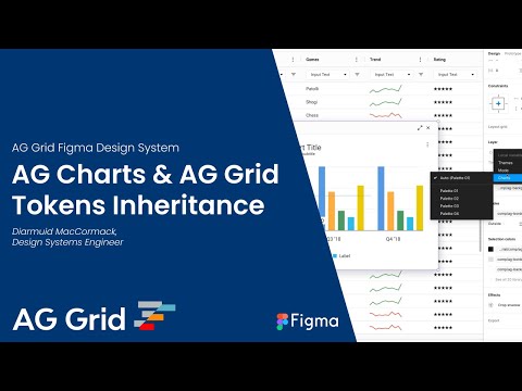
Watch our video on Theming AG Charts in Figma with Variables and Tokens. We also have a complete playlist of in-depth videos diving deeper into working with the AG Grid Figma design system.
Figma Support Copy Link
AG Charts Enterprise customers can request support or suggest features and improvements via Zendesk. Community users can file bug reports via our design system GitHub repo issues.