Number Filters allow you to filter numeric data.
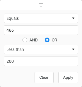
Enabling Number Filters Copy Link
import {
  createApp,
  defineComponent,
  onBeforeMount,
  ref,
  shallowRef,
} from "vue";
import { AgGridVue } from "ag-grid-vue3";
import {
  ClientSideRowModelModule,
  ColDef,
  ColGroupDef,
  GridApi,
  GridOptions,
  GridReadyEvent,
  ModuleRegistry,
  NumberFilterModule,
  enableDevValidations,
} from "ag-grid-community";
import { getData } from "./data";

if (process.env.NODE_ENV !== "production") {
  // Enable extended validations only for development
  enableDevValidations();
}

ModuleRegistry.registerModules([ClientSideRowModelModule, NumberFilterModule]);

const VueExample = defineComponent({
  template: `
        <div style="height: 100%">
                <ag-grid-vue
      style="width: 100%; height: 100%;"
      @grid-ready="onGridReady"
      :columnDefs="columnDefs"
      :defaultColDef="defaultColDef"
      :rowData="rowData"></ag-grid-vue>
        </div>
    `,
  components: {
    "ag-grid-vue": AgGridVue,
  },
  setup(props) {
    const gridApi = shallowRef<GridApi | null>(null);
    const columnDefs = ref<ColDef[]>([
      {
        field: "price",
        filter: true,
      },
      {
        field: "quantity",
        filter: "agNumberColumnFilter",
      },
    ]);
    const defaultColDef = ref<ColDef>({
      flex: 1,
      minWidth: 150,
    });
    const rowData = ref<any[] | null>(getData());

    const onGridReady = (params: GridReadyEvent) => {
      gridApi.value = params.api;
    };

    return {
      gridApi,
      columnDefs,
      defaultColDef,
      rowData,
      onGridReady,
    };
  },
});

const app = createApp(VueExample);
app.mount("#app");
export function getData(): any[] {
    const rows = [];

    for (let i = 0; i < 1000; i++) {
        rows.push({
            price: parseFloat(getRandomNumber(-500, 1000).toFixed(2)),
            quantity: Number(getRandomNumber(0, 1000).toFixed(0)),
        });
    }

    return rows;
}

function getRandomNumber(min: number, max: number) {
    return window.agRandom() * (max - min) + min;
}
The Number Filter is the default filter used in AG Grid Community for columns with number Cell Data Type, but it can also be explicitly configured as shown below:
<ag-grid-vue
    :columnDefs="columnDefs"
    /* other grid options ... */>
</ag-grid-vue>

this.columnDefs = [
    {
        field: 'price',
        // Number Filter is used by default in Community version for numeric columns
        filter: true,
        filterParams: {
            // pass in additional parameters to the Number Filter
        },
    },
    {
        field: 'quantity',
        // explicitly configure column to use the Number Filter
        filter: 'agNumberColumnFilter',
        filterParams: {
            // pass in additional parameters to the Number Filter
        },
    },
];
Number Filter Parameters Copy Link
Number Filters are configured through the filterParams attribute of the column definition (INumberFilterParams interface):
When specified, this will be used as a regex of all the characters that are allowed to be typed. It is compared against each character an edit brings in, and a keystroke, paste or drop bringing in a character it does not admit is refused whole. Text committed by an IME or another composing keyboard is not held to it, since a composition cannot be cancelled. Either this or numberFormatter makes the input field of type text, unless filterInputType says otherwise.
|
Overrides the browser's autocomplete/autofill behaviour by updating the autocomplete attribute on the component's input field(s). Possible values are:true to allow the default browser autocomplete/autofill behaviour. false to disable the browser autocomplete/autofill behaviour by setting the autocomplete attribute to off. enableInputAutoComplete is used. Some browsers do not respect setting the HTML attribute autocomplete="off" and display the auto-fill prompts anyway.
|
Specifies the buttons to be shown in the filter, in the order they should be displayed in. The options are: 'apply': If the Apply button is present, the filter is only applied after the user hits the Apply button. 'clear': The Clear button will clear the (form) details of the filter without removing any active filters on the column. 'reset': The Reset button will clear the details of the filter and any active filters on that column. 'cancel': The Cancel button will discard any changes that have been made to the filter in the UI, restoring the applied model. |
If the Apply button is present, the filter popup will be closed immediately when the Apply or Reset button is clicked if this is set to true. |
Overrides the default debounce time in milliseconds for the filter. Defaults are: TextFilter and NumberFilter: 500ms. (These filters have text field inputs, so a short delay before the input is formatted and the filtering applied is usually appropriate). DateFilter and SetFilter: 0ms |
By default, the two conditions are combined using AND. You can change this default by setting this property. Options: AND, OR
|
The default filter option to be selected. Must be one of the offered options. |
The type of input used by the filter. Defaults to text when allowedCharPattern or numberFormatter is provided, and number otherwise. Set it explicitly to keep a number input for a formatter whose output a number input can hold, or to take a text input without configuring either. An allowedCharPattern applies to either input, narrowing what a number input already accepts. |
Array of filter options to present to the user, and the options the Advanced Filter offers for the column. |
Placeholder text for the filter textbox.
|
If true, the 'inRange' filter option will include values equal to the start and end of the range. |
If true, blank (null, undefined, or an empty or whitespace-only string) values will pass the 'equals' filter option. |
If true, blank (null, undefined, or an empty or whitespace-only string) values will pass the 'greaterThan' and 'greaterThanOrEqual' filter options. |
If true, blank (null, undefined, or an empty or whitespace-only string) values will pass the 'lessThan' and 'lessThanOrEqual' filter options. |
If true, blank (null, undefined, or an empty or whitespace-only string) values will pass the 'notEqual' filter option. |
If true, blank (null, undefined, or an empty or whitespace-only string) values will pass the 'inRange' filter option. |
Maximum number of conditions allowed in the filter. Must be at least one - anything smaller is treated as one. |
By default only one condition is shown, and additional conditions are made visible when the previous conditions are entered (up to maxNumConditions). To have more conditions shown by default, set this to the number required. Conditions will be disabled until the previous conditions have been entered. Note that this cannot be greater than maxNumConditions - anything larger will be ignored. Must be at least one - anything smaller is treated as one. |
Provides a custom formatter to convert the number value in the filter model into a string to be used in the filter input. This is the inverse of the numberParser. Often used alongside allowedCharPattern, but either one on its own makes the filter use a text input, since a number input would discard the formatted text.
|
Typically used alongside allowedCharPattern, this provides a custom parser to convert the value entered in the filter inputs into a number that can be used for comparisons. The Advanced Filter reads this column's operands with it only when a numberFormatter is provided too: without one an operand is written as a plain decimal, which the default parser is what reads back.
|
If set to true, disables controls in the filter to mutate its state. Normally this would be used in conjunction with the Filter API. |
Custom Number Support Copy Link
The default behaviour of the Number Filter is to use a number input, however this has mixed browser support and behaviour. If you want to override the default behaviour, or allow users to type other characters (e.g. currency symbols, commas for thousands, etc.), the Number Filter allows you to control what characters the user is allowed to type. In this case, a text input is used with JavaScript controlling what characters the user is allowed (rather than the browser). You can also provide custom logic to parse the provided value into a number to be used in the filtering.
Custom number support is enabled by specifying configuration similar to the following:
<ag-grid-vue
    :columnDefs="columnDefs"
    /* other grid options ... */>
</ag-grid-vue>

this.columnDefs = [
    {
        field: 'age',
        filter: 'agNumberColumnFilter',
        filterParams: {
            // note: ensure you escape as if you were creating a RegExp from a string
            allowedCharPattern: '\\d\\-\\,',
            numberParser: text => {
                return text == null ? null : parseFloat(text.replace(',', '.'));
            },
            numberFormatter: value => {
                return value == null ? null : value.toString().replace('.', ',');
            },
        }
    }
];
The allowedCharPattern is a regex of all the characters that are allowed to be typed. A value starting [ and ending ] is used as written and must therefore match exactly one character; anything else is surrounded by square brackets [] for you. It is compared against each character an edit brings in, and an edit bringing in a character it does not admit is refused whole. That covers a paste and a drop as well as a keystroke. Text committed by an IME or another composing keyboard is not held to it, since a composition cannot be cancelled. A pattern that does not compile to a character pattern is reported as a warning and ignored.
The numberParser should take the user-entered text and return either a number if one can be interpreted, or null if not.
The numberFormatter should take a number (e.g. from the Filter Model) and convert it into the formatted text to be displayed, or null if no value.
numberParser and numberFormatter are also passed the grid api and context as a second argument, along with the column and colDef they are working on. One callback set on defaultColDef.filterParams can therefore serve every column it applies to. The Advanced Filter runs the same callbacks to read and write its operands; params.source is 'advancedFilter' there and 'columnFilter' here.
An allowedCharPattern of \\d\\-\\. will give similar behaviour to the default number input.
A text input is used when allowedCharPattern or numberFormatter is provided, unless filterInputType says otherwise, as a number input keeps only its own number syntax and would discard formatted text.
Set filterInputType to choose the input yourself. A numberFormatter writing text a number input can hold, such as (value) => (value == null ? null : value.toFixed(2)), can keep that input with filterInputType: 'number'. An allowedCharPattern applies to either input, narrowing what a number input already accepts.
Provide a numberParser alongside a numberFormatter to have the format read back. Without one, typed text is read with parseFloat, so 1,234 becomes 1.
Pair both to have the Advanced Filter read and display this column's operands in the same format. With only one of them, its operands stay plain numbers.
The following example demonstrates custom number support:
- The first column shows the default Number Filter behaviour.
- The second column demonstrates custom number support, and uses commas for decimals and allows a dollar sign ($) to be included.
- Floating filters are enabled and also react to the configuration of
allowedCharPatternandnumberFormatter.
import {
  createApp,
  defineComponent,
  onBeforeMount,
  ref,
  shallowRef,
} from "vue";
import { AgGridVue } from "ag-grid-vue3";
import {
  ClientSideRowModelModule,
  ColDef,
  ColGroupDef,
  GridApi,
  GridOptions,
  GridReadyEvent,
  INumberFilterParams,
  ModuleRegistry,
  NumberFilterModule,
  ValueFormatterParams,
  enableDevValidations,
} from "ag-grid-community";
import { getData } from "./data";

if (process.env.NODE_ENV !== "production") {
  // Enable extended validations only for development
  enableDevValidations();
}

ModuleRegistry.registerModules([ClientSideRowModelModule, NumberFilterModule]);

const numberValueFormatter = function (params: ValueFormatterParams) {
  return params.value.toFixed(2);
};

const saleFilterParams: INumberFilterParams = {
  allowedCharPattern: "\\d\\-\\,\\$",
  numberParser: (text: string | null) => {
    return text == null
      ? null
      : parseFloat(text.replace(",", ".").replace("$", ""));
  },
  numberFormatter: (value: number | null) => {
    return value == null ? null : value.toString().replace(".", ",");
  },
};

const saleValueFormatter = function (params: ValueFormatterParams) {
  const formatted = params.value.toFixed(2).replace(".", ",");
  if (formatted.indexOf("-") === 0) {
    return "-$" + formatted.slice(1);
  }
  return "$" + formatted;
};

const VueExample = defineComponent({
  template: `
        <div style="height: 100%">
                <ag-grid-vue
      style="width: 100%; height: 100%;"
      @grid-ready="onGridReady"
      :columnDefs="columnDefs"
      :defaultColDef="defaultColDef"
      :rowData="rowData"></ag-grid-vue>
        </div>
    `,
  components: {
    "ag-grid-vue": AgGridVue,
  },
  setup(props) {
    const gridApi = shallowRef<GridApi | null>(null);
    const columnDefs = ref<ColDef[]>([
      {
        field: "sale",
        headerName: "Sale ($)",
        floatingFilter: true,
        valueFormatter: numberValueFormatter,
      },
      {
        field: "sale",
        headerName: "Sale",
        floatingFilter: true,
        filterParams: saleFilterParams,
        valueFormatter: saleValueFormatter,
      },
    ]);
    const defaultColDef = ref<ColDef>({
      flex: 1,
      minWidth: 150,
      filter: true,
    });
    const rowData = ref<any[] | null>(getData());

    const onGridReady = (params: GridReadyEvent) => {
      gridApi.value = params.api;
    };

    return {
      gridApi,
      columnDefs,
      defaultColDef,
      rowData,
      onGridReady,
    };
  },
});

const app = createApp(VueExample);
app.mount("#app");
export function getData(): any[] {
    const rows = [];

    for (let i = 0; i < 1000; i++) {
        rows.push({ sale: parseFloat(getRandomNumber(-500, 1000).toFixed(2)) });
    }

    return rows;
}

function getRandomNumber(min: number, max: number) {
    return window.agRandom() * (max - min) + min;
}
Number Filter Model Copy Link
The Filter Model describes the current state of the applied Number Filter. If only one Filter Condition is set, this will be a NumberFilterModel:
One of the Number Filter's options, or a Custom Filter Option's displayKey. |
Filter type is always 'number' |
The number value(s) associated with the filter. Custom filters can have no values (hence both are optional). Range filter has two values (from and to), where filter acts as a from value.
|
Range filter to value.
|
If more than one Filter Condition is set, then multiple instances of the model are created and wrapped inside a Combined Model (ICombinedSimpleModel<NumberFilterModel>). A Combined Model looks as follows:
// A filter combining multiple conditions
interface ICombinedSimpleModel<NumberFilterModel> {
    filterType: string;

    operator: JoinOperator;

    // multiple instances of the Filter Model
    conditions: NumberFilterModel[];
}

type JoinOperator = 'AND' | 'OR';
An example of a Filter Model with two conditions is as follows:
// Number Filter with two conditions, both are equals type
const numberEquals18OrEquals20 = {
    filterType: 'number',
    operator: 'OR',
    conditions: [
        {
            filterType: 'number',
            type: 'equals',
            filter: 18
        },
        {
            filterType: 'number',
            type: 'equals',
            filter: 20
        }
    ]
};
Number Filter Options Copy Link
The Number Filter presents a list of Filter Options to the user.
The list of options is as follows:
| Option Name | Option Key | Included by Default |
|---|---|---|
| Equals | equals | Yes |
| Does not equal | notEqual | Yes |
| Greater than | greaterThan | Yes |
| Greater than or equal to | greaterThanOrEqual | Yes |
| Less than | lessThan | Yes |
| Less than or equal to | lessThanOrEqual | Yes |
| Between | inRange | Yes |
| Blank | blank | Yes |
| Not blank | notBlank | Yes |
| Choose one | empty | No |
Note that the empty filter option is primarily used when creating Custom Filter Options. When 'Choose one' is displayed, the filter is not active.
The default option for the Number Filter is equals.
When providing filter options, the default filter option (or the first option if no default set) must be an option that displays an input or the empty filter option (as a filter option with no inputs would mean the filter is active by default).
Range Input Validation and Error States Copy Link
When using the inRange filter type, the grid performs input validation to ensure the bounds of the range produce a valid filter; that is, where the start value is less than the end value.
Where this is not the case, the last edited input will display a red border and a hover tooltip directing the user to enter a valid value. While the filter is in an invalid state, the filter will not be applied. Screen readers that respond to the aria-invalid attribute or the ValidityState of the input will detect the input as invalid.
Number Filter Values Copy Link
By default, the values supplied to the Number Filter are retrieved from the data based on the field attribute. This can be overridden by providing a filterValueGetter in the Column Definition. This is similar to using a Value Getter, but is specific to the filter.
Function or expression. Gets the value for filtering purposes. |
A Value Formatter that changes the number itself, such as one that rounds, leaves the column displaying one number and filtering on another, because the filter compares the value the grid holds rather than the formatted text. Return the displayed number from filterValueGetter and every filter option compares against that instead:
<ag-grid-vue
    :columnDefs="columnDefs"
    /* other grid options ... */>
</ag-grid-vue>

this.columnDefs = [
    {
        field: 'price',
        filter: 'agNumberColumnFilter',
        valueFormatter: ({ value }) => (value == null ? '' : value.toFixed(2)),
        filterValueGetter: ({ getValue }) => {
            const value = getValue('price');
            return value == null ? null : Number(value.toFixed(2));
        },
    }
];
Where the displayed text is not itself a number, such as a currency, add numberParser to read what the user types and numberFormatter to write stored values back in the same form. The formatter gives the filter a text input on its own, so no allowedCharPattern is needed to make that text typeable — one would only narrow it, and a pattern omitting the symbols the formatter writes would stop the user typing them.
Applying the Number Filter Copy Link
Applying the Number Filter is described in more detail in the following sections:
Blank Cells Copy Link
If the row data contains blanks (i.e. null, undefined, or an empty or whitespace-only string), by default the row won't be included in filter results. To change this, use the filter params includeBlanksInEquals, includeBlanksInNotEqual, includeBlanksInLessThan, includeBlanksInGreaterThan and includeBlanksInRange. For example, the code snippet below configures a filter to include null for equals, but not for less than, greater than or in range (between):
const filterParams = {
    includeBlanksInEquals: true,
    includeBlanksInNotEqual: false,
    includeBlanksInLessThan: false,
    includeBlanksInGreaterThan: false,
    includeBlanksInRange: false,
};
In the following example you can filter by age and see how blank values are included. Note the following:
- Column Age has both
nullandundefinedvalues resulting in blank cells. - Toggle the controls on the top to see how
includeBlanksInEquals,includeBlanksInNotEqual,includeBlanksInLessThan,includeBlanksInGreaterThanandincludeBlanksInRangeimpact the search result.
import {
createApp,
defineComponent,
onBeforeMount,
ref,
shallowRef,
} from "vue";
import { AgGridVue } from "ag-grid-vue3";
import "./styles.css";
import {
ClientSideRowModelModule,
ColDef,
ColGroupDef,
GridApi,
GridOptions,
GridReadyEvent,
INumberFilterParams,
ModuleRegistry,
NumberFilterModule,
TextFilterModule,
ValueGetterParams,
enableDevValidations,
} from "ag-grid-community";
if (process.env.NODE_ENV !== "production") {
// Enable extended validations only for development
enableDevValidations();
}
ModuleRegistry.registerModules([
TextFilterModule,
ClientSideRowModelModule,
NumberFilterModule,
]);
const originalColumnDefs: ColDef[] = [
{ field: "athlete" },
{
field: "age",
maxWidth: 120,
filter: "agNumberColumnFilter",
filterParams: {
includeBlanksInEquals: false,
includeBlanksInNotEqual: false,
includeBlanksInLessThan: false,
includeBlanksInGreaterThan: false,
includeBlanksInRange: false,
} as INumberFilterParams,
},
{
headerName: "Description",
valueGetter: (params: ValueGetterParams) => `Age is ${params.data.age}`,
minWidth: 340,
},
];
const VueExample = defineComponent({
template: `
<div style="height: 100%">
<div class="test-container">
<div class="test-header">
<div class="test-label">Include NULL<br />in age:</div>
<label><input type="checkbox" id="checkboxEquals" v-on:change="updateParams('Equals')"> equals</label>
<label><input type="checkbox" id="checkboxNotEqual" v-on:change="updateParams('NotEqual')"> notEqual</label>
<label><input type="checkbox" id="checkboxLessThan" v-on:change="updateParams('LessThan')"> lessThan</label>
<label><input type="checkbox" id="checkboxGreaterThan" v-on:change="updateParams('GreaterThan')"> greaterThan</label>
<label><input type="checkbox" id="checkboxRange" v-on:change="updateParams('Range')"> inRange</label>
</div>
<ag-grid-vue
style="width: 100%; height: 100%;"
@grid-ready="onGridReady"
:columnDefs="columnDefs"
:defaultColDef="defaultColDef"
:rowData="rowData"></ag-grid-vue>
</div>
</div>
`,
components: {
"ag-grid-vue": AgGridVue,
},
setup(props) {
const gridApi = shallowRef<GridApi | null>(null);
const columnDefs = ref<ColDef[]>(originalColumnDefs);
const defaultColDef = ref<ColDef>({
flex: 1,
minWidth: 100,
});
const rowData = ref<any[] | null>([
{
athlete: "Alberto Gutierrez",
age: 36,
},
{
athlete: "Niall Crosby",
age: 40,
},
{
athlete: "Sean Landsman",
age: null,
},
{
athlete: "Robert Clarke",
age: undefined,
},
{
athlete: "Kirsten Flipkens",
age: "",
},
]);
function updateParams(toChange: string) {
const value: boolean = (
document.getElementById(`checkbox${toChange}`) as HTMLInputElement
).checked;
originalColumnDefs[1].filterParams[`includeBlanksIn${toChange}`] = value;
gridApi.value!.setGridOption("columnDefs", originalColumnDefs);
}
const onGridReady = (params: GridReadyEvent) => {
gridApi.value = params.api;
};
return {
gridApi,
columnDefs,
defaultColDef,
rowData,
onGridReady,
updateParams,
};
},
});
const app = createApp(VueExample);
app.mount("#app");
.test-container {
    height: 100%;
    display: flex;
    flex-direction: column;
}

.test-header {
    align-items: center;
    font-family: Verdana, Geneva, Tahoma, sans-serif;
    font-size: 13px;
    padding-bottom: 8px;
    display: flex;

    & > :not(:first-child) {
        margin-left: 16px;
        display: flex;
    }
}

.test-label {
    margin-right: 8px;
}
Data Updates Copy Link
The Number Filter is not affected by data changes. When the grid data is updated, the filter value will remain unchanged and the filter will be re-applied based on the updated data (e.g. the displayed rows will update if necessary).