




Angular Data Grid: Sparklines - Tooltips
This section shows how sparkline tooltip styles and contents can be customised using the tooltip options.
Disabling Sparkline Tooltips
Sparkline tooltips are enabled by default. They can be disabled via the tooltip options as shown in the code snippet below:
sparklineOptions: {
    tooltip: {
        enabled: false, // removes sparkline tooltips
    }
}
Default Tooltip
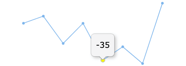
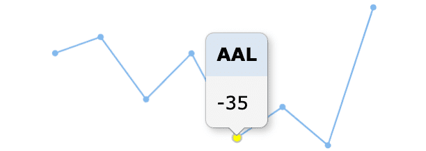
The default tooltip will show the Y value of the hovered item in the Content section of the tooltip, whereas the X value (if it exists) is displayed in the Title section of the tooltip. See the screenshots below for illustrations of these two cases.
Customising Tooltip Appearance
The default sparkline tooltip has the following template:
<div class="ag-sparkline-tooltip">
    <div class="ag-sparkline-tooltip-title"></div>
    <div class="ag-sparkline-tooltip-content"></div>
</div>
The tooltips can be customised using a tooltip renderer function supplied to the tooltip options as shown below:
sparklineOptions: {
    tooltip: {
        renderer: tooltipRenderer // Add tooltip renderer callback function to customise tooltip styles and content
    }
}- The
rendereris a callback function which receives data values associated with the highlighted data point. - It returns an object with the
contentandtitleproperties containing plain text or inner HTML that is used for the Content and Title sections of the tooltip.
Here's an example renderer function.
const tooltipRenderer = (params) => {
    const { yValue, xValue } = params;
    return {
        title: new Date(xValue).toLocaleDateString(), // formats date X values
        content: yValue.toFixed(1), // format Y number values
    }
}- In the snippet above, the renderer function sets the tooltip
contentto render Y values formatted with 1 digit after the decimal point. - The title of the tooltips is set to X values provided in the
paramsformatted using thetoLocaleString()method. This is optional because if X values are provided in the data, they will be formatted and displayed in the tooltip title by default.
Accessing Row Data
The tooltip can also be customised to display data from other columns of the current row.
This access is provideded by the input parameter supplied to the Tooltip Renderer, which includes a context object with a data property containing the row data.
The following snippet shows how values from the 'Symbol' column can be shown in the tooltip title:
const tooltipRenderer = (params) => {
    const { context } = params;
    return {
        title: context.data.symbol, // sets title of tooltips to the value for the 'symbol' field
    }
}
The following example demonstrates the above tooltip renderer:
Styling Tooltip Titles
The tooltip titles can be customised using the Tooltip Renderer.
The renderer function can return style attributes such as color, backgroundColor and opacity for the tooltip title as shown below:
const tooltipRenderer = (params) => {
    return {
        // sets styles for tooptip title
        color: 'white',
        backgroundColor: 'red',
        opacity: 0.3
    }
}
The following example demonstrates the results of the tooltip title styles above:
Interfaces
SparklineTooltip
Properties available on the SparklineTooltip interface.
| Set to false to disable tooltips. | |
| The element to place the tooltip into. This can be used to confine the tooltip to a specific area which may be outside of the sparkline grid cell. | |
| A callback function used to create the content for the tooltips. This function should return an object or a HTML string used to render the tooltip. See TooltipRendererResult. |
TooltipRendererParams
Properties available on the TooltipRendererParams interface.
TooltipRendererResult
Properties available on the TooltipRendererResult interface.
Next Up
Continue to the next section to learn about: Sparkline Points of Interest.