




Angular Charts: Area Series
Area series are line series with the area under the line filled, placing more emphasis on the magnitude of the change. Area series additionally support stacking to show the total value and the way individual values relate to the whole.
Single Area Series
To create a simple area chart we need to use series type 'area'. We also have to provide the xKey and at least one yKey.
Since 'area' series can be stacked on top of each other, they can have multiple yKeys, with one key for each stack level.
A minimal 'area' series config would therefore look like this:
series: [{
    type: 'area',
    xKey: 'year',
    yKeys: ['ie']
}]
In the snippet above we are using 'ie' as the only yKey, to show market share of just this internet browser. Using this simple series config produces the following chart:
Even though area series support markers, they are turned off by default for this series type, as this stylisation is the most common.
To enable area markers, all we need to do is add this to the series config:
marker: {
    enabled: true
}
When markers are enabled, the tooltips will be shown on hover. In this case the values shown are percentage values, however there is no % suffix because the series don't know about the nature of the data (as it is designed to work with all kinds of data). So for the purposes of this example we additionally provide a tooltipRenderer to add the % suffix. After this change, the tooltips will change like so:
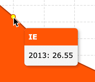
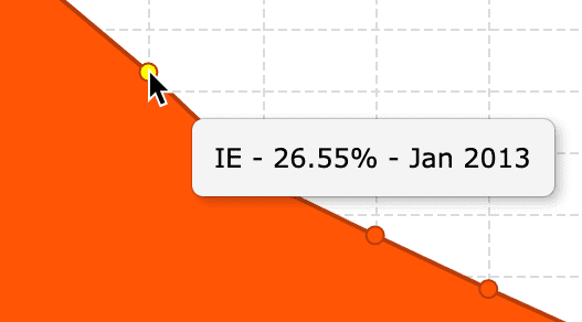
The final result can be seen in the example below.
Showing labels on top of data points is also an option with the label config. Labels can be enabled independently of series markers.
For example, to show bold labels on top of each data point (and in this case a marker) we would use the following config:
series: [{
    ...
    label: {
        enabled: true,
        fontWeight: 'bold'
    }
}]
The above config is used in the example below. Feel free to open it in Pluker and experiment with other label options.
Multiple Area Series
It is possible to use more than one 'area' series in a single chart. For example, if we want one series to show the magnitude of change in market share of Internet Explorer and the other series the change in market share of Chrome, we could use the following series config:
series: [
    {
        type: 'area',
        xKey: 'year',
        yKeys: ['ie']
    },
    {
        type: 'area',
        xKey: 'year',
        yKeys: ['chrome']
    }
]
Since multiple area series can overlap, it is a good idea to make the fill translucent, for example using fillOpacity: 0.7.
Note that in the example below we also:
- Use
yNamesto control the text that the legend displays - Enable
markers - Define custom
fillsandstrokes - Make the fill translucent using the
fillOpacityconfig
Stacked Area Series
If we want the areas to be stacked on top of each other, instead of creating a new 'area' series per stack level, we simply have to use multiple yKeys. For example, to have a stacked area chart that shows changes in market share for the most popular internet browsers we could use a config like this:
series: [{
    type: 'area',
    xKey: 'year',
    yKeys: ['ie', 'firefox', 'safari', 'chrome']
}]
This produces the following chart:
Normalized Area Series
Going back to our stacked area series example, if we wanted to normalize the totals so that for any given year stack levels always added up to a certain value, for example 100%, we could add the following to our series config:
normalizedTo: 100It's possible to use any non-zero value to normalize to.
API Reference
xKey *string | The key to use to retrieve x-values from the data. | |
xNamestring | A human-readable description of the x-values. If supplied, this will be shown in the default tooltip and passed to the tooltip renderer as one of the parameters. | |
yKeys *string[] | The keys to use to retrieve y-values from the data. | |
yNamesstring[] | Human-readable descriptions of the y-values. If supplied, a corresponding yName will be shown in the default tooltip and passed to the tooltip renderer as one of the parameters. | |
data *object[] | The data to use when rendering the series. If this is not supplied, data must be set on the chart instead. | |
visibleboolean | Whether or not to display the series. Default: true | |
showInLegendboolean | Whether or not to include the series in the legend. Default: true | |
cursorstring | The cursor to use for hovered area markers. This config is identical to the CSS cursor property.Default: 'default' | |
tooltip | Series-specific tooltip configuration. See tooltip for more details. | |
normalizedTonumber | The number to normalise the area stacks to. For example, if normalizedTo is set to 100, the stacks will all be scaled proportionally so that their total height is always 100. | |
fillsstring[] | The colours to cycle through for the fills of the areas. Default: ['#f3622d', '#fba71b', '#57b757', '#41a9c9', '#4258c9', '#9a42c8', '#c84164', '#888888'] | |
fillOpacitynumber | The opacity of the fill for the areas. Default: 1 | |
strokesstring[] | The colours to cycle through for the strokes of the areas. Default: ['#aa4520', '#b07513', '#3d803d', '#2d768d', '#2e3e8d', '#6c2e8c', '#8c2d46', '#5f5f5f'] | |
strokeOpacitynumber | The opacity of the stroke for the areas. Default: 1 | |
strokeWidthnumber | The width in pixels of the stroke for the areas. Default: 1 | |
marker | Configuration for the markers used in the series. See marker for more details. | |
label | Configuration for the labels shown on top of data points. See label for more details. | |
highlightStyle | Configuration for the highlighting used when the markers are hovered over. See highlightStyle for more details. | |
lineDashnumber[] | Defines how the area strokes are rendered. Every number in the array specifies the length in pixels of alternating dashes and gaps. For example, [6, 3] means dashes with a length of 6 pixels with gaps between of 3 pixels.Default: [] | |
lineDashOffsetnumber | The initial offset of the dashed line in pixels. Default: 0 | |
shadow | Configuration for the shadow used behind the chart series. See shadow for more details. |
tooltip
Series-specific tooltip configuration.
area: {
  ...
  tooltip: {
    enabled?: boolean; // default: true
    renderer?: Function;
  }
}enabledboolean | Whether or not to show tooltips when the series are hovered over. Default: true | |
rendererFunction | Function used to create the content for tooltips. |
marker
Configuration for the markers used in the series.
area: {
  ...
  marker: {
    enabled?: boolean; // default: false
    shape?: string | Marker; // default: 'circle'
    size?: number; // default: 8
    maxSize?: number; // default: 30
    fill?: string;
    stroke?: string;
    strokeWidth?: number;
    formatter?: Function;
  }
}enabledboolean | Whether or not to show markers. Default: false | |
shapestring | Marker | The shape to use for the markers. You can also supply a custom marker by providing a Marker subclass.Default: 'circle'Options: 'circle', 'cross', 'diamond', 'plus', 'square', 'triangle' | |
sizenumber | The size in pixels of the markers. Default: 8 | |
maxSizenumber | For series where the size of the marker is determined by the data, this determines the largest size a marker can be in pixels. Default: 30 | |
fillstring | The colour to use for marker fills. If this is not specified, the markers will take their fill from the series. | |
strokestring | The colour to use for marker strokes. If this is not specified, the markers will take their stroke from the series. | |
strokeWidthnumber | The width in pixels of the marker stroke. If this is not specified, the markers will take their stroke width from the series. | |
formatterFunction | Function used to return formatting for individual markers, based on the supplied information. If the current marker is highlighted, the highlighted property will be set to true; make sure to check this if you want to differentiate between the highlighted and un-highlighted states. |
label
Configuration for the labels shown on top of data points.
area: {
  ...
  label: {
    enabled?: boolean; // default: true
    color?: string; // default: 'rgba(70, 70, 70, 1)'
    fontStyle?: 'normal' | 'italic' | 'oblique'; // default: 'normal'
    fontWeight?: 'normal' | 'bold' | 'bolder' | 'lighter' | '100' | '200' | '300' | '400' | '500' | '600' | '700' | '800' | '900'; // default: 'normal'
    fontSize?: number; // default: 12
    fontFamily?: string; // default: 'Verdana, sans-serif'
    formatter?: Function;
  }
}enabledboolean | Whether or not the labels should be shown. Default: true | |
colorstring | The colour to use for the labels. Default: 'rgba(70, 70, 70, 1)' | |
fontStylestring | The font style to use for the labels. Default: 'normal'Options: 'normal', 'italic', 'oblique' | |
fontWeightstring | The font weight to use for the labels. Default: 'normal'Options: 'normal', 'bold', 'bolder', 'lighter', '100', '200', '300', '400', '500', '600', '700', '800', '900' | |
fontSizenumber | The font size in pixels to use for the labels. Default: 12 | |
fontFamilystring | The font family to use for the labels. Default: 'Verdana, sans-serif' | |
formatterFunction | Function used to turn 'yKey' values into text to be displayed by a label. Be default the values are simply stringified. |
highlightStyle
Configuration for the highlighting used when the markers are hovered over.
area: {
  ...
  highlightStyle: {
    fill?: string; // default: 'yellow'
    stroke?: string;
  }
}fillstring | The fill colour of the markers when hovered over. Use undefined for no highlight.Default: 'yellow' | |
strokestring | The colour of the stroke around the markers when hovered over. Use undefined for no highlight. |
shadow
Configuration for the shadow used behind the chart series.
area: {
  ...
  shadow: {
    enabled?: boolean; // default: true
    color?: string; // default: 'rgba(0, 0, 0, 0.5)'
    xOffset?: number; // default: 0
    yOffset?: number; // default: 0
    blur?: number; // default: 5
  }
}enabledboolean | Whether or not the shadow is visible. Default: true | |
colorstring | The colour of the shadow. Default: 'rgba(0, 0, 0, 0.5)' | |
xOffsetnumber | The horizontal offset in pixels for the shadow. Default: 0 | |
yOffsetnumber | The vertical offset in pixels for the shadow. Default: 0 | |
blurnumber | The radius of the shadow's blur, given in pixels. Default: 5 |
Next Up
Continue to the next section to learn about scatter and bubble series.