The Columns Tool Panel provides controls for managing the grid's columns. Use it to show, hide and reorder columns, group rows, aggregate data and pivot.
Columns Tool Panel Sections Copy Link
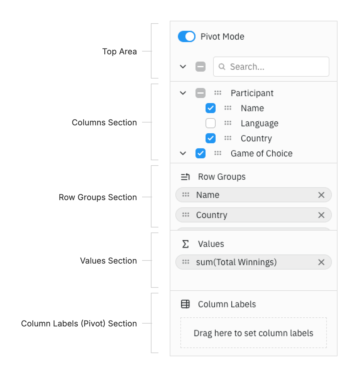
The Columns Tool Panel is split into the following sections, from top to bottom. The top area controls and the drop zones can be removed, see Section Visibility.
Top Area Copy Link
Turn Pivot Mode on or off, expand or collapse all column groups, select or unselect all columns, and search the Columns section by column name.
Columns Section Copy Link
Lists every column available to the grid, grouped by column group. Select a column to show or hide it or, in pivot mode, to group, aggregate or pivot it. Drag a column to reorder it, to move it into a drop zone or, when enabled, onto the grid to show it.
To change the order of the list or replace it with a custom layout, see Configuration. To style or rename its columns, render custom labels, or change the context menu and drag image, see Customisation.
Drop Zones Copy Link
The Row Groups Section, Values Section and Column Labels (Pivot) Section hold the columns used for the grid's Row Grouping, Aggregation and Pivoting.
Columns can only be dragged into a drop zone when their column definition allows it: enableRowGroup for Row Groups, enableValue for Values and enablePivot for Column Labels. See Configuration.
Buttons Copy Link
Optional Apply, Cancel and Reset buttons at the bottom of the panel. Apply stages changes until the user applies them, and Reset restores the columns to the current column definitions. See Deferred Updates.