The Columns Tool Panel provides controls for managing the grid's columns. It can be used to show / hide / reorder columns, group rows and aggregate data and perform pivot operations.
"use client";

import React, {
  useCallback,
  useMemo,
  useRef,
  useState,
  StrictMode,
} from "react";
import { createRoot } from "react-dom/client";
import { AgGridReact, AgGridProvider } from "ag-grid-react";
import {
  AutoGroupColumnDef,
  ClientSideRowModelModule,
  ColDef,
  ColGroupDef,
  GridApi,
  GridOptions,
  ModuleRegistry,
  NumberFilterModule,
  SideBarDef,
  TextFilterModule,
  enableDevValidations,
} from "ag-grid-community";
import {
  ColumnMenuModule,
  ColumnsToolPanelModule,
  ContextMenuModule,
  PivotModule,
  SetFilterModule,
} from "ag-grid-enterprise";
import { IOlympicData } from "./interfaces";
import { useFetchJson } from "./useFetchJson";

if (process.env.NODE_ENV !== "production") {
  // Enable extended validations only for development
  enableDevValidations();
}

const modules = [
  NumberFilterModule,
  ClientSideRowModelModule,
  ColumnsToolPanelModule,
  ColumnMenuModule,
  ContextMenuModule,
  PivotModule,
  SetFilterModule,
  TextFilterModule,
];

const GridExample = () => {
  const containerStyle = useMemo(() => ({ width: "100%", height: "100%" }), []);
  const gridStyle = useMemo(() => ({ height: "100%", width: "100%" }), []);

  const [columnDefs, setColumnDefs] = useState<(ColDef | ColGroupDef)[]>([
    {
      headerName: "Athlete",
      children: [
        {
          field: "athlete",
          filter: "agTextColumnFilter",
          enableRowGroup: true,
          enablePivot: true,
          minWidth: 150,
        },
        { field: "age", enableRowGroup: true, enablePivot: true },
        {
          field: "country",
          enableRowGroup: true,
          enablePivot: true,
          minWidth: 125,
        },
      ],
    },
    {
      headerName: "Competition",
      children: [
        { field: "year", enableRowGroup: true, enablePivot: true },
        {
          field: "date",
          enableRowGroup: true,
          enablePivot: true,
          minWidth: 180,
        },
      ],
    },
    { field: "sport", enableRowGroup: true, enablePivot: true, minWidth: 125 },
    {
      headerName: "Medals",
      children: [
        { field: "gold", enableValue: true },
        { field: "silver", enableValue: true },
        { field: "bronze", enableValue: true },
        { field: "total", enableValue: true },
      ],
    },
  ]);
  const defaultColDef = useMemo<ColDef>(() => {
    return {
      flex: 1,
      minWidth: 100,
      filter: true,
    };
  }, []);
  const autoGroupColumnDef = useMemo<AutoGroupColumnDef>(() => {
    return {
      minWidth: 200,
    };
  }, []);

  const { data, loading } = useFetchJson<IOlympicData>(
    "https://www.ag-grid.com/example-assets/olympic-winners.json",
  );

  return (
    <AgGridProvider modules={modules}>
      <div style={containerStyle}>
        <div style={gridStyle}>
          <AgGridReact<IOlympicData>
            rowData={data}
            loading={loading}
            columnDefs={columnDefs}
            defaultColDef={defaultColDef}
            autoGroupColumnDef={autoGroupColumnDef}
            sideBar={"columns"}
          />
        </div>
      </div>
    </AgGridProvider>
  );
};

const root = createRoot(document.getElementById("root")!);
root.render(
  <StrictMode>
    <GridExample />
  </StrictMode>,
);
export interface IOlympicData {
    athlete: string,
    age: number,
    country: string,
    year: number,
    date: string,
    sport: string,
    gold: number,
    silver: number,
    bronze: number,
    total: number
}import { useState, useEffect } from 'react';
/**
* Fetch example Json data
* Not recommended for production use!
*/
export const useFetchJson = <T,>(url:string, limit?: number) => {
const [data, setData] = useState<T[]>();
const [loading, setLoading] = useState(true);
useEffect(() => {
// StrictMode runs this effect twice: drop the superseded run's response rather than applying both.
let cancelled = false;
const fetchData = async () => {
setLoading(true);
// Note error handling is omitted here for brevity
const response = await fetch(url);
const json = await response.json();
const data = limit ? json.slice(0, limit) : json;
if (cancelled) {
return;
}
setData(data);
setLoading(false);
};
fetchData();
return () => {
cancelled = true;
};
}, [url, limit]);
return { data, loading };
};Remember to mark the column definitions with enableRowGroup for grouping, enablePivot for pivoting and enableValue for aggregation, otherwise you won't be able to drag and drop the columns to the desired sections.
Columns Tool Panel Sections Copy Link
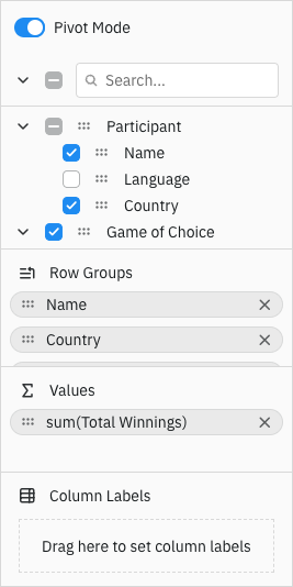
The Columns Tool Panel is split into different sections as described from the top:
- Top area
- Pivot Mode Section: Enable the 'Pivot Mode' toggle to turn the grid into Pivot Mode. Disable to take the grid out of pivot mode.
- Expand / Collapse All: Toggle to expand or collapse all column groups.
- Columns Section
- This section displays all columns, grouped by column groups, that are available to be displayed in the grid. By default the order of the columns is kept in sync with the order they are shown in the grid, but this behaviour can be disabled.
- Select / Unselect All: Toggle to select or unselect all columns in the columns section.
- Select / Unselect Column (or Group): Each column can be individually selected. The Selection Action depends on pivot mode.
- Drag Handle: Each column can be dragged either with the mouse or via touch on touch devices. The column can then be dragged to one of the following:
- Row Groups Section
- Values (Pivot) Section
- Column Labels Section
- Onto the grid (when
gridOptions.allowDragFromColumnsToolPanel=true) - Inside Columns Section to reorder columns (see Suppress Column Reordering)
- Row Groups Section
- Columns here will form the grid's Row Grouping.
- Values Section
- Columns here will form the grid's Aggregations. The grid calls this function 'Aggregations', however for the UI we follow the Excel naming convention and call it 'Values'.
- Column Labels (Pivot) Section
- Columns here will form the grid's Pivot. The grid calls this function 'Pivot', however for the UI we follow the Excel naming convention and call it 'Column Labels'.
- Context Menu
- Each column can be right-clicked to display a context menu. The context menu displays menu items related to whether the column can be grouped, pivoted and aggregated. When not in pivot mode, the context menu for visible columns includes an item to scroll the column into view.
Selection Action Copy Link
Selecting columns means different things depending on whether the grid is in pivot mode or not as follows:
- Pivot Mode Off: When pivot mode is off, selecting a column toggles the visibility of the column. A selected column is visible and an unselected column is hidden. With
allowDragFromColumnsToolPanel=true, you can drag a column from the tool panel onto the grid and it will become visible. - Pivot Mode On: When pivot mode is on, selecting a column will trigger the column to be either aggregated, grouped or pivoted depending on what is allowed for that column.
Column Selection Panel Configuration Copy Link
The Columns section and the Column Chooser use the same column selection panel. Their shared options are defined by IColumnSelectionPanelParams, while IToolPanelColumnCompParams adds options for the other Columns Tool Panel sections.
Shared Column Selection Options Copy Link
Properties available on the IColumnSelectionPanelParams interface.
To suppress updating the layout of columns as they are rearranged in the grid. |
To suppress the column search. |
To suppress the Select / Unselect All widget. |
To suppress the Expand / Collapse All widget. |
By default, column groups start expanded. Pass true to start with groups collapsed. |
Component used to render column and column group labels. The checkbox, drag handle and expand controls remain grid managed.
|
Additional parameters passed to the columnLabelRenderer. |
Callback to select which renderer to use for an individual column or column group label. |
Columns Tool Panel Options Copy Link
Properties available on the IToolPanelColumnCompParams interface.
Suppress Column Move |
Suppress Row Groups section |
Suppress Values section |
Suppress Column Labels (Pivot) section |
Suppress Pivot Mode selection |
Buttons to display at the bottom of the Columns Tool Panel. When 'apply' is included, changes are deferred until the apply button is clicked. |
Section Visibility Copy Link
Use the suppression options above to remove controls and sections from the Columns Tool Panel.
To remove a particular column from the tool panel, set the column property suppressColumnsToolPanel to true. This is useful when you have a column working in the background, e.g. a column you want to group by, but not visible to the user.
Set to true if you do not want this column or group to appear in the Columns Tool Panel. |
It is also possible to show and hide the sections of the Columns Tool Panel using the following methods provided in the IColumnToolPanel interface:
interface IColumnToolPanel {
    setPivotModeSectionVisible(visible: boolean): void;
    setRowGroupsSectionVisible(visible: boolean): void;
    setValuesSectionVisible(visible: boolean): void;
    setPivotSectionVisible(visible: boolean): void;
    ... // other methods
}
The example below demonstrates the suppress options / methods described above. Note the following:
- The following sections are not present in the tool panel: Row Groups, Values, Column Labels, Pivot Mode, Side Buttons, Column Filter, Select / Unselect All, Expand / Collapse All.
- The date column is hidden from the tool panel using:
colDef.suppressColumnsToolPanel=true. - Clicking Show Pivot Mode Section invokes
setPivotModeSectionVisible(true)on the Columns Tool Panel instance. - Clicking Show Row Groups Section invokes
setRowGroupsSectionVisible(true)on the Columns Tool Panel instance. - Clicking Show Values Section invokes
setValuesSectionVisible(true)on the Columns Tool Panel instance. - Clicking Show Pivot Section invokes
setPivotSectionVisible(true)on the Columns Tool Panel instance.
"use client";

import React, {
  useCallback,
  useMemo,
  useRef,
  useState,
  StrictMode,
} from "react";
import { createRoot } from "react-dom/client";
import { AgGridReact, AgGridProvider } from "ag-grid-react";
import "./styles.css";
import {
  AutoGroupColumnDef,
  ClientSideRowModelModule,
  ColDef,
  ColGroupDef,
  GridApi,
  GridOptions,
  ModuleRegistry,
  SideBarDef,
  enableDevValidations,
} from "ag-grid-community";
import {
  ColumnMenuModule,
  ColumnsToolPanelModule,
  ContextMenuModule,
  PivotModule,
} from "ag-grid-enterprise";
import { IOlympicData } from "./interfaces";
import { useFetchJson } from "./useFetchJson";

if (process.env.NODE_ENV !== "production") {
  // Enable extended validations only for development
  enableDevValidations();
}

const modules = [
  ClientSideRowModelModule,
  ColumnsToolPanelModule,
  ColumnMenuModule,
  ContextMenuModule,
  PivotModule,
];

const GridExample = () => {
  const gridRef = useRef<AgGridReact<IOlympicData>>(null);
  const containerStyle = useMemo(() => ({ width: "100%", height: "100%" }), []);
  const gridStyle = useMemo(() => ({ height: "100%", width: "100%" }), []);

  const [columnDefs, setColumnDefs] = useState<ColDef[]>([
    { headerName: "Name", field: "athlete", minWidth: 200 },
    { field: "age", enableRowGroup: true },
    { field: "country", minWidth: 200 },
    { field: "year" },
    { field: "date", suppressColumnsToolPanel: true, minWidth: 180 },
    { field: "sport", minWidth: 200 },
    { field: "gold", aggFunc: "sum" },
    { field: "silver", aggFunc: "sum" },
    { field: "bronze", aggFunc: "sum" },
    { field: "total", aggFunc: "sum" },
  ]);
  const defaultColDef = useMemo<ColDef>(() => {
    return {
      flex: 1,
      minWidth: 100,
      enablePivot: true,
    };
  }, []);
  const autoGroupColumnDef = useMemo<AutoGroupColumnDef>(() => {
    return {
      minWidth: 200,
    };
  }, []);
  const sideBar = useMemo<
    SideBarDef | string | string[] | boolean | null
  >(() => {
    return {
      toolPanels: [
        {
          id: "columns",
          labelDefault: "Columns",
          labelKey: "columns",
          iconKey: "columns",
          toolPanel: "agColumnsToolPanel",
          toolPanelParams: {
            suppressRowGroups: true,
            suppressValues: true,
            suppressPivots: true,
            suppressPivotMode: true,
            suppressColumnFilter: true,
            suppressColumnSelectAll: true,
            suppressColumnExpandAll: true,
          },
        },
      ],
      defaultToolPanel: "columns",
    };
  }, []);

  const { data, loading } = useFetchJson<IOlympicData>(
    "https://www.ag-grid.com/example-assets/olympic-winners.json",
  );

  const showPivotModeSection = useCallback(() => {
    const columnToolPanel =
      gridRef.current!.api.getToolPanelInstance("columns")!;
    columnToolPanel.setPivotModeSectionVisible(true);
  }, []);

  const showRowGroupsSection = useCallback(() => {
    const columnToolPanel =
      gridRef.current!.api.getToolPanelInstance("columns")!;
    columnToolPanel.setRowGroupsSectionVisible(true);
  }, []);

  const showValuesSection = useCallback(() => {
    const columnToolPanel =
      gridRef.current!.api.getToolPanelInstance("columns")!;
    columnToolPanel.setValuesSectionVisible(true);
  }, []);

  const showPivotSection = useCallback(() => {
    const columnToolPanel =
      gridRef.current!.api.getToolPanelInstance("columns")!;
    columnToolPanel.setPivotSectionVisible(true);
  }, []);

  return (
    <AgGridProvider modules={modules}>
      <div style={containerStyle}>
        <div className="example-wrapper">
          <div>
            <span className="button-group">
              <button onClick={showPivotModeSection}>
                Show Pivot Mode Section
              </button>
              <button onClick={showRowGroupsSection}>
                Show Row Groups Section
              </button>
              <button onClick={showValuesSection}>Show Values Section</button>
              <button onClick={showPivotSection}>Show Pivot Section</button>
            </span>
          </div>

          <div style={gridStyle}>
            <AgGridReact<IOlympicData>
              ref={gridRef}
              rowData={data}
              loading={loading}
              columnDefs={columnDefs}
              defaultColDef={defaultColDef}
              autoGroupColumnDef={autoGroupColumnDef}
              sideBar={sideBar}
            />
          </div>
        </div>
      </div>
    </AgGridProvider>
  );
};

const root = createRoot(document.getElementById("root")!);
root.render(
  <StrictMode>
    <GridExample />
  </StrictMode>,
);
.example-wrapper {
    display: flex;
    flex-direction: column;
    height: 100%;
}

#myGrid {
    flex: 1 1 0px;
    width: 100%;
}

.button-group {
    padding-bottom: 4px;
    display: inline-block;
    font-family: Verdana, Geneva, Tahoma, sans-serif;
    font-size: 13px;
}
export interface IOlympicData {
    athlete: string,
    age: number,
    country: string,
    year: number,
    date: string,
    sport: string,
    gold: number,
    silver: number,
    bronze: number,
    total: number
}import { useState, useEffect } from 'react';
/**
* Fetch example Json data
* Not recommended for production use!
*/
export const useFetchJson = <T,>(url:string, limit?: number) => {
const [data, setData] = useState<T[]>();
const [loading, setLoading] = useState(true);
useEffect(() => {
// StrictMode runs this effect twice: drop the superseded run's response rather than applying both.
let cancelled = false;
const fetchData = async () => {
setLoading(true);
// Note error handling is omitted here for brevity
const response = await fetch(url);
const json = await response.json();
const data = limit ? json.slice(0, limit) : json;
if (cancelled) {
return;
}
setData(data);
setLoading(false);
};
fetchData();
return () => {
cancelled = true;
};
}, [url, limit]);
return { data, loading };
}; Suppress Column Reordering Copy Link
By default, reordering columns in the grid will also reorder the columns shown in the Columns Section of the Columns Tool Panel. This default behaviour can be disabled via toolPanelParams.suppressSyncLayoutWithGrid.
Similarly, the reordering of columns from inside the Columns Section of the Columns Tool Panel is also enabled by default, and can be disabled via toolPanelParams.suppressColumnMove.
The configuration of these properties is shown below:
const sideBar = useMemo(() => {
	return {
          toolPanels: [
              {
                id: 'columns',
                labelDefault: 'Columns',
                labelKey: 'columns',
                iconKey: 'columns',
                toolPanel: 'agColumnsToolPanel',
                toolPanelParams: {
                  // tool panel columns won't move when columns are reordered in the grid
                  suppressSyncLayoutWithGrid: true,
                  // prevents columns being reordered from the Columns Tool Panel
                  suppressColumnMove: true,
                },
              },
            ],
            defaultToolPanel: 'columns',
        };
}, []);

<AgGridReact sideBar={sideBar} />
Note that it usually makes sense to enable both of these properties together but flexibility is provided through separate properties.
The following example demonstrates the results of enabling both of these properties. Note the following:
- Moving columns in the grid won't reorder columns in the Columns Tool Panel as
suppressSyncLayoutWithGrid=true. - It is not possible to reorder columns from the Columns Tool Panel as
suppressColumnMove=true.
"use client";

import React, {
  useCallback,
  useMemo,
  useRef,
  useState,
  StrictMode,
} from "react";
import { createRoot } from "react-dom/client";
import { AgGridReact, AgGridProvider } from "ag-grid-react";
import {
  AutoGroupColumnDef,
  ClientSideRowModelModule,
  ColDef,
  ColGroupDef,
  GridApi,
  GridOptions,
  ModuleRegistry,
  NumberFilterModule,
  SideBarDef,
  TextFilterModule,
  enableDevValidations,
} from "ag-grid-community";
import {
  ColumnMenuModule,
  ColumnsToolPanelModule,
  ContextMenuModule,
  PivotModule,
} from "ag-grid-enterprise";
import { IOlympicData } from "./interfaces";
import { useFetchJson } from "./useFetchJson";

if (process.env.NODE_ENV !== "production") {
  // Enable extended validations only for development
  enableDevValidations();
}

const modules = [
  NumberFilterModule,
  ClientSideRowModelModule,
  ColumnsToolPanelModule,
  ColumnMenuModule,
  ContextMenuModule,
  PivotModule,
  TextFilterModule,
];

const GridExample = () => {
  const containerStyle = useMemo(() => ({ width: "100%", height: "100%" }), []);
  const gridStyle = useMemo(() => ({ height: "100%", width: "100%" }), []);

  const [columnDefs, setColumnDefs] = useState<(ColDef | ColGroupDef)[]>([
    {
      headerName: "Athlete",
      children: [
        {
          headerName: "Name",
          field: "athlete",
          minWidth: 200,
          filter: "agTextColumnFilter",
        },
        { field: "age" },
        { field: "country", minWidth: 200 },
      ],
    },
    {
      headerName: "Competition",
      children: [{ field: "year" }, { field: "date", minWidth: 180 }],
    },
    { colId: "sport", field: "sport", minWidth: 200 },
    {
      headerName: "Medals",
      children: [
        { field: "gold" },
        { field: "silver" },
        { field: "bronze" },
        { field: "total" },
      ],
    },
  ]);
  const defaultColDef = useMemo<ColDef>(() => {
    return {
      flex: 1,
      minWidth: 100,
      // allow every column to be aggregated
      enableValue: true,
      // allow every column to be grouped
      enableRowGroup: true,
      // allow every column to be pivoted
      enablePivot: true,
      filter: true,
    };
  }, []);
  const autoGroupColumnDef = useMemo<AutoGroupColumnDef>(() => {
    return {
      minWidth: 200,
    };
  }, []);
  const sideBar = useMemo<
    SideBarDef | string | string[] | boolean | null
  >(() => {
    return {
      toolPanels: [
        {
          id: "columns",
          labelDefault: "Columns",
          labelKey: "columns",
          iconKey: "columns",
          toolPanel: "agColumnsToolPanel",
          toolPanelParams: {
            // tool panel columns won't move when columns are reordered in the grid
            suppressSyncLayoutWithGrid: true,
            // prevents columns being reordered from the columns tool panel
            suppressColumnMove: true,
          },
        },
      ],
      defaultToolPanel: "columns",
    };
  }, []);

  const { data, loading } = useFetchJson<IOlympicData>(
    "https://www.ag-grid.com/example-assets/olympic-winners.json",
  );

  return (
    <AgGridProvider modules={modules}>
      <div style={containerStyle}>
        <div style={gridStyle}>
          <AgGridReact<IOlympicData>
            rowData={data}
            loading={loading}
            columnDefs={columnDefs}
            defaultColDef={defaultColDef}
            autoGroupColumnDef={autoGroupColumnDef}
            sideBar={sideBar}
          />
        </div>
      </div>
    </AgGridProvider>
  );
};

const root = createRoot(document.getElementById("root")!);
root.render(
  <StrictMode>
    <GridExample />
  </StrictMode>,
);
export interface IOlympicData {
    athlete: string,
    age: number,
    country: string,
    year: number,
    date: string,
    sport: string,
    gold: number,
    silver: number,
    bronze: number,
    total: number
}import { useState, useEffect } from 'react';
/**
* Fetch example Json data
* Not recommended for production use!
*/
export const useFetchJson = <T,>(url:string, limit?: number) => {
const [data, setData] = useState<T[]>();
const [loading, setLoading] = useState(true);
useEffect(() => {
// StrictMode runs this effect twice: drop the superseded run's response rather than applying both.
let cancelled = false;
const fetchData = async () => {
setLoading(true);
// Note error handling is omitted here for brevity
const response = await fetch(url);
const json = await response.json();
const data = limit ? json.slice(0, limit) : json;
if (cancelled) {
return;
}
setData(data);
setLoading(false);
};
fetchData();
return () => {
cancelled = true;
};
}, [url, limit]);
return { data, loading };
}; Styling Columns Copy Link
You can add a CSS class to the columns in the tool panel by specifying toolPanelClass in the column definition as follows:
const [columnDefs, setColumnDefs] = useState([
    // set as string
    { field: 'gold', toolPanelClass: 'tp-gold' },

    // set as array of strings
    { field: 'silver', toolPanelClass: ['tp-silver'] },

    // set as function returning string or array of strings
    {
        field: 'bronze',
        toolPanelClass: params => {
            return 'tp-bronze';
        },
    }
]);

<AgGridReact columnDefs={columnDefs} />
Columns Tool Panel Example Copy Link
The example below demonstrates the Columns Tool Panel using a mixture of items explained above. Note the following:
- The
country,year,dateandsportcolumns all haveenableRowGroup=trueandenablePivot=true. This means you can drag the columns to the group and pivot sections, but you cannot drag them to the values sections. - The
gold,silverandbronzecolumns all haveenableValue=true. This means you can drag the columns to the values section, but you cannot drag them to the group or pivot sections. - The
gold,silverandbronzecolumns have style applied usingtoolPanelClass. - The country column uses a
headerValueGetterto give the column a slightly different name dependent on where it appears using thelocationparameter.
"use client";

import React, {
  useCallback,
  useMemo,
  useRef,
  useState,
  StrictMode,
} from "react";
import { createRoot } from "react-dom/client";
import { AgGridReact, AgGridProvider } from "ag-grid-react";
import "./styles.css";
import {
  AutoGroupColumnDef,
  ClientSideRowModelModule,
  ColDef,
  ColGroupDef,
  GridApi,
  GridOptions,
  HeaderValueGetterParams,
  ModuleRegistry,
  NumberFilterModule,
  SideBarDef,
  enableDevValidations,
} from "ag-grid-community";
import {
  ColumnMenuModule,
  ColumnsToolPanelModule,
  ContextMenuModule,
  PivotModule,
  RowGroupingPanelModule,
  SetFilterModule,
} from "ag-grid-enterprise";
import { IOlympicData } from "./interfaces";
import { useFetchJson } from "./useFetchJson";

if (process.env.NODE_ENV !== "production") {
  // Enable extended validations only for development
  enableDevValidations();
}

const modules = [
  NumberFilterModule,
  ClientSideRowModelModule,
  ColumnsToolPanelModule,
  ColumnMenuModule,
  ContextMenuModule,
  SetFilterModule,
  PivotModule,
  RowGroupingPanelModule,
];

function countryHeaderValueGetter(params: HeaderValueGetterParams) {
  switch (params.location) {
    case "csv":
      return "CSV Country";
    case "columnToolPanel":
      return "TP Country";
    case "columnDrop":
      return "CD Country";
    case "header":
      return "H Country";
    default:
      return "Should never happen!";
  }
}

const GridExample = () => {
  const containerStyle = useMemo(() => ({ width: "100%", height: "100%" }), []);
  const gridStyle = useMemo(() => ({ height: "100%", width: "100%" }), []);

  const [columnDefs, setColumnDefs] = useState<ColDef[]>([
    {
      field: "athlete",
      minWidth: 200,
      enableRowGroup: true,
      enablePivot: true,
    },
    {
      field: "age",
      enableValue: true,
    },
    {
      field: "country",
      minWidth: 200,
      enableRowGroup: true,
      enablePivot: true,
      headerValueGetter: countryHeaderValueGetter,
    },
    {
      field: "year",
      enableRowGroup: true,
      enablePivot: true,
    },
    {
      field: "date",
      minWidth: 180,
      enableRowGroup: true,
      enablePivot: true,
    },
    {
      field: "sport",
      minWidth: 200,
      enableRowGroup: true,
      enablePivot: true,
    },
    {
      field: "gold",
      hide: true,
      enableValue: true,
      toolPanelClass: "tp-gold",
    },
    {
      field: "silver",
      hide: true,
      enableValue: true,
      toolPanelClass: ["tp-silver"],
    },
    {
      field: "bronze",
      hide: true,
      enableValue: true,
      toolPanelClass: (params) => {
        return "tp-bronze";
      },
    },
    {
      headerName: "Total",
      field: "total",
    },
  ]);
  const defaultColDef = useMemo<ColDef>(() => {
    return {
      flex: 1,
      minWidth: 100,
      filter: true,
    };
  }, []);
  const autoGroupColumnDef = useMemo<AutoGroupColumnDef>(() => {
    return {
      minWidth: 200,
    };
  }, []);

  const { data, loading } = useFetchJson<IOlympicData>(
    "https://www.ag-grid.com/example-assets/olympic-winners.json",
  );

  return (
    <AgGridProvider modules={modules}>
      <div style={containerStyle}>
        <div style={gridStyle}>
          <AgGridReact<IOlympicData>
            rowData={data}
            loading={loading}
            columnDefs={columnDefs}
            defaultColDef={defaultColDef}
            autoGroupColumnDef={autoGroupColumnDef}
            sideBar={"columns"}
            rowGroupPanelShow={"always"}
          />
        </div>
      </div>
    </AgGridProvider>
  );
};

const root = createRoot(document.getElementById("root")!);
root.render(
  <StrictMode>
    <GridExample />
  </StrictMode>,
);
.tp-gold::after {
    content: '\1F947';
    font-size: 1em;
    top: 50%;
    left: 100%;
}

.tp-silver::after {
    content: '\1F948';
    font-size: 1em;
    top: 50%;
    left: 100%;
}

.tp-bronze::after {
    content: '\1F949';
    font-size: 1em;
    top: 50%;
    left: 100%;
}
export interface IOlympicData {
    athlete: string,
    age: number,
    country: string,
    year: number,
    date: string,
    sport: string,
    gold: number,
    silver: number,
    bronze: number,
    total: number
}import { useState, useEffect } from 'react';
/**
* Fetch example Json data
* Not recommended for production use!
*/
export const useFetchJson = <T,>(url:string, limit?: number) => {
const [data, setData] = useState<T[]>();
const [loading, setLoading] = useState(true);
useEffect(() => {
// StrictMode runs this effect twice: drop the superseded run's response rather than applying both.
let cancelled = false;
const fetchData = async () => {
setLoading(true);
// Note error handling is omitted here for brevity
const response = await fetch(url);
const json = await response.json();
const data = limit ? json.slice(0, limit) : json;
if (cancelled) {
return;
}
setData(data);
setLoading(false);
};
fetchData();
return () => {
cancelled = true;
};
}, [url, limit]);
return { data, loading };
}; Custom Column Labels Copy Link
Use columnLabelRenderer to replace the text shown for columns and column groups in the Columns section. The grid continues to provide and manage the checkbox, drag handle and group expand controls.
The renderer can be supplied directly or referenced by a name registered in the grid's components map. Additional properties can be passed through columnLabelRendererParams.
Use columnLabelRendererSelector to select different renderers for individual columns or column groups. The selector can also provide renderer-specific params; returning undefined falls back to columnLabelRenderer.
const components = {
    customColumnLabel: CustomColumnLabel,
};
const sideBar = useMemo(() => {
	return {
        toolPanels: [{
            id: 'columns',
            labelDefault: 'Columns',
            labelKey: 'columns',
            iconKey: 'columns',
            toolPanel: 'agColumnsToolPanel',
            toolPanelParams: {
                columnLabelRenderer: 'customColumnLabel',
                columnLabelRendererParams: {
                    columnIcon: '●',
                    columnGroupIcon: '◆',
                },
            },
        }],
    };
}, []);

<AgGridReact
    components={components}
    sideBar={sideBar}
/>
The renderer receives either column or columnGroup, together with the resolved displayName and a source of 'columnsToolPanel'. The same renderer can be configured independently for the Column Chooser.
Column search, tooltips, drag labels and accessibility announcements continue to use displayName, rather than text extracted from the renderer. Column selection rows have a fixed height, so renderer content should remain inline and fit within the configured list item height. Clicking the rendered label retains the normal selection behaviour; interactive elements should stop event propagation when they should not toggle the column.
"use client";

import React, {
  useCallback,
  useMemo,
  useRef,
  useState,
  StrictMode,
} from "react";
import { createRoot } from "react-dom/client";
import { AgGridReact, AgGridProvider } from "ag-grid-react";
import "./styles.css";
import {
  ClientSideRowModelModule,
  ColDef,
  ColGroupDef,
  Components,
  GridOptions,
  ModuleRegistry,
  SideBarDef,
  enableDevValidations,
} from "ag-grid-community";
import { ColumnsToolPanelModule } from "ag-grid-enterprise";
import CustomColumnLabel from "./customColumnLabel.tsx";

if (process.env.NODE_ENV !== "production") {
  enableDevValidations();
}

const modules = [ClientSideRowModelModule, ColumnsToolPanelModule];

const GridExample = () => {
  const containerStyle = useMemo(() => ({ width: "100%", height: "100%" }), []);
  const gridStyle = useMemo(() => ({ height: "100%", width: "100%" }), []);
  const [rowData, setRowData] = useState<any[]>([
    {
      athlete: "Michael Phelps",
      country: "United States",
      sport: "Swimming",
      gold: 8,
      silver: 0,
      bronze: 0,
    },
  ]);
  const [columnDefs, setColumnDefs] = useState<(ColDef | ColGroupDef)[]>([
    {
      headerName: "Athlete Details",
      groupId: "athleteDetails",
      children: [
        { field: "athlete" },
        { field: "country" },
        { field: "sport" },
      ],
    },
    {
      headerName: "Results",
      groupId: "results",
      children: [{ field: "gold" }, { field: "silver" }, { field: "bronze" }],
    },
  ]);
  const components = useMemo<Components>(() => {
    return {
      customColumnLabel: CustomColumnLabel,
    };
  }, []);
  const defaultColDef = useMemo<ColDef>(() => {
    return {
      flex: 1,
      minWidth: 120,
    };
  }, []);
  const sideBar = useMemo<
    SideBarDef | string | string[] | boolean | null
  >(() => {
    return {
      toolPanels: [
        {
          id: "columns",
          labelDefault: "Columns",
          labelKey: "columns",
          iconKey: "columns",
          toolPanel: "agColumnsToolPanel",
          toolPanelParams: {
            columnLabelRenderer: "customColumnLabel",
            columnLabelRendererParams: {
              columnIcon: "●",
              columnGroupIcon: "◆",
            },
          },
        },
      ],
      defaultToolPanel: "columns",
    };
  }, []);

  return (
    <AgGridProvider modules={modules}>
      <div style={containerStyle}>
        <div className="example-wrapper">
          <div style={gridStyle}>
            <AgGridReact
              rowData={rowData}
              columnDefs={columnDefs}
              components={components}
              defaultColDef={defaultColDef}
              sideBar={sideBar}
            />
          </div>
        </div>
      </div>
    </AgGridProvider>
  );
};

const root = createRoot(document.getElementById("root")!);
root.render(
  <StrictMode>
    <GridExample />
  </StrictMode>,
);
.example-wrapper {
    display: flex;
    flex-direction: column;
    height: 100%;
}

#myGrid {
    flex: 1 1 0px;
    width: 100%;
}

.custom-column-label {
    display: inline-flex;
    min-width: 0;
    align-items: center;
    gap: 6px;
}

.custom-column-label-icon {
    color: var(--ag-accent-color);
}

.custom-column-label-text {
    overflow: hidden;
    text-overflow: ellipsis;
    white-space: nowrap;
}
import React from 'react';

import type { CustomColumnSelectionLabelProps } from 'ag-grid-react';

interface CustomColumnLabelProps extends CustomColumnSelectionLabelProps {
    columnIcon: string;
    columnGroupIcon: string;
}

export default (props: CustomColumnLabelProps) => {
    const isGroup = props.columnGroup != null;

    return (
        <span className="custom-column-label">
            <span className="custom-column-label-icon">{isGroup ? props.columnGroupIcon : props.columnIcon}</span>
            <span className="custom-column-label-text">{props.displayName}</span>
        </span>
    );
};
Renderer Parameters Copy Link
Properties available on the IColumnSelectionLabelRendererParams<TData = any, TContext = any> interface.
The text value resolved from the column or column group definition. |
The column being rendered, or null when rendering a column group. |
The column group being rendered, or null when rendering a column. |
The panel in which the label is rendered. |
The grid api. |
Application context as set on gridOptions.context. |
Context Menu Copy Link
Right-clicking a column or column group label opens a menu with items for grouping, aggregating and pivoting. The menu items can be customised or include custom menu items.
Built-In Menu Items Copy Link
The following menu items are shown by default based on the column's configuration and the grid's current state:
scrollIntoView: "Scroll into View". Scrolls the column into view. Hides while pivoting or when the column is pinned.rowGroup: "Group by" or "Un-Group by". Appears only when the column allows row grouping.value: "Add to values" or "Remove from values". Adds or removes the column as an aggregated value (the Values section). Appears only when the column allows aggregation.pivot: "Add to labels" or "Remove from labels". Adds or removes the column as a pivot column label (the Column Labels section). Appears only in pivot mode when the column allows pivoting.
For a column group, rowGroup, value and pivot apply to every child column that individually allows the action; scrollIntoView instead scrolls only the first visible child column into view.
With Read Only Functions rowGroup, value and pivot are not shown.
Custom Menu Items Copy Link
The menu items shown can be customised via colDef.columnMenuItems or getColumnMenuItems(). See Column Menu - Customising the menu items. The callback's params.source will be 'columnsToolPanel' when triggered from the columns tool panel.
The example below shows both the built-in items and this customisation. Note the following:
- Right-click Gold to see the built-in items plus an optional pinning sub-menu and a custom Highlight Column item, added by the
getColumnMenuItems()callback. - Silver hides the "Scroll into View" item via
colDef.columnMenuItems. - Bronze restricts its menu to only "Add to values" via a static
colDef.columnMenuItemsarray. - Since
colDef.columnMenuItemstakes priority overgetColumnMenuItems(), Silver and Bronze don't get the Highlight Column item. - The column header menu and Column Chooser are unaffected:
getColumnMenuItems()returnsparams.defaultItemsunchanged for those sources.
Read Only Functions Copy Link
By setting the property functionsReadOnly=true, the grid will prevent changes to group, pivot or values through the GUI. This is useful if you want to show the user the group, pivot and values panel, so they can see which columns are used, but prevent them from making changes to the selection.
"use client";
import React, {
useCallback,
useMemo,
useRef,
useState,
StrictMode,
} from "react";
import { createRoot } from "react-dom/client";
import { AgGridReact, AgGridProvider } from "ag-grid-react";
import "./styles.css";
import {
AutoGroupColumnDef,
ClientSideRowModelModule,
ColDef,
ColGroupDef,
GridApi,
GridOptions,
GridReadyEvent,
ModuleRegistry,
SideBarDef,
enableDevValidations,
} from "ag-grid-community";
import {
ColumnMenuModule,
ColumnsToolPanelModule,
ContextMenuModule,
PivotModule,
RowGroupingPanelModule,
} from "ag-grid-enterprise";
import { IOlympicData } from "./interfaces";
import { useFetchJson } from "./useFetchJson";
if (process.env.NODE_ENV !== "production") {
// Enable extended validations only for development
enableDevValidations();
}
const modules = [
ClientSideRowModelModule,
ColumnsToolPanelModule,
ColumnMenuModule,
ContextMenuModule,
PivotModule,
RowGroupingPanelModule,
];
const GridExample = () => {
const gridRef = useRef<AgGridReact<IOlympicData>>(null);
const containerStyle = useMemo(() => ({ width: "100%", height: "100%" }), []);
const gridStyle = useMemo(() => ({ height: "100%", width: "100%" }), []);
const [columnDefs, setColumnDefs] = useState<ColDef[]>([
{
field: "athlete",
minWidth: 200,
enableRowGroup: true,
enablePivot: true,
},
{
field: "age",
enableValue: true,
},
{
field: "country",
minWidth: 200,
enableRowGroup: true,
enablePivot: true,
rowGroupIndex: 1,
},
{
field: "year",
enableRowGroup: true,
enablePivot: true,
pivotIndex: 1,
},
{
field: "date",
minWidth: 180,
enableRowGroup: true,
enablePivot: true,
},
{
field: "sport",
minWidth: 200,
enableRowGroup: true,
enablePivot: true,
rowGroupIndex: 2,
},
{
field: "gold",
hide: true,
enableValue: true,
},
{
field: "silver",
hide: true,
enableValue: true,
aggFunc: "sum",
},
{
field: "bronze",
hide: true,
enableValue: true,
aggFunc: "sum",
},
{
headerName: "Total",
field: "total",
},
]);
const defaultColDef = useMemo<ColDef>(() => {
return {
flex: 1,
minWidth: 150,
};
}, []);
const autoGroupColumnDef = useMemo<AutoGroupColumnDef>(() => {
return {
minWidth: 250,
};
}, []);
const onGridReady = useCallback((params: GridReadyEvent) => {
(document.getElementById("read-only") as HTMLInputElement).checked = true;
}, []);
const { data, loading } = useFetchJson<IOlympicData>(
"https://www.ag-grid.com/example-assets/olympic-winners.json",
);
const setReadOnly = useCallback(() => {
gridRef.current!.api.setGridOption(
"functionsReadOnly",
(document.getElementById("read-only") as HTMLInputElement).checked,
);
}, []);
return (
<AgGridProvider modules={modules}>
<div style={containerStyle}>
<div className="test-container">
<div className="test-header">
<label>
<input type="checkbox" id="read-only" onChange={setReadOnly} />{" "}
Functions Read Only
</label>
</div>
<div style={gridStyle}>
<AgGridReact<IOlympicData>
ref={gridRef}
rowData={data}
loading={loading}
columnDefs={columnDefs}
defaultColDef={defaultColDef}
autoGroupColumnDef={autoGroupColumnDef}
pivotMode={true}
sideBar={"columns"}
rowGroupPanelShow={"always"}
pivotPanelShow={"always"}
functionsReadOnly={true}
onGridReady={onGridReady}
/>
</div>
</div>
</div>
</AgGridProvider>
);
};
const root = createRoot(document.getElementById("root")!);
root.render(
<StrictMode>
<GridExample />
</StrictMode>,
);
.test-container {
height: 100%;
display: flex;
flex-direction: column;
}
.test-header {
font-family: Verdana, Geneva, Tahoma, sans-serif;
font-size: 13px;
margin-bottom: 5px;
}
export interface IOlympicData {
    athlete: string,
    age: number,
    country: string,
    year: number,
    date: string,
    sport: string,
    gold: number,
    silver: number,
    bronze: number,
    total: number
}import { useState, useEffect } from 'react';
/**
* Fetch example Json data
* Not recommended for production use!
*/
export const useFetchJson = <T,>(url:string, limit?: number) => {
const [data, setData] = useState<T[]>();
const [loading, setLoading] = useState(true);
useEffect(() => {
// StrictMode runs this effect twice: drop the superseded run's response rather than applying both.
let cancelled = false;
const fetchData = async () => {
setLoading(true);
// Note error handling is omitted here for brevity
const response = await fetch(url);
const json = await response.json();
const data = limit ? json.slice(0, limit) : json;
if (cancelled) {
return;
}
setData(data);
setLoading(false);
};
fetchData();
return () => {
cancelled = true;
};
}, [url, limit]);
return { data, loading };
}; Expand / Collapse Column Groups Copy Link
It is possible to expand and collapse the column groups in the Columns Tool Panel by invoking methods on the Columns Tool Panel Instance. These methods are shown below:
interface IColumnToolPanel {
expandColumnGroups(groupIds?: string[]): void;
collapseColumnGroups(groupIds?: string[]): void;
... // other methods
}The code snippet below shows how to expand and collapse column groups using the Columns Tool Panel instance:
// lookup Columns Tool Panel instance by id, in this case using the default columns instance id
const columnsToolPanel = gridApi.getToolPanelInstance('columns');
// expands all column groups in the Columns Tool Panel
columnsToolPanel.expandColumnGroups();
// collapses all column groups in the Columns Tool Panel
columnsToolPanel.collapseColumnGroups();
// expands the 'Athlete' and 'Competition' column groups in the Columns Tool Panel
columnsToolPanel.expandColumnGroups(['athleteGroupId', 'competitionGroupId']);
// collapses the 'Competition' column group in the Columns Tool Panel
columnsToolPanel.collapseColumnGroups(['competitionGroupId']);Notice in the snippet above that it's possible to target individual column groups by supplying groupIds.
The example below demonstrates these methods in action. Note the following:
- When the grid is initialised,
collapseColumnGroups()is invoked using theonGridReadycallback to collapse all column groups in the tool panel. - Clicking Expand All expands all column groups using
expandColumnGroups(). - Clicking Collapse All collapses all column groups using
collapseColumnGroups(). - Clicking Expand Athlete & Competition expands only the 'Athlete' and 'Competition' column groups using
expandColumnGroups(['athleteGroupId', 'competitionGroupId']). - Clicking Collapse Competition collapses only the 'Competition' column group using
collapseColumnGroups(['competitionGroupId']).
"use client";
import React, {
useCallback,
useMemo,
useRef,
useState,
StrictMode,
} from "react";
import { createRoot } from "react-dom/client";
import { AgGridReact, AgGridProvider } from "ag-grid-react";
import "./styles.css";
import {
AutoGroupColumnDef,
ClientSideRowModelModule,
ColDef,
ColGroupDef,
GridApi,
GridOptions,
GridReadyEvent,
ModuleRegistry,
NumberFilterModule,
SideBarDef,
TextFilterModule,
enableDevValidations,
} from "ag-grid-community";
import {
ColumnMenuModule,
ColumnsToolPanelModule,
ContextMenuModule,
PivotModule,
SetFilterModule,
} from "ag-grid-enterprise";
import { IOlympicData } from "./interfaces";
import { useFetchJson } from "./useFetchJson";
if (process.env.NODE_ENV !== "production") {
// Enable extended validations only for development
enableDevValidations();
}
const modules = [
NumberFilterModule,
ClientSideRowModelModule,
ColumnsToolPanelModule,
ColumnMenuModule,
ContextMenuModule,
SetFilterModule,
PivotModule,
TextFilterModule,
];
const GridExample = () => {
const gridRef = useRef<AgGridReact<IOlympicData>>(null);
const containerStyle = useMemo(() => ({ width: "100%", height: "100%" }), []);
const gridStyle = useMemo(() => ({ height: "100%", width: "100%" }), []);
const [columnDefs, setColumnDefs] = useState<(ColDef | ColGroupDef)[]>([
{
groupId: "athleteGroupId",
headerName: "Athlete",
children: [
{
headerName: "Name",
field: "athlete",
minWidth: 200,
filter: "agTextColumnFilter",
},
{
groupId: "competitionGroupId",
headerName: "Competition",
children: [{ field: "year" }, { field: "date", minWidth: 180 }],
},
],
},
{
groupId: "medalsGroupId",
headerName: "Medals",
children: [
{ field: "gold" },
{ field: "silver" },
{ field: "bronze" },
{ field: "total" },
],
},
]);
const defaultColDef = useMemo<ColDef>(() => {
return {
flex: 1,
minWidth: 100,
// allow every column to be aggregated
enableValue: true,
// allow every column to be grouped
enableRowGroup: true,
// allow every column to be pivoted
enablePivot: true,
filter: true,
};
}, []);
const autoGroupColumnDef = useMemo<AutoGroupColumnDef>(() => {
return {
minWidth: 200,
};
}, []);
const onGridReady = useCallback((params: GridReadyEvent) => {
const columnToolPanel = params.api.getToolPanelInstance("columns")!;
columnToolPanel.collapseColumnGroups();
}, []);
const { data, loading } = useFetchJson<IOlympicData>(
"https://www.ag-grid.com/example-assets/olympic-winners.json",
);
const expandAllGroups = useCallback(() => {
const columnToolPanel =
gridRef.current!.api.getToolPanelInstance("columns")!;
columnToolPanel.expandColumnGroups();
}, []);
const collapseAllGroups = useCallback(() => {
const columnToolPanel =
gridRef.current!.api.getToolPanelInstance("columns")!;
columnToolPanel.collapseColumnGroups();
}, []);
const expandAthleteAndCompetitionGroups = useCallback(() => {
const columnToolPanel =
gridRef.current!.api.getToolPanelInstance("columns")!;
columnToolPanel.expandColumnGroups([
"athleteGroupId",
"competitionGroupId",
]);
}, []);
const collapseCompetitionGroups = useCallback(() => {
const columnToolPanel =
gridRef.current!.api.getToolPanelInstance("columns")!;
columnToolPanel.collapseColumnGroups(["competitionGroupId"]);
}, []);
return (
<AgGridProvider modules={modules}>
<div style={containerStyle}>
<div className="example-wrapper">
<div>
<span className="button-group">
<button onClick={expandAllGroups}>Expand All</button>
<button onClick={collapseAllGroups}>Collapse All</button>
<button onClick={expandAthleteAndCompetitionGroups}>
Expand Athlete & Competition
</button>
<button onClick={collapseCompetitionGroups}>
Collapse Competition
</button>
</span>
</div>
<div style={gridStyle}>
<AgGridReact<IOlympicData>
ref={gridRef}
rowData={data}
loading={loading}
columnDefs={columnDefs}
defaultColDef={defaultColDef}
autoGroupColumnDef={autoGroupColumnDef}
sideBar={"columns"}
onGridReady={onGridReady}
/>
</div>
</div>
</div>
</AgGridProvider>
);
};
const root = createRoot(document.getElementById("root")!);
root.render(
<StrictMode>
<GridExample />
</StrictMode>,
);
.example-wrapper {
display: flex;
flex-direction: column;
height: 100%;
}
#myGrid {
flex: 1 1 0px;
width: 100%;
}
.button-group {
padding-bottom: 4px;
display: inline-block;
font-family: Verdana, Geneva, Tahoma, sans-serif;
font-size: 13px;
}
export interface IOlympicData {
    athlete: string,
    age: number,
    country: string,
    year: number,
    date: string,
    sport: string,
    gold: number,
    silver: number,
    bronze: number,
    total: number
}import { useState, useEffect } from 'react';
/**
* Fetch example Json data
* Not recommended for production use!
*/
export const useFetchJson = <T,>(url:string, limit?: number) => {
const [data, setData] = useState<T[]>();
const [loading, setLoading] = useState(true);
useEffect(() => {
// StrictMode runs this effect twice: drop the superseded run's response rather than applying both.
let cancelled = false;
const fetchData = async () => {
setLoading(true);
// Note error handling is omitted here for brevity
const response = await fetch(url);
const json = await response.json();
const data = limit ? json.slice(0, limit) : json;
if (cancelled) {
return;
}
setData(data);
setLoading(false);
};
fetchData();
return () => {
cancelled = true;
};
}, [url, limit]);
return { data, loading };
}; Deferred Updates Copy Link
You can configure the Columns Tool Panel to stage changes and require an explicit Apply action before they are committed. This allows multiple configuration changes to be made and applied in a single update, avoiding unnecessary intermediate recomputations or requests.
Deferred Updates are enabled by including the Apply button in toolPanelParams.buttons.
Note that in the example below:
- Changes made in the Columns Tool Panel are staged as pending changes.
- Apply commits all pending changes in a single operation.
- Cancel discards all pending changes and restores the last applied state.
"use client";
import React, {
useCallback,
useMemo,
useRef,
useState,
StrictMode,
} from "react";
import { createRoot } from "react-dom/client";
import { AgGridReact, AgGridProvider } from "ag-grid-react";
import "./styles.css";
import {
AutoGroupColumnDef,
ClientSideRowModelModule,
ColDef,
ColGroupDef,
GridApi,
GridOptions,
ModuleRegistry,
SideBarDef,
enableDevValidations,
} from "ag-grid-community";
import {
ColumnMenuModule,
ColumnsToolPanelModule,
ContextMenuModule,
PivotModule,
RowGroupingPanelModule,
} from "ag-grid-enterprise";
import { IOlympicData } from "./interfaces";
import { useFetchJson } from "./useFetchJson";
if (process.env.NODE_ENV !== "production") {
// Enable extended validations only for development
enableDevValidations();
}
const modules = [
ClientSideRowModelModule,
ColumnsToolPanelModule,
ColumnMenuModule,
ContextMenuModule,
PivotModule,
RowGroupingPanelModule,
];
const GridExample = () => {
const containerStyle = useMemo(() => ({ width: "100%", height: "100%" }), []);
const gridStyle = useMemo(() => ({ height: "100%", width: "100%" }), []);
const [columnDefs, setColumnDefs] = useState<ColDef[]>([
{
field: "athlete",
minWidth: 200,
enableRowGroup: true,
enablePivot: true,
},
{ field: "age", enableValue: true },
{
field: "country",
minWidth: 200,
enableRowGroup: true,
enablePivot: true,
rowGroup: true,
},
{ field: "year", enableRowGroup: true, enablePivot: true },
{ field: "date", minWidth: 180, enableRowGroup: true, enablePivot: true },
{ field: "sport", minWidth: 200, enableRowGroup: true, enablePivot: true },
{ field: "gold", hide: true, enableValue: true },
{ field: "silver", hide: true, enableValue: true, aggFunc: "sum" },
{ field: "bronze", hide: true, enableValue: true, aggFunc: "sum" },
{ headerName: "Total", field: "total", enableValue: true },
]);
const defaultColDef = useMemo<ColDef>(() => {
return {
flex: 1,
minWidth: 150,
};
}, []);
const autoGroupColumnDef = useMemo<AutoGroupColumnDef>(() => {
return {
minWidth: 250,
};
}, []);
const sideBar = useMemo<
SideBarDef | string | string[] | boolean | null
>(() => {
return {
toolPanels: [
{
id: "columns",
labelDefault: "Columns",
labelKey: "columns",
iconKey: "columns",
toolPanel: "agColumnsToolPanel",
toolPanelParams: {
buttons: ["cancel", "apply"],
},
},
],
defaultToolPanel: "columns",
};
}, []);
const { data, loading } = useFetchJson<IOlympicData>(
"https://www.ag-grid.com/example-assets/olympic-winners.json",
);
return (
<AgGridProvider modules={modules}>
<div style={containerStyle}>
<div className="example-wrapper">
<div style={gridStyle}>
<AgGridReact<IOlympicData>
rowData={data}
loading={loading}
columnDefs={columnDefs}
defaultColDef={defaultColDef}
autoGroupColumnDef={autoGroupColumnDef}
rowGroupPanelShow={"always"}
pivotPanelShow={"always"}
sideBar={sideBar}
/>
</div>
</div>
</div>
</AgGridProvider>
);
};
const root = createRoot(document.getElementById("root")!);
root.render(
<StrictMode>
<GridExample />
</StrictMode>,
);
.example-wrapper {
display: flex;
flex-direction: column;
height: 100%;
}
#myGrid {
flex: 1 1 0px;
width: 100%;
}
export interface IOlympicData {
athlete: string,
age: number,
country: string,
year: number,
date: string,
sport: string,
gold: number,
silver: number,
bronze: number,
total: number
}import { useState, useEffect } from 'react';
/**
* Fetch example Json data
* Not recommended for production use!
*/
export const useFetchJson = <T,>(url:string, limit?: number) => {
const [data, setData] = useState<T[]>();
const [loading, setLoading] = useState(true);
useEffect(() => {
// StrictMode runs this effect twice: drop the superseded run's response rather than applying both.
let cancelled = false;
const fetchData = async () => {
setLoading(true);
// Note error handling is omitted here for brevity
const response = await fetch(url);
const json = await response.json();
const data = limit ? json.slice(0, limit) : json;
if (cancelled) {
return;
}
setData(data);
setLoading(false);
};
fetchData();
return () => {
cancelled = true;
};
}, [url, limit]);
return { data, loading };
};const sideBar = useMemo(() => {
return {
toolPanels: [
{
id: 'columns',
labelDefault: 'Columns',
labelKey: 'columns',
iconKey: 'columns',
toolPanel: 'agColumnsToolPanel',
toolPanelParams: {
buttons: ['cancel', 'apply'],
},
},
],
defaultToolPanel: 'columns',
};
}, []);
<AgGridReact sideBar={sideBar} />Changes made outside the Columns Tool Panel — such as dragging columns into the Row Group or Pivot Panels, using the Column Menu, or calling the Grid / Column API — are applied immediately and clear any pending changes. Column pinning, resizing, and group expansion do not clear pending changes.
When using the Server-Side Row Model, Deferred Updates can be used to batch multiple configuration changes into a single server request. See Deferred Column Configuration for an SSRM-specific example.
Custom Column Layout Copy Link
The order of columns in the Columns Tool Panel is derived from the columnDefs supplied in the grid options, and is kept in sync with the grid when columns are moved by default. However custom column layouts can also be defined by invoking the following method on the Columns Tool Panel Instance:
interface IColumnToolPanel {
setColumnLayout(colDefs: ColDef[]): void;
... // other methods
}Notice that the same Column Definitions that are supplied in the grid options are also passed to setColumnLayout(colDefs).
The code snippets below show how to set custom column layouts using the Columns Tool Panel instance:
// original column definitions supplied to the grid
const [columnDefs, setColumnDefs] = useState([
{ field: 'a' },
{ field: 'b' },
{ field: 'c' }
]);
<AgGridReact columnDefs={columnDefs} />// lookup Columns Tool Panel instance by id, in this case using the default columns instance id
const columnsToolPanel = gridApi.getToolPanelInstance('columns');
// set custom Columns Tool Panel layout
columnsToolPanel.setColumnLayout([
{
headerName: 'Group 1', // group doesn't appear in grid
children: [
{ field: 'c' }, // custom column order with column "b" omitted
{ field: 'a' }
]
}
]);Notice from the snippet above that it's possible to define column groups in the tool panel that don't exist in the grid. Also note that columns can be omitted or positioned in a different order but all referenced columns must already exist in the grid.
When providing a custom layout it is recommended to enable both suppressSyncLayoutWithGrid and suppressColumnMove (see Suppress Column Reordering for more details).
The example below shows two custom layouts for the Columns Tool Panel. Note the following:
- When the grid is initialised the column layout in the Columns Tool Panel matches what is supplied to the grid in
gridOptions.columnDefs. - Clicking Custom Sort Layout invokes
setColumnLayout(colDefs)with a list of column definitions arranged in ascending order. - Clicking Custom Group Layout invokes
setColumnLayout(colDefs)with a list of column definitions containing groups that don't appear in the grid. - Moving columns in the grid won't affect the custom layouts as
suppressSyncLayoutWithGridis enabled. - Moving columns from within the Columns Tool Panel has been disabled as
suppressColumnMoveis enabled.
"use client";
import React, {
useCallback,
useMemo,
useRef,
useState,
StrictMode,
} from "react";
import { createRoot } from "react-dom/client";
import { AgGridReact, AgGridProvider } from "ag-grid-react";
import "./styles.css";
import {
AutoGroupColumnDef,
ClientSideRowModelModule,
ColDef,
ColGroupDef,
GridApi,
GridOptions,
ModuleRegistry,
NumberFilterModule,
SideBarDef,
TextFilterModule,
enableDevValidations,
} from "ag-grid-community";
import {
ColumnMenuModule,
ColumnsToolPanelModule,
ContextMenuModule,
PivotModule,
SetFilterModule,
} from "ag-grid-enterprise";
import { IOlympicData } from "./interfaces";
import { useFetchJson } from "./useFetchJson";
if (process.env.NODE_ENV !== "production") {
// Enable extended validations only for development
enableDevValidations();
}
const modules = [
NumberFilterModule,
ClientSideRowModelModule,
ColumnsToolPanelModule,
ColumnMenuModule,
ContextMenuModule,
SetFilterModule,
PivotModule,
TextFilterModule,
];
const sortedToolPanelColumnDefs = [
{
headerName: "Athlete",
children: [
{ field: "age" },
{ field: "country" },
{ headerName: "Name", field: "athlete" },
],
},
{
headerName: "Competition",
children: [{ field: "date" }, { field: "year" }],
},
{
headerName: "Medals",
children: [
{ field: "bronze" },
{ field: "gold" },
{ field: "silver" },
{ field: "total" },
],
},
{ colId: "sport", field: "sport" },
];
const customToolPanelColumnDefs = [
{
headerName: "Dummy Group 1",
children: [
{ field: "age" },
{ headerName: "Name", field: "athlete" },
{
headerName: "Dummy Group 2",
children: [{ colId: "sport" }, { field: "country" }],
},
],
},
{
headerName: "Medals",
children: [
{ field: "total" },
{ field: "bronze" },
{
headerName: "Dummy Group 3",
children: [{ field: "silver" }, { field: "gold" }],
},
],
},
];
const GridExample = () => {
const gridRef = useRef<AgGridReact<IOlympicData>>(null);
const containerStyle = useMemo(() => ({ width: "100%", height: "100%" }), []);
const gridStyle = useMemo(() => ({ height: "100%", width: "100%" }), []);
const [columnDefs, setColumnDefs] = useState<(ColDef | ColGroupDef)[]>([
{
headerName: "Athlete",
children: [
{
headerName: "Name",
field: "athlete",
minWidth: 200,
filter: "agTextColumnFilter",
},
{ field: "age" },
{ field: "country", minWidth: 200 },
],
},
{
headerName: "Competition",
children: [{ field: "year" }, { field: "date", minWidth: 180 }],
},
{ colId: "sport", field: "sport", minWidth: 200 },
{
headerName: "Medals",
children: [
{ field: "gold" },
{ field: "silver" },
{ field: "bronze" },
{ field: "total" },
],
},
]);
const defaultColDef = useMemo<ColDef>(() => {
return {
flex: 1,
minWidth: 100,
// allow every column to be aggregated
enableValue: true,
// allow every column to be grouped
enableRowGroup: true,
// allow every column to be pivoted
enablePivot: true,
filter: true,
};
}, []);
const autoGroupColumnDef = useMemo<AutoGroupColumnDef>(() => {
return {
minWidth: 200,
};
}, []);
const sideBar = useMemo<
SideBarDef | string | string[] | boolean | null
>(() => {
return {
toolPanels: [
{
id: "columns",
labelDefault: "Columns",
labelKey: "columns",
iconKey: "columns",
toolPanel: "agColumnsToolPanel",
toolPanelParams: {
// prevents custom layout changing when columns are reordered in the grid
suppressSyncLayoutWithGrid: true,
// prevents columns being reordered from the columns tool panel
suppressColumnMove: true,
},
},
],
defaultToolPanel: "columns",
};
}, []);
const { data, loading } = useFetchJson<IOlympicData>(
"https://www.ag-grid.com/example-assets/olympic-winners.json",
);
const setCustomSortLayout = useCallback(() => {
const columnToolPanel =
gridRef.current!.api.getToolPanelInstance("columns");
columnToolPanel!.setColumnLayout(sortedToolPanelColumnDefs);
}, [sortedToolPanelColumnDefs]);
const setCustomGroupLayout = useCallback(() => {
const columnToolPanel =
gridRef.current!.api.getToolPanelInstance("columns");
columnToolPanel!.setColumnLayout(customToolPanelColumnDefs);
}, [customToolPanelColumnDefs]);
return (
<AgGridProvider modules={modules}>
<div style={containerStyle}>
<div className="example-wrapper">
<div>
<span className="button-group">
<button onClick={setCustomSortLayout}>Custom Sort Layout</button>
<button onClick={setCustomGroupLayout}>
Custom Group Layout
</button>
</span>
</div>
<div style={gridStyle}>
<AgGridReact<IOlympicData>
ref={gridRef}
rowData={data}
loading={loading}
columnDefs={columnDefs}
defaultColDef={defaultColDef}
autoGroupColumnDef={autoGroupColumnDef}
sideBar={sideBar}
/>
</div>
</div>
</div>
</AgGridProvider>
);
};
const root = createRoot(document.getElementById("root")!);
root.render(
<StrictMode>
<GridExample />
</StrictMode>,
);
.example-wrapper {
    display: flex;
    flex-direction: column;
    height: 100%;
}

#myGrid {
    flex: 1 1 0px;
    width: 100%;
}

.button-group {
    padding-bottom: 4px;
    display: inline-block;
    font-family: Verdana, Geneva, Tahoma, sans-serif;
    font-size: 13px;
}
export interface IOlympicData {
    athlete: string,
    age: number,
    country: string,
    year: number,
    date: string,
    sport: string,
    gold: number,
    silver: number,
    bronze: number,
    total: number
}import { useState, useEffect } from 'react';
/**
* Fetch example Json data
* Not recommended for production use!
*/
export const useFetchJson = <T,>(url:string, limit?: number) => {
const [data, setData] = useState<T[]>();
const [loading, setLoading] = useState(true);
useEffect(() => {
// StrictMode runs this effect twice: drop the superseded run's response rather than applying both.
let cancelled = false;
const fetchData = async () => {
setLoading(true);
// Note error handling is omitted here for brevity
const response = await fetch(url);
const json = await response.json();
const data = limit ? json.slice(0, limit) : json;
if (cancelled) {
return;
}
setData(data);
setLoading(false);
};
fetchData();
return () => {
cancelled = true;
};
}, [url, limit]);
return { data, loading };
}; Custom Drag and Drop Image Copy Link
The drag and drop image can be customised via the grid properties dragAndDropImageComponent and dragAndDropImageComponentParams.
const CustomDragAndDropImage = (props: CustomDragAndDropImageProps) => {
return <div>{props.label}</div>;
};The following props are passed to the Custom Component (CustomDragAndDropImageProps interface).
CustomDragAndDropImageProps Copy Link
The label provided by the grid about the item being dragged. |
The name of the icon provided by the grid about the current drop target. |
true if the grid is attempting to scroll horizontally while dragging. |
DragSource |
The grid api. |
Application context as set on gridOptions.context. |
Custom Params Copy Link
On top of the parameters provided by the grid, you can also provide your own parameters. This is useful if you want to allow configuring the component. For example, you might have parts of the grid that you want to highlight with a different colour.
colDef = {
dragAndDropImageComponent: MyDragAndDropImageComponent,
dragAndDropImageComponentParams : {
accentColour: 'SlateGray'
}
}"use client";
import React, {
useCallback,
useMemo,
useRef,
useState,
StrictMode,
} from "react";
import { createRoot } from "react-dom/client";
import { AgGridReact, AgGridProvider } from "ag-grid-react";
import "./styles.css";
import {
ClientSideRowModelModule,
ColDef,
ColGroupDef,
GridApi,
GridOptions,
ModuleRegistry,
NumberFilterModule,
SideBarDef,
enableDevValidations,
} from "ag-grid-community";
import {
ColumnMenuModule,
ColumnsToolPanelModule,
ContextMenuModule,
FiltersToolPanelModule,
PivotModule,
RowGroupingPanelModule,
SetFilterModule,
} from "ag-grid-enterprise";
import CustomDragAndDropImage from "./customDragAndDropImage.tsx";
import { IOlympicData } from "./interfaces";
import { useFetchJson } from "./useFetchJson";
if (process.env.NODE_ENV !== "production") {
// Enable extended validations only for development
enableDevValidations();
}
const modules = [
NumberFilterModule,
ClientSideRowModelModule,
ColumnsToolPanelModule,
FiltersToolPanelModule,
ColumnMenuModule,
ContextMenuModule,
PivotModule,
SetFilterModule,
RowGroupingPanelModule,
];
const GridExample = () => {
const containerStyle = useMemo(() => ({ width: "100%", height: "100%" }), []);
const gridStyle = useMemo(() => ({ height: "100%", width: "100%" }), []);
const [columnDefs, setColumnDefs] = useState<ColDef[]>([
{ field: "athlete" },
{ field: "country" },
{ field: "year", width: 100 },
{ field: "date" },
{ field: "sport" },
{ field: "gold" },
{ field: "silver" },
{ field: "bronze" },
]);
const defaultColDef = useMemo<ColDef>(() => {
return {
width: 170,
filter: true,
// allow every column to be aggregated
enableValue: true,
// allow every column to be grouped
enableRowGroup: true,
// allow every column to be pivoted
enablePivot: true,
};
}, []);
const dragAndDropImageComponent = useCallback(CustomDragAndDropImage, []);
const dragAndDropImageComponentParams = useMemo(() => {
return {
accentColour: "SlateGray",
};
}, []);
const { data, loading } = useFetchJson<IOlympicData>(
"https://www.ag-grid.com/example-assets/olympic-winners.json",
);
return (
<AgGridProvider modules={modules}>
<div style={containerStyle}>
<div style={gridStyle}>
<AgGridReact<IOlympicData>
rowData={data}
loading={loading}
columnDefs={columnDefs}
defaultColDef={defaultColDef}
sideBar={true}
rowGroupPanelShow={"always"}
dragAndDropImageComponent={dragAndDropImageComponent}
dragAndDropImageComponentParams={dragAndDropImageComponentParams}
/>
</div>
</div>
</AgGridProvider>
);
};
const root = createRoot(document.getElementById("root")!);
root.render(
<StrictMode>
<GridExample />
</StrictMode>,
);
.my-custom-drag-and-drop-cover {
padding: 2rem;
color: white;
cursor: move;
display: flex;
align-items: center;
gap: 0.5rem;
border-radius: 0.5rem;
}
import React from 'react';
import type { CustomDragAndDropImageProps } from 'ag-grid-react';
export default (props: CustomDragAndDropImageProps & { accentColour: string }) => {
const getIcon = (icon: string | null): string | undefined => {
const { dragSource, api } = props;
if (!icon) {
icon = dragSource.getDefaultIconName ? dragSource.getDefaultIconName() : 'notAllowed';
}
if (icon === 'hide' && api.getGridOption('suppressDragLeaveHidesColumns')) {
return '';
}
if (icon === 'left') {
return 'fa-hand-point-left';
}
if (icon === 'right') {
return 'fa-hand-point-right';
}
if (icon === 'hide') {
return 'fa-mask';
}
if (icon === 'notAllowed') {
return 'fa-ban';
}
if (icon === 'pinned') {
return 'fa-thumbtack';
}
if (icon === 'group') {
return 'fa-layer-group';
}
if (icon === 'aggregate') {
return 'fa-table';
}
if (icon === 'pivot') {
return 'fa-ruler-combined';
}
return 'fa-walking';
};
return (
<div className="my-custom-drag-and-drop-cover" style={{ backgroundColor: props.accentColour }}>
<i className={`fas fa-2x ${getIcon(props.icon)}`}></i>
<div>{props.label}</div>
</div>
);
};
export interface IOlympicData {
    athlete: string,
    age: number,
    country: string,
    year: number,
    date: string,
    sport: string,
    gold: number,
    silver: number,
    bronze: number,
    total: number
}import { useState, useEffect } from 'react';
/**
* Fetch example Json data
* Not recommended for production use!
*/
export const useFetchJson = <T,>(url:string, limit?: number) => {
const [data, setData] = useState<T[]>();
const [loading, setLoading] = useState(true);
useEffect(() => {
// StrictMode runs this effect twice: drop the superseded run's response rather than applying both.
let cancelled = false;
const fetchData = async () => {
setLoading(true);
// Note error handling is omitted here for brevity
const response = await fetch(url);
const json = await response.json();
const data = limit ? json.slice(0, limit) : json;
if (cancelled) {
return;
}
setData(data);
setLoading(false);
};
fetchData();
return () => {
cancelled = true;
};
}, [url, limit]);
return { data, loading };
};