



React Data GridUser Created ChartsEnterprise
User created charts are designed to provide an out-of-the box charting experience, similar to that found in spreadsheet applications such as Excel, but fully integrated inside your applications.
Users can select a range of cells in the grid and create a chart from the context menu, as shown below:
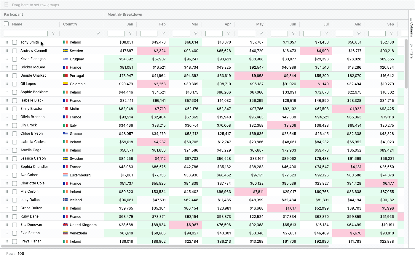
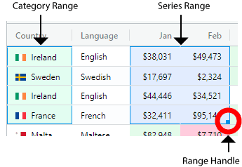
Notice that Chart Ranges appear in the grid after a chart is created. These provide useful visual feedback for users by highlighting the charted category and series data in the grid.
Try it out on our demo page by doing the following:
- Select a Cell Range of numeric values in the grid by dragging the mouse over a range of cells.
- Bring up the Context Menu and select the desired chart type from the 'Chart Range' sub menu.
Note that developers can also programmatically create range charts, see Application Created Charts.
Enabling User Created Charts
All that is required for users to create charts, from the data already contained in the grid, is to enable the following grid option:
const enableCharts = true;

<AgGridReact enableCharts={enableCharts} />
To allow users to create charts from a Range Selection and / or display the Chart Ranges
in the grid, enableRangeSelection should also be enabled as follows:
const enableCharts = true;
const enableRangeSelection = true;

<AgGridReact
    enableCharts={enableCharts}
    enableRangeSelection={enableRangeSelection}
/>
User Created Charts
The video above highlights a number of charting features. For more details on each feature follow the links provided below:
- Chart Ranges: When a chart is created, corresponding chart ranges appear in the grid and can be adjusted via the chart range handle.
- Categories and Series: Columns can be configured as either categories or series for charting. If not configured then the grid will infer whether a column contains category or series data.
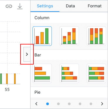
- Chart Tool Panels:
The chart tool panels can be opened by a button located in the middle right part of the chart. The Chart Tool Panels allow a user to:
- Change the chart type
- Change the theme
- Change which columns are used as categories and series
- Format different aspects of the chart
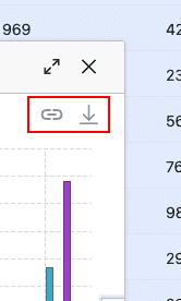
- Chart Toolbar:
The chart toolbar is located in the top right area of the chart and allows a user to:
- Unlink the chart from the grid
- Download the chart
By default, user created charts are displayed inside the grid's own popup windows. The windows can be moved (by mouse dragging a window's title bar) and resized (by mouse dragging a window's borders).
It is also possible to display user created charts in a location or application dialog. For more details see the section on providing a chart container.
If using the grid's own popup window, you will probably want to use the grid option popupParent so that the popup windows are not constrained to the bounds of the grid. Typically, users set popupParent=document.body to achieve this.
Next Up
Continue to the next section to learn about the: Range Chart.