



JavaScript Data GridFilter Conditions
This section describes the Filter Conditions shared by the three Simple Filters provided by the grid - Text Filter, Number Filter and Date Filter.
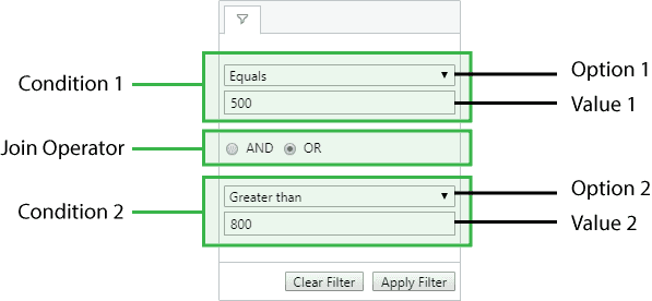
Each Simple Filter follows the same layout. The filter consists of one or more Filter Conditions separated by zero or more Join Operators.
The only layout difference is the type of input field presented to the user: a text field for Text Filters, a number field for Number Filters, and a date picker field for Date Filters.
Filter Options
Each filter provides a dropdown list of filter options to select from. Each filter option represents a filtering strategy, e.g. 'equals', 'not equals', etc.
Each filter's default filter options can be found on their respective pages:
Information on defining Custom Filter Options can be found below.
Filter Value
Each filter option takes zero (a possibility with custom options), one (for most) or two (for 'in range') values. The value type depends on the filter type, e.g. the Date Filter takes Date values.
Number of Conditions
By default each filter initially only displays one Filter Condition. When the user completes all the visible Filter Conditions, another Filter Condition becomes visible. When the user clears the last completed Filter Condition, any empty Filter Conditions on either side are hidden if required. Additionally, when the filter is closed, any empty Filter Conditions not at the end are removed if required.
The maximum number of Filter Conditions can be controlled by setting the Filter Parameter maxNumConditions (the default value is two).
It is also possible to always display a certain number of Filter Conditions by setting the Filter Parameter numAlwaysVisibleConditions. In this case, Filter Conditions at the end will be disabled until the previous Filter Condition has been completed.
Join Operator
The Join Operator decides how the Filter Conditions are joined, using either AND or OR. All Join Operators have the same value, with only the first one being editable when there are multiple.
Example: Simple Filter Conditions
The following example demonstrates Filter Condition configuration that can be applied to any Simple Filter.
- The Athlete column shows a Text Filter with default behaviour for all options.
- The Country column shows a Text Filter with
filterOptionsset to show a different list of available options, anddefaultOptionset to change the default option selected. - The Sport column shows a Text Filter with
maxNumConditionsset to10so that up to ten conditions can be entered. - The Age column has a Number Filter with
numAlwaysVisibleConditionsset to2so that two conditions are always shown. ThedefaultJoinOperatoris also set to'OR'rather than the default ('AND'). - The Date column has a Date Filter with
maxNumConditionsset to1, so that only the first condition is shown.
Custom Filter Options
For applications that have bespoke filtering requirements, it is also possible to add new custom filtering options to the number, text and date filters. For example, a 'Not Equal (with Nulls)' filter option could be included alongside the built in 'Not Equal' option.
Custom filter options are supplied to the grid via filterParams.filterOptions and must conform to the IFilterOptionDef interface:
Properties available on the IFilterOptionDef interface.
The displayKey should contain a unique key value that doesn't clash with the built-in filter keys. A default displayName should also be provided but can be replaced by a locale-specific value using a getLocaleText.
The custom filter logic is implemented through the predicate function, which receives the filterValues typed by the user along with the cellValue from the grid, and returns true or false.
The number of filterValues and corresponding inputs is controlled by the optional property numberOfInputs:
- If set to
0all inputs are hidden, and an empty array offilterValuesis provided to thepredicatefunction. - If unspecified or set to
1a single input is displayed, and one-element array offilterValuesare provided to thepredicatefunction. - If set to
2two inputs are displayed, and a two-element array offilterValuesis provided to thepredicatefunction.
Custom FilterOptionDefs can be supplied alongside the built-in filter option string keys as shown below:
const gridOptions = {
    columnDefs: [
         {
             field: 'age',
             filter: 'agNumberColumnFilter',
             filterParams: {
                 filterOptions: [
                     'lessThan',
                     {
                         displayKey: 'lessThanWithNulls',
                         displayName: 'Less Than with Nulls',
                         predicate: ([filterValue], cellValue) => cellValue == null
                             || cellValue < filterValue,
                     },
                     'greaterThan',
                     {
                         displayKey: 'greaterThanWithNulls',
                         displayName: 'Greater Than with Nulls',
                         predicate: ([filterValue], cellValue) => cellValue == null
                            || cellValue > filterValue,
                     },
                     {
                         displayKey: 'betweenExclusive',
                         displayName: 'Between (Exclusive)',
                         predicate: ([fv1, fv2], cellValue) => cellValue == null
                             || fv1 < cellValue && fv2 > cellValue,
                         numberOfInputs: 2,
                     }
                 ]
             }
         }
     ],

    // other grid options ...
}
The following example demonstrates several custom filter options:
- The Athlete column contains four custom filter options managed by a Text Filter:
Starts with "A"andStarts with "N"have no inputs; their predicate function is provided zero values.Regular Expressionhas one input; its predicate function is provided one value.Between (Exclusive)has two inputs; its predicate function is provided two values.
- The Age column contains five custom filter options managed by a Number Filter:
Even Numbers,Odd NumbersandBlankshave no inputs; their predicate function is provided zero values.Age 5 Years Agohas one input; its predicate function is provided one value.Between (Exclusive)has two inputs; its predicate function is provided two values.Choose Oneis a built-in option and acts as an inactive filter option.- The
maxNumConditions=1option is used to only display one Filter Condition.
- The Date column contains three custom filter options managed by a Date Filter:
Equals (with Nulls)has one inputs; its predicate function is provided one value.Leap Yearhas no inputs; its predicate function is provided zero values.Between (Exclusive)has two inputs; its predicate function is provided two values.- NOTE: a custom
comparatoris still required for the built-in date filter options, i.e.equals.
- The Country column includes:
- a custom
* Not Equals (No Nulls) *filter which also removes null values. - it also demonstrates how localisation can be achieved via the
gridOptions.getLocaleText(params)callback function, where the default value is replaced for the filter option'notEqualNoNulls'.
- a custom
- Saving and restoring custom filter options via
api.getFilterModel()andapi.setFilterModel()can be tested using the provided buttons.
Customising Filter Placeholder Text
Filter placeholder text can be customised on a per column basis using filterParams.filterPlaceholder within the grid option columnDefs. The placeholder can be either a string or a function as shown in the snippet below:
const gridOptions = {
    columnDefs: [
        {
            field: 'age',
            filter: 'agNumberColumnFilter',
            filterParams: {
                filterPlaceholder: 'Age...'
            }
        },
        {
            field: 'total',
            filter: 'agNumberColumnFilter',
            filterParams: {
                filterPlaceholder: (params) => {
                    const { filterOption, placeholder } = params;
                    return `${filterOption} ${placeholder}`;
                }
            }
        }
    ],

    // other grid options ...
}
When filterPlaceholder is a function, the parameters are made up of the following:
The following example shows the various ways of specifying filter placeholders. Click on the filter menu for the different columns in the header row to see the following:
Athletecolumn shows the default placeholder ofFilter...with no configurationCountrycolumn shows the stringCountry...for all filter optionsSportcolumn shows the filter option key with the default placeholder eg, for theContainsfilter option, it showscontains - Filter.... The filter option keys are listed in the table above.Totalcolumn shows the filter option name with the suffixtotaleg, for theEqualsfilter option, it showsEquals total. The filter option names are listed in the table above.
Next Up
Continue to the next section to learn about Applying Filters.