



Vue Data GridSparklines - Line CustomisationEnterprise
This section shows how Line Sparklines can be customised by overriding the default line options.
The following Line Sparkline Options can be used to customise Line Sparklines:
Also see Additional Customisations for more advanced customisations that are common across all sparklines.
The snippet below shows option overrides for the Line Sparkline:
sparklineOptions: {
    type: 'line',
    line: {
        stroke: 'rgb(124, 255, 178)',
        strokeWidth: 2,
    },
    padding: {
        top: 5,
        bottom: 5,
    },
    highlightStyle: {
        size: 7,
        fill: 'rgb(124, 255, 178)',
        strokeWidth: 0
    },
}
The following example demonstrates the results of the Line Sparkline options above:
Line Options
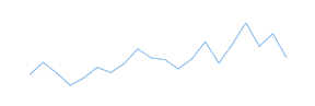
To apply custom stroke and strokeWidth attributes to the line, set these properties under line options as shown:
sparklineOptions: {
    type: 'line',
    // Customise the line path in the sparkline.
    line: {
        stroke: 'orange',
        strokeWidth: 2,
    },
}
The result of the above configuration is displayed below on the right, compared with default line options on the left.

Marker Options
The markers are enabled by default but the size has been set to 0px, making them invisible.
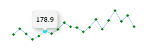
The size property in the highlightStyle options is 6px by default, allowing the markers to become visible when in the highlighted state.
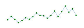
These formats can be modified to your liking by setting the marker and highlightStyle options as demonstated below.
sparklineOptions: {
    type: 'line',
    marker: {
        size: 3,
        shape: 'diamond',
        fill: 'green',
        stroke: 'green',
        strokeWidth: 2
    },
    highlightStyle: {
        size: 10,
        fill: 'cyan',
        stroke: 'cyan',
    },
}- In the snippet above, we have configured the marker size to be
3px in the un-highlighted normal state, and10px in the highlighted state. - Note that the fill and stroke are also different depending on the highlighted state of the marker.
The result of the above configuration is displayed below, compared with default marker options in the first sparkline.
Crosshairs Options
Crosshairs display a vertical and horizontal line running across the sparklines when hovering on a data point. When the mouse is moved, the crosshairs will snap to the closest data point.
By default, the vertical crosshair line has been enabled for line sparklines and is displayed as a solid grey line.
The horizontal and vertical crosshair lines can be enabled or disabled independently by adding crosshairs options as shown below:
sparklineOptions: {
    crosshairs: {
        xLine: {
            enabled: false // enabled by default, set to false to remove the default vertical crosshair line
        },
        yLine: {
            enabled: false // disabled by default, set to true to enable the horizontal crosshair line
        }
    }
}
The style of the crosshair line, including stroke, strokeWidth, lineDash and lineCap, can be customised via the xLine and yLine options:
sparklineOptions: {
    crosshairs: {
        xLine: {
            enabled: true, // enabled by default
            lineDash: 'dash',
            stroke: 'rgba(0, 0, 0, 0.5)',
        },
        yLine: {
            enabled: true,
            lineDash: 'dash',
            stroke: 'rgba(0, 0, 0, 0.5)',
        },
    }
}
Below is an example to show crosshair customisation. Note that:
- The sparklines in the Change column have been configured so that both the vertical and horizontal crosshairs (xLine and yLine) are displayed as a dashed grey line.
- The sparklines in the Rate Of Change column have been configured so that no crosshairs are displayed when the sparklines are hovered.
Sparkline Padding Options
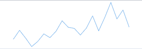
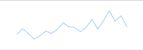
To add extra space around the sparklines, custom padding options can be applied in the following way.
sparklineOptions: {
    type: 'line',
    // Adjust the padding around the sparklines.
    padding: {
        top: 10,
        right: 5,
        bottom: 10,
        left: 5
    },
}- The
top,right,bottomandleftproperties are all optional and can be modified independently.
Additional Customisations
More advanced customisations are discussed separately in the following sections:
- Axis - configure the axis type via
axisoptions. - Tooltips - configure tooltips using
tooltipoptions. - Points of Interest - configure individual points of interest using a
formatter.
Interfaces
LineSparklineOptions
Properties available on the LineSparklineOptions interface.
typeType'line' | The type of sparklines to create, in this case it would be 'line'. |
lineTypeSparklineLineOptions | The configuration for the line. |
markerTypeSparklineMarkerOptions | The configuration for the marker styles. |
crosshairsTypeSparklineCrosshairsOptions | The configuration for the crosshairs. |
x | The key to use to retrieve X values from the data. This will only be used if the data array contains objects with key-value pairs.
|
y | The key to use to retrieve Y values from the data. This will only be used if the data array contains objects with key-value pairs.
|
paddingTypePaddingOptions | Configuration for the padding in pixels shown around the sparklines. |
axisTypeSparklineAxisOptions | The options for the axis line in the sparklines. See: SparklineAxisOptions |
highlight | The configuration for the highlighting used when the items are hovered over. |
tooltipTypeSparklineTooltipOptions | Configuration for the tooltips. |
SparklineMarkerOptions
Properties available on the SparklineMarkerOptions interface.
SparklineAxisOptions
Properties available on the SparklineAxisOptions interface.
Next Up
Continue to the next section to learn about: Sparkline Data.