



React Data GridGet Started with AG Grid
Quick Look Code Example
import React, { useState } from 'react';
import { createRoot } from 'react-dom/client';
import { AgGridReact } from 'ag-grid-react';

import 'ag-grid-community/styles/ag-grid.css';
import 'ag-grid-community/styles/ag-theme-alpine.css';

const App = () => {
    const [rowData] = useState([
        {make: "Toyota", model: "Celica", price: 35000},
        {make: "Ford", model: "Mondeo", price: 32000},
        {make: "Porsche", model: "Boxster", price: 72000}
    ]);

    const [columnDefs] = useState([
        { field: 'make' },
        { field: 'model' },
        { field: 'price' }
    ]);

    return (
        <div className="ag-theme-alpine" style={{height: 400, width: 600}}>
            <AgGridReact
                rowData={rowData}
                columnDefs={columnDefs}>
            </AgGridReact>
        </div>
    );
};

const root = createRoot(document.getElementById('root'));
root.render(<GridExample />);
Please refer to our Compatibility Chart for Supported Versions of React & AG Grid.
Getting Started with Community Video
Getting Started with Enterprise Video
Getting Started with AG Grid Community
Below we provide code for a simple AG Grid React application. To get this working locally, create a new React application as follows:
npx create-react-app hello
 cd hello
 npm install --save ag-grid-community
 npm install --save ag-grid-react
npm startGrid Dependencies
Note the package.json has the following dependencies:
"dependencies": {
    "ag-grid-community": "30.0.0",
    "ag-grid-react": "30.0.0",
    ...
ag-grid-community is the core logic of the Grid, and ag-grid-react is the React Rendering Engine.
Both are needed for the grid to work with React and their versions must match.
Copy in Application Code
Copy the content below into the file App.js:
import React, { useState, useRef, useEffect, useMemo, useCallback} from 'react';
import { createRoot } from 'react-dom/client';
import { AgGridReact } from 'ag-grid-react'; // the AG Grid React Component

import 'ag-grid-community/styles/ag-grid.css'; // Core grid CSS, always needed
import 'ag-grid-community/styles/ag-theme-alpine.css'; // Optional theme CSS

const App = () => {

  const gridRef = useRef(); // Optional - for accessing Grid's API
  const [rowData, setRowData] = useState(); // Set rowData to Array of Objects, one Object per Row

  // Each Column Definition results in one Column.
  const [columnDefs, setColumnDefs] = useState([
    {field: 'make', filter: true},
    {field: 'model', filter: true},
    {field: 'price'}
  ]);

  // DefaultColDef sets props common to all Columns
  const defaultColDef = useMemo( ()=> ({
      sortable: true
    }));

  // Example of consuming Grid Event
  const cellClickedListener = useCallback( event => {
    console.log('cellClicked', event);
  }, []);

  // Example load data from server
  useEffect(() => {
    fetch('https://www.ag-grid.com/example-assets/row-data.json')
    .then(result => result.json())
    .then(rowData => setRowData(rowData))
  }, []);

  // Example using Grid's API
  const buttonListener = useCallback( e => {
    gridRef.current.api.deselectAll();
  }, []);

  return (
    <div>

      {/* Example using Grid's API */}
      <button onClick={buttonListener}>Push Me</button>

      {/* On div wrapping Grid a) specify theme CSS Class Class and b) sets Grid size */}
      <div className="ag-theme-alpine" style={{width: 500, height: 500}}>

        <AgGridReact
            ref={gridRef} // Ref for accessing Grid's API

            rowData={rowData} // Row Data for Rows

            columnDefs={columnDefs} // Column Defs for Columns
            defaultColDef={defaultColDef} // Default Column Properties

            animateRows={true} // Optional - set to 'true' to have rows animate when sorted
            rowSelection='multiple' // Options - allows click selection of rows

            onCellClicked={cellClickedListener} // Optional - registering for Grid Event
            />
      </div>
    </div>
  );
};

export default App;
If everything is correct, you should see a simple grid that looks like this:
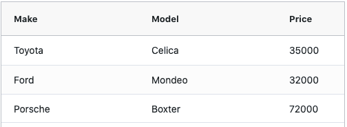
We will now break this file down and explain the different parts...
Grid CSS and Themes
Two CSS files were loaded as follows:
import 'ag-grid-community/styles/ag-grid.css'; // Core grid CSS, always needed
import 'ag-grid-community/styles/ag-theme-alpine.css'; // Optional theme CSS
The first ag-grid.css is always needed. It's the core structural CSS needed by the grid. Without this, the Grid will not work.
The second ag-theme-alpine.css is the chosen Grid Theme. This is then subsequently applied to the Grid by including the Theme's CSS Class in the Grid's parent DIV className="ag-theme-alpine".
<div className="ag-theme-alpine" style={{width: 500, height: 500}}>You can select from any of the Grid Provided Themes. If you don't like the provided themes you can Customise the Provided Theme or do not use a Theme and style the grid yourself from scratch.
The dimension of the Grid is also set on the parent DIV via style={{width: 500, height: 500}}. The grid will fill 100% in both directions, so size it's parent element to the required dimensions.
Setting Row Data
The Grid is provided Row Data via the rowData Grid Property. This is wired up using React useState() hook and loading the data from the server.
const [rowData, setRowData] = useState(); // Set rowData to Array of Objects, one Object per Row

...

// Example load data from server
useEffect(() => {
    fetch('https://www.ag-grid.com/example-assets/row-data.json')
    .then(result => result.json())
    .then(rowData => setRowData(rowData))
}, []);

...

<AgGridReact
    rowData={rowData} // Row Data for Rows
    ...
    />
Setting Column Definitions
Columns are defined by setting Column definitions. Each Column Definition defines one Column. Properties can be set for all Columns using the Default Column Definition.
// Each Column Definition results in one Column.
const [columnDefs, setColumnDefs] = useState([
    {field: 'make', filter: true},
    {field: 'model', filter: true},
    {field: 'price'}
]);

// DefaultColDef sets props common to all Columns
const defaultColDef = useMemo( ()=> ({
    sortable: true
}));

...

<AgGridReact
    columnDefs={columnDefs} // Column Defs for Columns
    defaultColDef={defaultColDef} // Default Column Properties
    ...
/>
Accessing the Grid's API
const gridRef = useRef(); // Optional - for accessing Grid's API
// Example using Grid's API
const buttonListener = useCallback( e => {
    gridRef.current.api.deselectAll();
}, []);

<AgGridReact
    ref={gridRef} // Ref for accessing Grid's API
    />
Consuming Grid Events
Listen to Grid Events by adding a callback to the appropriate on[eventName] property.
This example demonstrates consuming the cellClicked event.
<AgGridReact
    onCellClicked={cellClickedListener} // Optional - registering for Grid Event
    ...
/>
Grid Properties
Set other Grid Options by adding parameters to <AgGridReact/> component.
This example demonstrates setting animateRows and rowSelection.
<AgGridReact
    animateRows={true} // Optional - set to 'true' to have rows animate when sorted
    rowSelection='multiple' // Options - allows click selection of rows
    ...
/>
Getting Started with AG Grid Enterprise
We would love for you to try out AG Grid Enterprise. There is no cost to trial. You only need to get in touch if you want to start using AG Grid Enterprise in a project intended for production.
The following steps continues from above and installs AG Grid Enterprise.
Install Dependency
In addition to ag-grid-community and ag-grid-react, AG Grid Enterprise also needs
ag-grid-enterprise.
npm install --save ag-grid-enterpriseThe package.json should now contain the following dependencies:
"dependencies": {
    "ag-grid-community": "30.0.0",
    "ag-grid-enterprise": "30.0.0",
    "ag-grid-react": "30.0.0",
    ...
ag-grid-enterprise contains the Enterprise features only, it does not contain the core grid,
hence you still need ag-grid-community and ag-grid-react. Versions of all three must match.
Import Enterprise
Import AG Grid Enterprise intro your application as follows:
import 'ag-grid-enterprise';And that is all, you use the same <AgGridReact/> component, except this time it comes installed
with all the Enterprise features.
For example, you can now Row Group (an Enterprise Feature) by a particular Column by
setting rowGroup=true on the Column Definition.
// Each Column Definition results in one Column.
const [columnDefs, setColumnDefs] = useState([
    {field: 'make', rowGroup: true},
    {field: 'model'},
    {field: 'price'}
]);