



JavaScript Data GridAccessibility
AG Grid provides amongst the best support for accessibility compared to other grids available on the market today. This page provides guidance on how to address accessibility concerns in your grid implementations.
Web Conformance Guidelines
Even if you are not mandated to conform to any particular accessibility standard, it can be helpful to understand the guidelines outlined as they are generally good practices worth incorporating into your web based applications.
Currently the most commonly encountered conformance guidelines are:
- ADA - US Department of Justice
- Section 508 - US federal agencies
- WCAG 2.0 - globally accepted standard
WCAG 2.0 has 3 levels of conformance; A, AA and AAA (in order of conformance)
As meeting WCAG 2.0 level AA guidelines also meets the ADA and Section 508 standards, it is likely that most organisations will want to target this standard.
High Contrast Theme
For users that are visually impaired due to colour deficiencies, care should be taken when using colours to provide information.
Using our demo page as an example, the chrome plugin Colorblindly shows how cells with colour indicators might appear to someone with total colour blindness (Monochromacy / Achromatopsia).
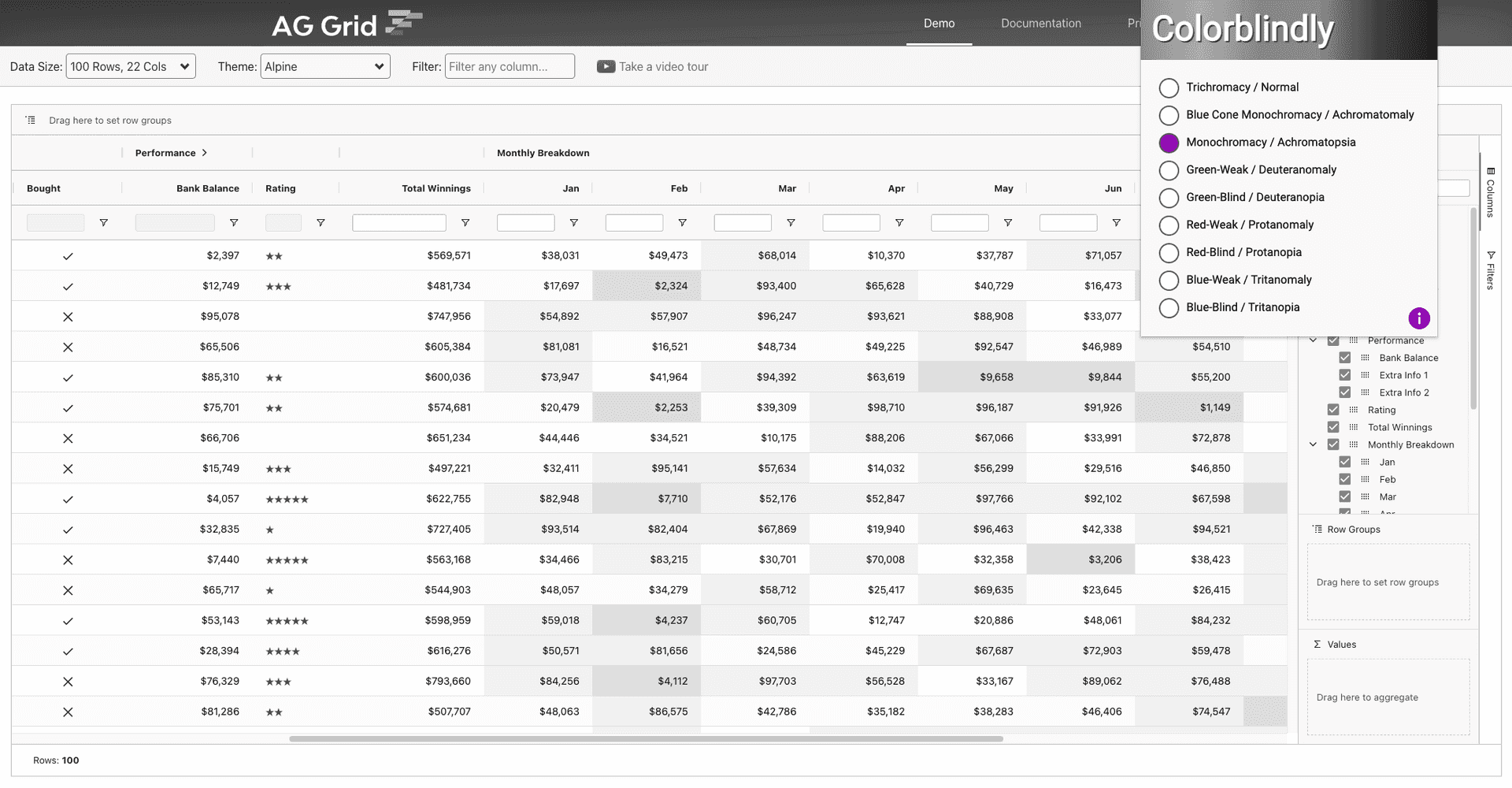
To create a high contrast theme please check out the Themes documentation for details.
Keyboard navigation
Users who have motor disabilities, as well as visually impaired users, often rely on keyboards for navigation.
For details on how to navigate the grid without using a mouse refer to the Keyboard Navigation documentation. Note that it is possible to provide custom navigation which could come in useful for some accessibility requirements.
Screen Readers
Users who are visually impaired will typically require the assistance of a screen reader to interpret and interact with grid based application.
There are numerous screen readers available, however right now the most popular screen reader for Windows is JAWS and for MAC users it is the embedded VoiceOver software. Our testing has focused on these screen readers.
In order to cover the widest range of use cases and screen readers, AG Grid has taken a standards-based approach to implementing accessibility support. Instead of optimizing our implementation for specific screen readers, we have followed the W3C WCAG standard and added the relevant ARIA-tags to let screen readers announce any AG Grid element and its state.
However, different screen readers interpret the WCAG standard in different ways. As a result, they may generate different announcements for the same AG Grid element, or no announcement at all.
This is why we recommend testing how different screen readers announce the UI of the application you're using, selecting the best one and recommending that to your users. We believe this is the best way to guide your users how to get the best possible experience at this time until screen readers improve their support for the WCAG standard.
ARIA Attributes
In order to give screen readers the contextual information they require to interpret and interact with the grid, ARIA attributes are added to the grid DOM elements. These attributes are particularity useful when plain HTML elements such div and span are used to create complex DOM structures, which is the case with AG Grid.
When inspecting the DOM you'll notice the following roles and properties have been added:
- role="treegrid" - marks the enclosing element of the grid.
Note: You can set any aria property in the panel (role="treegrid") by using thesetGridAriaPropertymethod in the Grid Api.- aria-rowcount - announces the number of rows.
- aria-colcount - announces the number of rows.
- aria-multiselectable="true" - marks the grid as being able to select multiple rows.
- role="rowgroup" - element that serve as container for the table header rows and grid rows.
- role="row" - a row of column headers or grid cells.
- aria-rowindex - announces the visible index of the row.
- aria-selected - only present if the row is selectable, it announces the selection state.
- aria-expanded - only present in row groups, it announces the expand state.
- role="columnheader" - element containing a column header.
- aria-colindex - announces the visible index of the column.
- aria-colspan - only present if the column spans across multiple columns, it helps guide screen readers.
- aria-expanded - only present in grouped headers, it announces the expand state.
- aria-sort - only present in sortable columns, it announces the sort state.
- role="gridcell" - element containing a grid cell.
- aria-colindex - announces the visible index of the cell.
- aria-selected - only present if the cell is selectable, it announces the selection state.
- aria-expanded - only present in a group cell, it announces the expand state.
- role="tablist" - element that serve as a container for a single levels of tab items.
- role="tab" - marks an element as a tablist item.
- role="tree" - element that serve as a container for items that could have multiple levels.
- role="treeitem" - marks an element as an item of a tree.
- aria-level - announces the current level of the tree.
- aria-expanded - only present if the item has subitems, it announces the current expand state.
- role="listbox" - element that serve as a container for multiple elements that will be presented as a list.
- role="option" - marks an element as an item of a listbox.
- aria-setsize - announces the total number of items in the listbox.
- aria-posinset - announces the position of the item within the set.
- aria-selected - only present if the item is selectable, it announces the current select state.
- aria-checked - only present if the item has a checkbox, it announces the current check state.
- role="presentation" - indicates an element should be ignored.
- aria-hidden="true" - indicates an element and child elements should be ignored.
- aria-label - used to provide information about the current focused item.
- aria-labelledby - used to provide the id of an element that has the label for the current focused element.
- aria-describedby - used to provide additional information about the current selected item.
These attributes will enable screen readers to interpret and navigate the columns and rows of the grid.
Some other grids claim to provide support for complex grid layouts and interactions but based on our own independent testing and the feedback we've received from our users this is clearly not the case.
Customising the Grid for Accessibility
In order to support large datasets with a minimised memory footprint and a responsive user experience, the grid uses row and column virtualisation, loading new rows and columns as they're needed. However, screen readers assume all elements of the grid are loaded when the page is loaded and they appear in the DOM in order of their visual appearance. In order to meet these requirements, we recommend making the following changes.
Ensure DOM Element order
By default, rows and columns can appear out of order in the DOM. This 'incorrect order' can result in inconsistent results when parsed by screen readers.
To force row and column order, enable the following gridOptions property like so:
const gridOptions = {
    ensureDomOrder: true,

    // other grid options ...
}
Animations won't work properly when the DOM order is forced, so ensure they are not enabled.
Ensure all grid elements are always rendered
In order to ensure all grid elements are loaded, you need to disable column and row virtualization. The best way to do this is to use pagination. This way you can reduce the initial loading time and memory footprint while ensuring all elements for these rows are loaded for screen readers.
If your requirement is to use scrolling instead of pagination, you can disable row virtualisation at the expense of increasing the memory footprint. Please test the performance of this and if it's not satisfactory, switch to using pagination instead.
Column virtualisation can be disabled as follows:
const gridOptions = {
    suppressColumnVirtualisation: true,

    // other grid options ...
}
This means if you have 100 columns, but only 10 visible due to scrolling, all 100 will always be rendered.
Row virtualisation can be disabled as follows:
const gridOptions = {
    suppressRowVirtualisation: true,

    // other grid options ...
}
However note that lots of rendered rows will mean a very large amount of rendering in the DOM which will slow things down.
Example of Grid Customised for Accessibility
The example below presents a simple grid layout with the following properties enabled:
ensureDomOrder- ensures the rows and columns in the DOM always appear in the same order as displayed in the grid.suppressColumnVirtualisationandsuppressRowVirtualisation- ensure all column and rows appear in the DOM.
Customising ARIA Labels
The grid has default ARIA labels for areas like rows, group cells, filters, search fields and so on. If there is a need to
customise these labels, this could be achieved by changing the localisation variables for ARIA.
See the localisation example, inspect the items or use a screen reader to see the
customisation in action.
Known Limitations
Using advanced functionality in AG Grid makes the DOM structure incompatible with the assumptions screen readers make. This results in a few limitations in accessibility when specific functionality is used:
-
Navigation to pinned rows/columns
Screen readers assume that the visual and DOM element order are identical. Specifically, when you pin a row/column, it causes elements to be rendered in different containers. This is why you cannot use screen readers to navigate into a pinned row/column cells, as in fact, this means they're rendered in a different element from the rest of the columns/rows which are scrollable.
-
Limitations announcing the correct column name in grouped columns
Even though all aria tags have been applied to the necessary elements, some screen readers have trouble navigating the tags when the structure of the grid gets more complex (eg. grouped columns). This is the reason why there are some limitations announcing the correct column names.
-
No announcements of state change of a gridcell or gridheader
Some screen readers will not recognise changes that happen to an element that is currently focused (including children of this element). So in order to detect changes (eg. sorted state, updated labels, etc...) you will need to move focus to another element and back.
-
Server-Side Row Model
Announcing the row count in the grid when using server-side row model (SSRM) is not supported. This is because the row count cannot be known in all the scenarios where SSRM is in use.