



Angular Data GridRow GroupingEnterprise
Row Grouping allows rows to be grouped by columns with the grid performing a 'group by' operation on the rows supplied to the grid. This section introduces Row Grouping and provides links to subsections that cover the various ways Row Grouping can be configured and customised.
The grid can be configured to initially display rows in a grouped state or rows can be grouped programmatically through the grid API's. Users can also manually group rows through the UI as shown below:
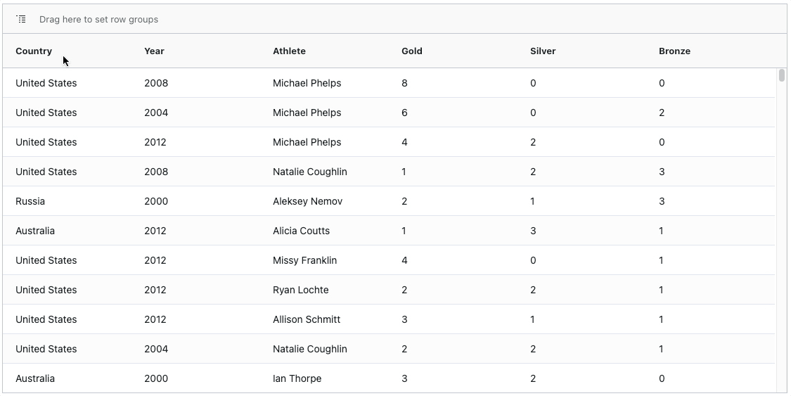
Enabling Default Row Grouping
To group rows by a particular column, enable the rowGroup column property as shown below:
<ag-grid-angular
    [columnDefs]="columnDefs"
    /* other grid options ... */>
</ag-grid-angular>

this.columnDefs = [
    { field: 'country', rowGroup: true, hide: true },
    { field: 'year', rowGroup: true, hide: true },
    { field: 'sport' },
    { field: 'total' }
];
In the snippet above, rows will be grouped by country and year as both column definitions have rowGroup=true declared.
Note that the Single Group Column display type is used by default.
The example below demonstrates the default row grouping behaviour. Note the following:
-
There are two active row groups as the supplied
countryandyearcolumn definitions haverowGroup=truedeclared. -
A group column is added to the left-hand side of the grid as there are active row groups.
-
The
countryandyearcolumns are hidden ashide=trueon their column definitions.
Row Grouping Customisations
The previous example demonstrated the Default Row Grouping behavior, however extensive Row Grouping customisations are also possible as summarised below:
- Display Types - compares the different ways row groups can be displayed in the grid.
- Single Group Column - a single group column is automatically added by the grid for all row groups.
- Multiple Group Columns - group columns are automatically added by the grid for each row group.
- Group Rows - group rows are automatically added by the grid containing the row groups instead of group columns.
- Custom Group Columns - customise how row groups are displayed without using the built-in display types.
- Row Group Panel - add a panel above the grid to allow users control which columns the rows are grouped by.
- Group Order - control how row groups are ordered.
- Sorting Groups - configure and customise how row groups are sorted.
- Filtering Groups - configure and customise how row groups are filtered.
- Group Footers - add group footers showing totals for each group level.
- Opening Groups - control how row groups are expanded and collapsed.
- Complex Objects - group rows using row data contains complex objects.
- Unbalanced Groups - group rows when there are
nullorundefinedgroup values.
API Reference
Row Grouping can be configured using the following grid properties:
group | Specifies how the results of row grouping should be displayed. The options are: 'singleColumn': single group column automatically added by the grid. 'multipleColumns': a group column per row group is added automatically. 'groupRows': group rows are automatically added instead of group columns. 'custom': informs the grid that group columns will be provided. |
group | If grouping, set to the number of levels to expand by default, e.g. 0 for none, 1 for first level only, etc. Set to -1 to expand everything. |
auto | Allows specifying the group 'auto column' if you are not happy with the default. If grouping, this column definition is included as the first column in the grid. If not grouping, this column is not included. |
group | When true, preserves the current group order when sorting on non-group columns. See: Maintain Group Order |
group | When true, if you select a group, the children of the group will also be selected. See: Group Selection |
group | If grouping, this controls whether to show a group footer when the group is expanded. If true, then by default, the footer will contain aggregate data (if any) when shown and the header will be blank. When closed, the header will contain the aggregate data regardless of this setting (as the footer is hidden anyway). This is handy for 'total' rows, that are displayed below the data when the group is open, and alongside the group when it is closed.
|
group | Set to true to show a 'grand total' group footer across all groups. |
group | If true, and showing footer, aggregate data will always be displayed at both the header and footer levels. This stops the possibly undesirable behaviour of the header details 'jumping' to the footer on expand. |
group | If using groupSelectsChildren, then only the children that pass the current filter will get selected. See: Group Selection |
show | Shows the open group in the group column for non-group rows. See: Showing Open Groups |
is | (Client-side Row Model only) Allows groups to be open by default. |
initial | Allows default sorting of groups. See: Initial Group Order |
group | Set to true to collapse groups that only have one child. |
group | Set to true to collapse lowest level groups that only have one child. |
group | Set to true to hide parents that are open. When used with multiple columns for showing groups, it can give a more pleasing user experience. See: Hide Open Parents |
group | Set to true to prevent the grid from creating a '(Blanks)' group for nodes which do not belong to a group, and display the unbalanced nodes alongside group nodes. |
row | When to show the 'row group panel' (where you drag rows to group) at the top. |
row | Set to true to suppress sort indicators and actions from the row group panel. See: Suppress Sorting |
group | Provide the Cell Renderer to use when groupDisplayType = 'groupRows'. |
group | Customise the parameters provided to the groupRowRenderer component. |
suppress | By default, dragging a column out of the grid, i.e. to the Row Group Panel, it will be hidden in the grid. This property prevents the column becoming hidden in the grid. |
suppress | Set to true prevent Group Rows from sticking to the top of the grid. |
suppress | If true, when you drag a column into a row group panel the column is not hidden. |
suppress | By default, when a column is un-grouped, i.e. using the Row Group Panel, it is made visible in the grid. This property stops the column becoming visible again when un-grouping. |
tree | Set to true to enable the Grid to work with Tree Data. You must also implement the getDataPath(data) callback. See: Tree Data |
get | Callback to be used when working with Tree Data when treeData = true. See: Tree Data |
Next Up
Continue to the next section to learn about the different Row Grouping Display Types.