




Vue Data Grid: Simple Filters
The grid provides three Simple Filters for filtering strings, numbers and dates.
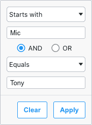
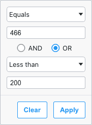
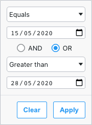
Each of the filters works in a similar way. This page describes the common parts of the Simple Filters.
Example: Simple Filters
The example below demonstrates all three Simple Filters working. Note the following:
- The Athlete column has a Text Filter.
- The Age column has a Number Filter.
- The Date column has a Date Filter.
filter=falseis set on the Total column to disable the filter.
Simple Filter Parts
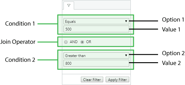
Each Simple Filter follows the same layout. The only layout difference is the type of input field presented to the user: for Text and Number Filters a text field is displayed, whereas for Date Filters a date picker field is displayed.
Filter Options
Each filter provides a dropdown list of filter options to select from. Each filter option represents a filtering strategy, e.g. 'equals', 'not equals', etc.
Each filter's default Filter Options are listed below, as well as information on Defining Custom Filter Options.
Filter Value
Each filter option takes zero (a possibility with custom options), one (for most) or two (for 'in range') values. The value type depends on the filter type, e.g. the Date Filter takes Date values.
Condition 1 and Condition 2
Each filter initially only displays Condition 1. When the user completes the Condition 1 section of the filter, Condition 2 becomes visible.
Join Operator
The Join Operator decides how Condition 1 and Condition 2 are joined, using either AND or OR.
Simple Filters Parameters
Simple Filters are configured though the filterParams attribute of the column definition. All of the parameters from Provided Filters are available:
| Specifies the buttons to be shown in the filter, in the order they should be displayed in. The options are: 'apply': If the Apply button is present, the filter is only applied after the user hits the Apply button. 'clear': The Clear button will clear the (form) details of the filter without removing any active filters on the column. 'reset': The Reset button will clear the details of the filter and any active filters on that column. 'cancel': The Cancel button will discard any changes that have been made to the filter in the UI, restoring the applied model. | |
| If the Apply button is present, the filter popup will be closed immediately when the Apply or Reset button is clicked if this is set to true. Default: false | |
| Overrides the default debounce time in milliseconds for the filter. Defaults are: TextFilter and NumberFilter: 500ms. (These filters have text field inputs, so a short delay before the input is formatted and the filtering applied is usually appropriate). DateFilter and SetFilter: 0ms | |
| If set to true, disables controls in the filter to mutate its state. Normally this would be used in conjunction with the Filter API. See Read-only Filter UI.Default: false |
Additional parameters are also available depending on the type of filter being used. See each type for the full list of parameters available: Text, Number, Date.
Example: Simple Filter Options
The following example demonstrates those configuration options that can be applied to any Simple Filter.
- The Athlete column shows a Text Filter with default behavior for all options.
- The Country column shows a Text Filter with
filterOptionsset to show a different list of available options, anddefaultOptionset to change the default option selected. - The Age column has a Number Filter with
alwaysShowBothConditionsset totrueso that both condition are always shown. ThedefaultJoinOperatoris also set to'OR'rather than the default ('AND'). - The Date column has a Date Filter with
suppressAndOrConditionset totrue, so that only the first condition is shown.
Simple Filter Options
Each simple filter presents a list of options to the user. The list of options for each filter are as follows:
| Option Name | Option Key | Supported Filters |
|---|---|---|
| Equals | equals | Text, Number, Date |
| Not Equals | notEqual | Text, Number, Date |
| Contains | contains | Text |
| Not Contains | notContains | Text |
| Starts With | startsWith | Text |
| Ends With | endsWith | Text |
| Less Than | lessThan | Number, Date |
| Less Than or Equal | lessThanOrEqual | Number |
| Greater Than | greaterThan | Number, Date |
| Greater Than or Equal | greaterThanOrEqual | Number |
| In Range | inRange | Number, Date |
| Blank | blank | Text, Number, Date |
| Not blank | notBlank | Text, Number, Date |
| Choose One | empty | Text, Number, Date |
Note that the empty filter option is primarily used when creating Custom Filter Options. When 'Choose One' is displayed, the filter is not active.
Default Filter Options
Each of the three filter types has the following default options and default selected option.
| Filter | Default List of Options | Default Selected Option |
|---|---|---|
| Text | Contains, Not Contains, Equals, Not Equals, Starts With, Ends With. | Contains |
| Number | Equals, Not Equals, Less Than, Less Than or Equal, Greater Than, Greater Than or Equal, In Range. | Equals |
| Date | Equals, Greater Than, Less Than, Not Equals, In Range. | Equals |
Simple Filter Models
When saving or restoring state on a filter, the Filter Model is used. The Filter Model represents the state of the filter. For example, the code below first gets and then sets the Filter Model for the Athlete column:
// get filter instance
const filterInstance = this.gridApi.getFilterInstance('athlete');

// get filter model
const model = filterInstance.getModel();

// set filter model and update
filterInstance.setModel({
    type: 'endsWith',
    filter: 'thing'
});

// refresh rows based on the filter (not automatic to allow for batching multiple filters)
this.gridApi.onFilterChanged();
This section explains what the Filter Model looks like for each of the simple filters. The interface used by each filter type is as follows:
The best way to understand what the Filter Models look like is to set a filter via the
UI and call api.getFilterModel() in your console. You can then see what the model looks like for different variations of the filters.
TextFilterModel
Properties available on the TextFilterModel interface.
NumberFilterModel
Properties available on the NumberFilterModel interface.
DateFilterModel
Properties available on the DateFilterModel interface.
Examples of filter model instances are as follows:
// number filter with one condition, with equals type
const numberLessThan35 = {
    filterType: 'number',
    type: 'lessThan',
    filter: 35
};
// number filter with one condition, with inRange type
const numberBetween35And40 = {
filterType: 'number',
type: 'inRange',
filter: 35,
filterTo: 40
};The filterType is not used by the grid when you call setFilterModel(). It is provided for information purposes only when you get the filter model. This is useful if you are doing server-side filtering, where the filter type may be used in building back-end queries.
If the filter has both Condition 1 and Condition 2 set, then two instances of the model are created and wrapped inside a Combined Model. A combined model looks as follows:
// A filter combining two conditions
// M is either TextFilterModel, NumberFilterModel or DateFilterModel
interface ICombinedSimpleModel<M> {
    // the filter type: date, number or text
    filterType: string;

    operator: JoinOperator;

    // two instances of the filter model
    condition1: M;
    condition2: M;
}

type JoinOperator = 'AND' | 'OR';
An example of a filter model with two conditions is as follows:
// number filter with two conditions, both are equals type
const numberEquals18OrEquals20 = {
    filterType: 'number',
    operator: 'OR',
    condition1: {
        filterType: 'number',
        type: 'equals',
        filter: 18
    },
    condition2: {
        filterType: 'number',
        type: 'equals',
        filter: 18
    }
};
Custom Filter Options
For applications that have bespoke filtering requirements, it is also possible to add new custom filtering options to the number, text and date filters. For example, a 'Not Equal (with Nulls)' filter option could be included alongside the built in 'Not Equal' option.
Custom filter options are supplied to the grid via filterParams.filterOptions and must conform to the IFilterOptionDef interface:
Properties available on the IFilterOptionDef interface.
The displayKey should contain a unique key value that doesn't clash with the built-in filter keys. A default displayName should also be provided but can be replaced by a locale-specific value using a getLocaleText.
The custom filter logic is implemented through the predicate function, which receives the filterValues typed by the user along with the cellValue from the grid, and returns true or false.
The number of filterValues and corresponding inputs is controlled by the optional property numberOfInputs:
- If set to
0all inputs are hidden, and an empty array offilterValuesis provided to thepredicatefunction. - If unspecified or set to
1a single input is displayed, and one-element array offilterValuesare provided to thepredicatefunction. - If set to
2two inputs are displayed, and a two-element array offilterValuesis provided to thepredicatefunction.
Custom FilterOptionDefs can be supplied alongside the built-in filter option string keys as shown below:
<ag-grid-vue
    :columnDefs="columnDefs"
    /* other grid options ... */>
</ag-grid-vue>

this.columnDefs = [
    {
        field: 'age',
        filter: 'agNumberColumnFilter',
        filterParams: {
            filterOptions: [
                'lessThan',
                {
                    displayKey: 'lessThanWithNulls',
                    displayName: 'Less Than with Nulls',
                    predicate: ([filterValue], cellValue) => cellValue == null || cellValue < filterValue,
                },
                'greaterThan',
                {
                    displayKey: 'greaterThanWithNulls',
                    displayName: 'Greater Than with Nulls',
                    predicate: ([filterValue], cellValue) => cellValue == null || cellValue > filterValue,
                },
                {
                    displayKey: 'betweenExclusive',
                    displayName: 'Between (Exclusive)',
                    predicate: ([fv1, fv2], cellValue) => cellValue == null || fv1 < cellValue && fv2 > cellValue,
                    numberOfInputs: 2,
                }
            ]
        }
    }
];
The following example demonstrates several custom filter options:
-
The Athlete column contains four custom filter options managed by a Text Filter:
Starts with "A"andStarts with "N"have no inputs; their predicate function is provided zero values.Regular Expressionhas one input; its predicate function is provided one value.Between (Exclusive)has two inputs; its predicate function is provided two values.
-
The Age column contains five custom filter options managed by a Number Filter:
Even Numbers,Odd NumbersandBlankshave no inputs; their predicate function is provided zero values.Age 5 Years Agohas one input; its predicate function is provided one value.Between (Exclusive)has two inputs; its predicate function is provided two values.Choose Oneis a built-in option and acts as an inactive filter option.- The
suppressAndOrCondition=trueoption is used to suppress the join operator panel and condition 2.
-
The Date column contains three custom filter options managed by a Date Filter:
Equals (with Nulls)has one inputs; its predicate function is provided one value.Leap Yearhas no inputs; its predicate function is provided zero values.Between (Exclusive)has two inputs; its predicate function is provided two values.- NOTE: a custom
comparatoris still required for the built-in date filter options, i.e.equals.
-
The Country column includes:
- a custom
* Not Equals (No Nulls) *filter which also removes null values. - it also demonstrates how localisation can be achieved via the
gridOptions.getLocaleText(params)callback function, where the default value is replaced for the filter option'notEqualNoNulls'.
- a custom
- Saving and restoring custom filter options via
api.getFilterModel()andapi.setFilterModel()can be tested using the provided buttons.
Blank Cells (Date and Number Filters)
If the row data contains blanks (i.e. null or undefined), by default the row won't be included in filter results. To change this, use the filter params includeBlanksInEquals, includeBlanksInLessThan, includeBlanksInGreaterThan and includeBlanksInRange. For example, the code snippet below configures a filter to include null for equals, but not for less than, greater than or in range:
const filterParams = {
    includeBlanksInEquals: true,
    includeBlanksInLessThan: false,
    includeBlanksInGreaterThan: false,
    includeBlanksInRange: false,
};
In the following example you can filter by age or date and see how blank values are included. Note the following:
- Columns Age and Date have both
nullandundefinedvalues resulting in blank cells. - Toggle the controls on the top to see how
includeBlanksInEquals,includeBlanksInLessThan,includeBlanksInGreaterThanandincludeBlanksInRangeimpact the search result.
Data Updates
Grid data can be updated in a number of ways, including:
Simple filters are not affected by data changes, as is demonstrated by the following example:
- Perform some filtering using the configured simple filters, such as filtering by Age equals
24. - Click the Jumble Ages button to update the grid data by jumbling values in the Age column between rows.
- Observe that filters remain unchanged, but the displayed rows change to those now assigned an age
of
24.
Style Header on Filter
Each time a filter is applied to a column the CSS class ag-header-cell-filtered is added to the header. This can be used for adding style to headers that are filtered.
In the example below, we've added some styling to ag-header-cell-filtered, so when you filter a column you will notice the column header change.
Customising Filter Placeholder Text
Filter placeholder text can be customised on a per column basis using filterParams.filterPlaceholder within the grid option columnDefs. The placeholder can be either a string or a function as shown in the snippet below:
<ag-grid-vue
    :columnDefs="columnDefs"
    /* other grid options ... */>
</ag-grid-vue>

this.columnDefs = [
    {
        field: 'age',
        filter: 'agNumberColumnFilter',
        filterParams: {
            filterPlaceholder: 'Age...'
        }
    },
    {
        field: 'total',
        filter: 'agNumberColumnFilter',
        filterParams: {
            filterPlaceholder: (params) => {
                const { filterOption, placeholder } = params;
                return `${filterOption} ${placeholder}`;
            }
        }
    }
];
When filterPlaceholder is a function, the parameters are made up of the following:
The following example shows the various ways of specifying filter placeholders. Click on the filter menu for the different columns in the header row to see the following:
Athletecolumn shows the default placeholder ofFilter...with no configurationCountrycolumn shows the stringCountry...for all filter optionsSportcolumn shows the filter option key with the default placeholder eg, for theContainsfilter option, it showscontains - Filter.... The filter option keys are listed in the table above.Totalcolumn shows the filter option name with the suffixtotaleg, for theEqualsfilter option, it showsEquals total. The filter option names are listed in the table above.
- Simple Filters
- Example: Simple Filters
- Simple Filter Parts
- Filter Options
- Filter Value
- Condition 1 and Condition 2
- Join Operator
- Simple Filters Parameters
- Example: Simple Filter Options
- Simple Filter Options
- Default Filter Options
- Simple Filter Models
- Custom Filter Options
- Blank Cells (Date and Number Filters)
- Data Updates
- Style Header on Filter
- Customising Filter Placeholder Text