This section covers the Multiple Group Columns display type, where a group column is automatically added by the grid for each row group.
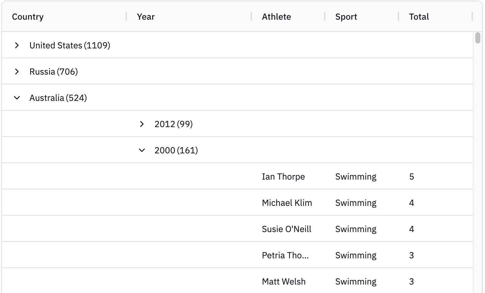
Enabling Multiple Group Columns
To display each row group under a separate group column set groupDisplayType = 'multipleColumns' as shown below:
const gridOptions = {
    columnDefs: [
        { field: 'country', rowGroup: true, hide: true },
        { field: 'year', rowGroup: true, hide: true },
        { field: 'athlete' },
        { field: 'sport' },
        { field: 'total' }
    ],

    // display each row grouping in a separate group column
    groupDisplayType: 'multipleColumns',

    // other grid options ...
}
In the snippet above, rows will be grouped by country and year as both column definitions have rowGroup=true declared, and a group column displayed for each column that we are grouping by.
This is demonstrated in the following example, note the following:
There are two active row groups as the supplied
countryandyearcolumn definitions haverowGroup=truedeclared.Separate group columns are displayed for
countryandyearasgroupDisplayType = 'multipleColumns'.The
countryandyearcolumns are not shown in the grid ashide=trueis set on their column definitions.
Group Column Configuration
The Multiple Group Columns display type adds an Auto Group Column for each row group to the grid. To change the default configurations of these group columns, use the autoGroupColumnDef grid option as shown below:
const gridOptions = {
    autoGroupColumnDef: {
        headerValueGetter: params => `${params.colDef.headerName} Group Column`,
        minWidth: 220,
        cellRendererParams: {
            suppressCount: true,
            checkbox: true,
        }
    },

    // other grid options ...
}
Note how in the snippet above that the autoGroupColumnDef can be used to override any Column Property.
The Auto Group Columns use the Group Cell Renderer to render group cells, and are configured via the cellRendererParams property.
The following example demonstrates some of the available autoGroupColumnDef configurations. Note that:
The group column names are changed using the
headerValueGetterto add 'Group Column' after each column name.The min width of the group column is changed via
minWidth = 220.The count of each row group is removed by setting
cellRendererParams.suppressCount = true.Checkboxes are displayed beside each row group by setting
cellRendererParams.checkbox = true.
Showing Open Groups
Setting the grid property showOpenedGroup=true will show the name of the opened group inside the group column. This is useful when suppressGroupRowsSticky=true and the user scrolls down through the children of the group, and the row showing what group was opened is scrolled out of view.
The following example uses showOpenedGroup=true and suppressGroupRowsSticky=true with many group columns. The open groups are shown across all group columns where the group is open for that column.
Hide Open Parents
Depending on your preference, you may wish to hide parent rows when they are open. This gives the impression to the user that the children take the place of the parent row. This feature only makes sense when groups are in different columns. To turn this feature on set groupHideOpenParents=true.
This is demonstrated in the example below. Notice that each group row has aggregated values. When the group is closed, the group row shows the aggregated result. When the group is open, the group row is removed and in its place the child rows are displayed. The group column still displays the parent group in the group column, to allow users to close the group by clicking the chevron.
The grid in the example below is configured to colour the rows differently for each group level. When a group is opened, the row colour changes to reflect the fact that the parent group row has been replaced by its child rows.
Filter is enabled for each column by providing a filterValueGetter for the autoGroupColumnDef. The filterValueGetter returns the value of the grouped column - eg for Country, it will filter on Country.
When groupHideOpenParents=true the Grid automatically disables Group Rows Sticky, see: suppressGroupRowsSticky.
Next Up
Continue to the next section to learn about the Group Rows display type.