---
product: "AG Grid"
title: "Side Bar"
description: "This section covers how to configure the Side Bar which contains Tool Panels."
enterprise: true
framework: vue
version: "36.2.0"
related:
- title: "Columns Tool Panel"
url: "https://www.ag-grid.com/archive/36.2.0/vue-data-grid/tool-panel-columns/"
- title: "Filters Tool Panel (New)"
url: "https://www.ag-grid.com/archive/36.2.0/vue-data-grid/tool-panel-filters-new/"
- title: "Filters Tool Panel"
url: "https://www.ag-grid.com/archive/36.2.0/vue-data-grid/tool-panel-filters/"
- title: "Custom Panel"
url: "https://www.ag-grid.com/archive/36.2.0/vue-data-grid/component-tool-panel/"
llms: "https://www.ag-grid.com/archive/36.2.0/llms.txt"
---
# Side Bar
This section covers how to configure the Side Bar which contains Tool Panels.
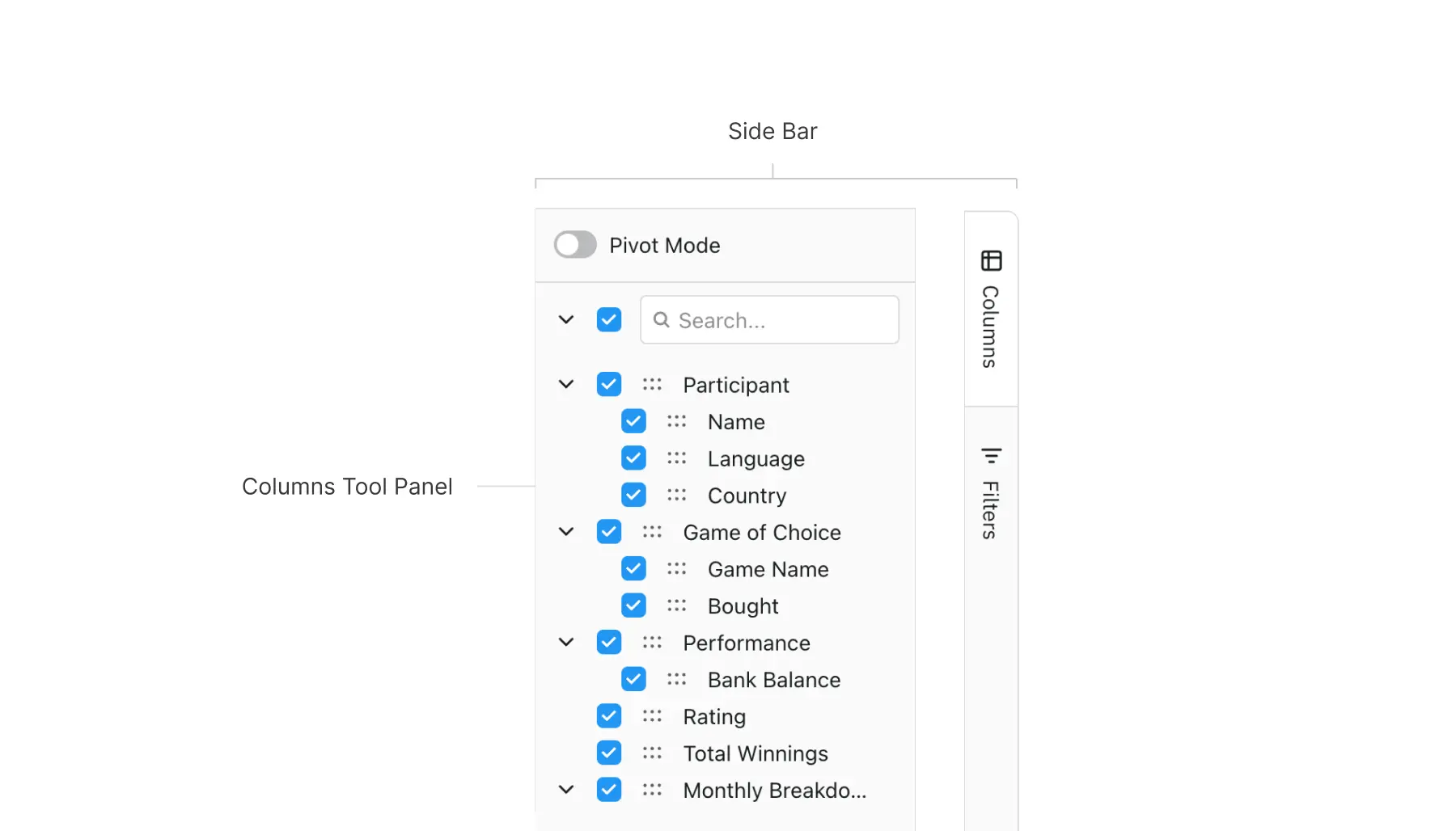
## Configuring the Side Bar
The Side Bar is configured using the grid property `sideBar`. The property takes multiple forms to allow easy configuration or more advanced configuration. The different forms for the `sideBar` property are as follows:
| Type | Description |
| --- | --- |
| `undefined` / `null` | No Side Bar provided. |
| `boolean` | Set to `true` to display the Side Bar with default configuration. |
| `string` / `string[]` | Set to `'columns'`, `'filters'` or `'filters-new'` to display the Side Bar with just one of [Columns](https://www.ag-grid.com/archive/36.2.0/vue-data-grid/tool-panel-columns/), [Filters](https://www.ag-grid.com/archive/36.2.0/vue-data-grid/tool-panel-filters/) or [New Filters](https://www.ag-grid.com/archive/36.2.0/vue-data-grid/tool-panel-filters-new/) Tool Panels or an array of some or all of these values. |
| `SideBarDef` (long form) | An object of type `SideBarDef` (explained below) to allow detailed configuration of the Side Bar. Use this to configure the provided Tool Panels (e.g. pass parameters to the columns or filters panel) or to include custom Tool Panels. |
### Boolean Configuration
The default Side Bar contains the Columns and Filters Tool Panels. To use the default Side Bar, set the grid property `sideBar=true`. The Columns panel will be open by default.
The default configuration doesn't allow customisation of the Tool Panels.
#### Boolean Configuration
```ts
import {
createApp,
defineComponent,
onBeforeMount,
ref,
shallowRef,
} from "vue";
import { AgGridVue } from "ag-grid-vue3";
import {
AutoGroupColumnDef,
ClientSideRowModelModule,
ColDef,
ColGroupDef,
GridApi,
GridOptions,
GridReadyEvent,
ModuleRegistry,
NumberFilterModule,
SideBarDef,
TextFilterModule,
enableDevValidations,
} from "ag-grid-community";
import {
ColumnsToolPanelModule,
FiltersToolPanelModule,
PivotModule,
SetFilterModule,
} from "ag-grid-enterprise";
import { IOlympicData } from "./interfaces";
if (process.env.NODE_ENV !== "production") {
// Enable extended validations only for development
enableDevValidations();
}
ModuleRegistry.registerModules([
NumberFilterModule,
ClientSideRowModelModule,
ColumnsToolPanelModule,
FiltersToolPanelModule,
SetFilterModule,
PivotModule,
TextFilterModule,
]);
const VueExample = defineComponent({
template: `
`,
components: {
"ag-grid-vue": AgGridVue,
},
setup(props) {
const gridApi = shallowRef | null>(null);
const columnDefs = ref([
{ field: "athlete", filter: "agTextColumnFilter", minWidth: 200 },
{ field: "age" },
{ field: "country", minWidth: 180 },
{ field: "year" },
{ field: "date", minWidth: 150 },
{ field: "gold" },
{ field: "silver" },
{ field: "bronze" },
{ field: "total" },
]);
const defaultColDef = ref({
flex: 1,
minWidth: 100,
// allow every column to be aggregated
enableValue: true,
// allow every column to be grouped
enableRowGroup: true,
// allow every column to be pivoted
enablePivot: true,
filter: true,
});
const autoGroupColumnDef = ref({
minWidth: 200,
});
const rowData = ref(null);
const onGridReady = (params: GridReadyEvent) => {
gridApi.value = params.api;
const updateData = (data) => (rowData.value = data);
fetch("https://www.ag-grid.com/example-assets/olympic-winners.json")
.then((resp) => resp.json())
.then((data) => updateData(data));
};
return {
gridApi,
columnDefs,
defaultColDef,
autoGroupColumnDef,
rowData,
onGridReady,
};
},
});
const app = createApp(VueExample);
app.mount("#app");
```
[Live example: Boolean Configuration](https://www.ag-grid.com/archive/36.2.0/examples/side-bar/boolean-configuration/vue3/)
### String Configuration
To display just one of the provided Tool Panels, set either `sideBar='columns'`, `sideBar='filters'` or `sideBar='filters-new'`. This will display the desired item with default configuration. Alternatively pass some or all of these values as a `string[]`, i.e `sideBar=['columns','filters', 'filters-new']`.
The example below demonstrates using the string configuration. Note the following:
- The grid property `sideBar` is set to `'filters'`.
- The Side Bar is displayed showing only the Filters panel.
#### Side Bar - Only Filters
```ts
import {
createApp,
defineComponent,
onBeforeMount,
ref,
shallowRef,
} from "vue";
import { AgGridVue } from "ag-grid-vue3";
import {
ClientSideRowModelModule,
ColDef,
ColGroupDef,
GridApi,
GridOptions,
GridReadyEvent,
ModuleRegistry,
NumberFilterModule,
SideBarDef,
TextFilterModule,
enableDevValidations,
} from "ag-grid-community";
import {
ColumnsToolPanelModule,
FiltersToolPanelModule,
PivotModule,
SetFilterModule,
} from "ag-grid-enterprise";
import { IOlympicData } from "./interfaces";
if (process.env.NODE_ENV !== "production") {
// Enable extended validations only for development
enableDevValidations();
}
ModuleRegistry.registerModules([
NumberFilterModule,
ClientSideRowModelModule,
ColumnsToolPanelModule,
FiltersToolPanelModule,
SetFilterModule,
PivotModule,
TextFilterModule,
]);
const VueExample = defineComponent({
template: `
`,
components: {
"ag-grid-vue": AgGridVue,
},
setup(props) {
const gridApi = shallowRef | null>(null);
const columnDefs = ref([
{ field: "athlete", filter: "agTextColumnFilter", minWidth: 200 },
{ field: "age" },
{ field: "country", minWidth: 180 },
{ field: "year" },
{ field: "date", minWidth: 150 },
{ field: "gold" },
{ field: "silver" },
{ field: "bronze" },
{ field: "total" },
]);
const defaultColDef = ref({
flex: 1,
minWidth: 100,
// allow every column to be aggregated
enableValue: true,
// allow every column to be grouped
enableRowGroup: true,
// allow every column to be pivoted
enablePivot: true,
filter: true,
});
const sideBar = ref(
"filters",
);
const rowData = ref(null);
const onGridReady = (params: GridReadyEvent) => {
gridApi.value = params.api;
const updateData = (data) => (rowData.value = data);
fetch("https://www.ag-grid.com/example-assets/olympic-winners.json")
.then((resp) => resp.json())
.then((data) => updateData(data));
};
return {
gridApi,
columnDefs,
defaultColDef,
sideBar,
rowData,
onGridReady,
};
},
});
const app = createApp(VueExample);
app.mount("#app");
```
[Live example: Side Bar - Only Filters](https://www.ag-grid.com/archive/36.2.0/examples/side-bar/only-filters/vue3/)
### SideBarDef Configuration
The previous configurations are shortcuts for the full fledged configuration using a `SideBarDef` object. For full control over the configuration, you must provide a `SideBarDef` object.
Properties available on the `SideBarDef` interface.
| Property | Type | Required | Default | Description |
| --- | --- | --- | --- | --- |
| `toolPanels` | `(ToolPanelDef \| string)[]` | | | |
| `defaultToolPanel` | `string` | | | |
| `hiddenByDefault` | `boolean` | | | |
| `position` | `'left' \| 'right'` | | | |
| `hideButtons` | `boolean` | | | |
The `toolPanels` property follows the `ToolPanelDef` interface:
Properties available on the `ToolPanelDef` interface.
| Property | Type | Required | Default | Description |
| --- | --- | --- | --- | --- |
| `id` | `string` | | | |
| `labelKey` | `string` | | | |
| `labelDefault` | `string` | | | |
| `minWidth` | `number` | | | |
| `maxWidth` | `number` | | | |
| `width` | `number` | | | |
| `iconKey` | `string` | | | |
| `toolPanel` | `any` | | | |
| `toolPanelParams` | `any` | | | |
| `parent` | `HTMLElement \| null` | | | |
The following snippet shows configuring the Tool Panel using a `SideBarDef` object:
```ts
this.sideBar = {
toolPanels: [
{
id: 'columns',
labelDefault: 'Columns',
labelKey: 'columns',
iconKey: 'columns',
toolPanel: 'agColumnsToolPanel',
minWidth: 225,
maxWidth: 225,
width: 225
},
{
id: 'filters',
labelDefault: 'Filters',
labelKey: 'filters',
iconKey: 'filter',
toolPanel: 'agFiltersToolPanel',
minWidth: 180,
maxWidth: 400,
width: 250
}
],
position: 'left',
defaultToolPanel: 'filters',
};
```
The snippet above is demonstrated in the following example:
#### SideBarDef
```ts
import {
createApp,
defineComponent,
onBeforeMount,
ref,
shallowRef,
} from "vue";
import { AgGridVue } from "ag-grid-vue3";
import {
AutoGroupColumnDef,
ClientSideRowModelModule,
ColDef,
ColGroupDef,
GridApi,
GridOptions,
GridReadyEvent,
ModuleRegistry,
NumberFilterModule,
SideBarDef,
TextFilterModule,
enableDevValidations,
} from "ag-grid-community";
import {
ColumnsToolPanelModule,
FiltersToolPanelModule,
PivotModule,
SetFilterModule,
} from "ag-grid-enterprise";
import { IOlympicData } from "./interfaces";
if (process.env.NODE_ENV !== "production") {
// Enable extended validations only for development
enableDevValidations();
}
ModuleRegistry.registerModules([
NumberFilterModule,
ClientSideRowModelModule,
ColumnsToolPanelModule,
FiltersToolPanelModule,
SetFilterModule,
PivotModule,
TextFilterModule,
]);
const VueExample = defineComponent({
template: `
`,
components: {
"ag-grid-vue": AgGridVue,
},
setup(props) {
const gridApi = shallowRef | null>(null);
const columnDefs = ref([
{ field: "athlete", filter: "agTextColumnFilter", minWidth: 200 },
{ field: "age" },
{ field: "country", minWidth: 180 },
{ field: "year" },
{ field: "date", minWidth: 150 },
{ field: "gold" },
{ field: "silver" },
{ field: "bronze" },
{ field: "total" },
]);
const defaultColDef = ref({
flex: 1,
minWidth: 100,
// allow every column to be aggregated
enableValue: true,
// allow every column to be grouped
enableRowGroup: true,
// allow every column to be pivoted
enablePivot: true,
filter: true,
});
const autoGroupColumnDef = ref({
minWidth: 200,
});
const sideBar = ref({
toolPanels: [
{
id: "columns",
labelDefault: "Columns",
labelKey: "columns",
iconKey: "columns",
toolPanel: "agColumnsToolPanel",
minWidth: 225,
width: 225,
maxWidth: 225,
},
{
id: "filters",
labelDefault: "Filters",
labelKey: "filters",
iconKey: "filter",
toolPanel: "agFiltersToolPanel",
minWidth: 180,
maxWidth: 400,
width: 250,
},
],
position: "left",
defaultToolPanel: "filters",
});
const rowData = ref(null);
const onGridReady = (params: GridReadyEvent) => {
gridApi.value = params.api;
const updateData = (data) => (rowData.value = data);
fetch("https://www.ag-grid.com/example-assets/olympic-winners.json")
.then((resp) => resp.json())
.then((data) => updateData(data));
};
return {
gridApi,
columnDefs,
defaultColDef,
autoGroupColumnDef,
sideBar,
rowData,
onGridReady,
};
},
});
const app = createApp(VueExample);
app.mount("#app");
```
[Live example: SideBarDef](https://www.ag-grid.com/archive/36.2.0/examples/side-bar/sideBarDef/vue3/)
> **Note**
>
> Calling `setSideBarVisible(true)` when `sideBarDef.hideButtons` is set to true and no tool panel is open will not display anything.
> **Note**
>
> The [Popup Parent](https://www.ag-grid.com/archive/36.2.0/vue-data-grid/context-menu/#popup-parent) must be set to an element that contains both the tool panel parent and the grid to ensure all popups (e.g., Columns Tool Panel context menus) are fully visible.
## Configuration Shortcuts
The `boolean` and `string` configurations are shortcuts for more detailed configurations. When you use a shortcut the grid replaces it with the equivalent long form of the configuration by building the equivalent `SideBarDef`.
The following code snippets show an example of the `boolean` shortcut and the equivalent `SideBarDef` long form.
```ts
// shortcut
this.sideBar = true;
```
```ts
// equivalent detailed long form
this.sideBar = {
toolPanels: [
{
id: 'columns',
labelDefault: 'Columns',
labelKey: 'columns',
iconKey: 'columns',
toolPanel: 'agColumnsToolPanel',
},
{
id: 'filters',
labelDefault: 'Filters',
labelKey: 'filters',
iconKey: 'filter',
toolPanel: 'agFiltersToolPanel',
}
],
defaultToolPanel: 'columns',
};
```
The following code snippets show an example of the `string` shortcut and the equivalent `SideBarDef` long form.
```ts
// shortcut
this.sideBar = 'filters';
```
```ts
// equivalent detailed long form
this.sideBar = {
toolPanels: [
{
id: 'filters',
labelDefault: 'Filters',
labelKey: 'filters',
iconKey: 'filter',
toolPanel: 'agFiltersToolPanel',
}
],
defaultToolPanel: 'filters',
};
```
You can also use shortcuts inside the `sideBar.toolPanels` array for specifying the Columns and Filters items.
```ts
// shortcut
this.sideBar = {
toolPanels: ['columns', 'filters']
};
```
```ts
// equivalent detailed long form
this.sideBar = {
toolPanels: [
{
id: 'columns',
labelDefault: 'Columns',
labelKey: 'columns',
iconKey: 'columns',
toolPanel: 'agColumnsToolPanel',
},
{
id: 'filters',
labelDefault: 'Filters',
labelKey: 'filters',
iconKey: 'filter',
toolPanel: 'agFiltersToolPanel',
}
]
};
```
## Side Bar Customisation
If you are using the long form (providing a `SideBarDef` object) then it is possible to customise. The example below changes the filter label and icon.
#### Side Bar Fine Tuning
```ts
import {
createApp,
defineComponent,
onBeforeMount,
ref,
shallowRef,
} from "vue";
import { AgGridVue } from "ag-grid-vue3";
import {
AutoGroupColumnDef,
ClientSideRowModelModule,
ColDef,
ColGroupDef,
GridApi,
GridOptions,
GridReadyEvent,
ModuleRegistry,
NumberFilterModule,
SideBarDef,
TextFilterModule,
enableDevValidations,
} from "ag-grid-community";
import {
ColumnsToolPanelModule,
FiltersToolPanelModule,
PivotModule,
SetFilterModule,
} from "ag-grid-enterprise";
import { IOlympicData } from "./interfaces";
if (process.env.NODE_ENV !== "production") {
// Enable extended validations only for development
enableDevValidations();
}
ModuleRegistry.registerModules([
NumberFilterModule,
ClientSideRowModelModule,
ColumnsToolPanelModule,
FiltersToolPanelModule,
SetFilterModule,
PivotModule,
TextFilterModule,
]);
const VueExample = defineComponent({
template: `
`,
components: {
"ag-grid-vue": AgGridVue,
},
setup(props) {
const gridApi = shallowRef | null>(null);
const columnDefs = ref([
{ field: "athlete", filter: "agTextColumnFilter", minWidth: 200 },
{ field: "age" },
{ field: "country", minWidth: 180 },
{ field: "year" },
{ field: "date", minWidth: 150 },
{ field: "gold" },
{ field: "silver" },
{ field: "bronze" },
{ field: "total" },
]);
const defaultColDef = ref({
flex: 1,
minWidth: 100,
// allow every column to be aggregated
enableValue: true,
// allow every column to be grouped
enableRowGroup: true,
// allow every column to be pivoted
enablePivot: true,
filter: true,
});
const autoGroupColumnDef = ref({
minWidth: 200,
});
const sideBar = ref({
toolPanels: [
"columns",
{
id: "filters",
labelKey: "filters",
labelDefault: "Filters",
iconKey: "menu",
toolPanel: "agFiltersToolPanel",
},
{
id: "filters 2",
labelKey: "filters",
labelDefault: "Filters XXXXXXXX",
iconKey: "filter",
toolPanel: "agFiltersToolPanel",
},
],
defaultToolPanel: "filters",
});
const rowData = ref(null);
const onGridReady = (params: GridReadyEvent) => {
gridApi.value = params.api;
const updateData = (data) => (rowData.value = data);
fetch("https://www.ag-grid.com/example-assets/olympic-winners.json")
.then((resp) => resp.json())
.then((data) => updateData(data));
};
return {
gridApi,
columnDefs,
defaultColDef,
autoGroupColumnDef,
sideBar,
rowData,
onGridReady,
};
},
});
const app = createApp(VueExample);
app.mount("#app");
```
[Live example: Side Bar Fine Tuning](https://www.ag-grid.com/archive/36.2.0/examples/side-bar/fine-tuning/vue3/)
### Tool Panel Parent
By default, Tool Panels are rendered inside the Side Bar. If you want to render Tool Panels in a different location, you can set the [parent](https://www.ag-grid.com/archive/36.2.0/vue-data-grid/side-bar/#reference-ToolPanelDef-parent) property in the `ToolPanelDef`. This is useful if you want to render Tool Panel in a different part of your application, such as a popup window or a separate section of your page.
> **Note**
>
> To ensure correct panel sizing, AG Grid adds a CSS class to the parent element. If your component also sets the parent class it may overwrite this, so include the `ag-tool-panel-external` class when setting the parent class:
>
> ```html
>
> ```
The [Popup Parent](https://www.ag-grid.com/archive/36.2.0/vue-data-grid/context-menu/#popup-parent) must also be set to an element that contains both the Tool Panel parent and the grid.
You can also provide a parent for the tool panel in the call to openToolPanel method:
| Property | Type | Required | Default | Description |
| --- | --- | --- | --- | --- |
| `openToolPanel` | `Function` | | | |
#### Tool Panel Parent
```ts
import {
createApp,
defineComponent,
onMounted,
ref,
shallowRef,
useTemplateRef,
} from "vue";
import {
ClientSideRowModelModule,
type ColDef,
type GridApi,
type GridReadyEvent,
ModuleRegistry,
NumberFilterModule,
type SideBarDef,
TextFilterModule,
type ToolPanelDef,
enableDevValidations,
} from "ag-grid-community";
import {
ColumnsToolPanelModule,
NewFiltersToolPanelModule,
SetFilterModule,
} from "ag-grid-enterprise";
import { AgGridVue } from "ag-grid-vue3";
// Import data interface
import { IOlympicData } from "./interfaces";
import "./styles.css";
// Register AG Grid modules
if (process.env.NODE_ENV !== "production") {
// Enable extended validations only for development
enableDevValidations();
}
ModuleRegistry.registerModules([
NumberFilterModule,
ClientSideRowModelModule,
ColumnsToolPanelModule,
NewFiltersToolPanelModule,
SetFilterModule,
TextFilterModule,
]);
const VueExample = defineComponent({
template: `
`,
components: {
"ag-grid-vue": AgGridVue,
},
setup() {
const drawerRef = useTemplateRef("drawer");
const drawerContentRef = useTemplateRef("drawerContent");
const popupRef = useTemplateRef("popup");
const popupContentRef = useTemplateRef("popupContent");
const gridApi = shallowRef | null>(null);
const columnDefs = ref([
{ field: "athlete", filter: "agTextColumnFilter", minWidth: 200 },
{ field: "country", minWidth: 180 },
{ field: "date", minWidth: 150 },
{ field: "gold", minWidth: 150 },
{ field: "silver", minWidth: 150 },
]);
const defaultColDef = ref({ flex: 1, minWidth: 100, filter: true });
const autoGroupColumnDef = ref({ minWidth: 200 });
const rowData = ref(null);
const columnsToolPanel = ref({
id: "columns",
labelDefault: "Popup",
labelKey: "columns",
iconKey: "columnsToolPanel",
toolPanel: "agColumnsToolPanel",
toolPanelParams: {
suppressRowGroups: true,
suppressValues: true,
suppressPivotMode: true,
},
parent: popupContentRef.value,
});
let popupParent = shallowRef(document.body);
const filtersToolPanel = ref({
id: "filters",
labelDefault: "Drawer",
labelKey: "filters",
iconKey: "filter",
toolPanel: "agNewFiltersToolPanel",
});
const sideBar = ref({
toolPanels: [columnsToolPanel.value, filtersToolPanel.value],
hideButtons: true,
hiddenByDefault: true,
});
function closePopup() {
const drawer = popupRef.value;
drawer!.classList.toggle("active", false);
gridApi.value!.closeToolPanel();
}
function closeDrawer() {
const drawer = drawerRef.value;
drawer!.classList.toggle("active", false);
gridApi.value!.closeToolPanel();
}
function openPopup() {
closeDrawer();
const popup = popupRef.value!;
popup.classList.toggle("active", true);
gridApi.value!.openToolPanel(
columnsToolPanel.value.id,
popupContentRef.value!,
);
}
function openDrawer() {
closePopup();
const drawer = drawerRef.value!;
drawer.classList.toggle("active", true);
gridApi.value!.openToolPanel(
filtersToolPanel.value.id,
drawer.querySelector(".content"),
);
}
const onGridReady = (params: GridReadyEvent) => {
gridApi.value = params.api;
const updateData = (data: any) => (rowData.value = data);
fetch("https://www.ag-grid.com/example-assets/olympic-winners.json")
.then((resp) => resp.json())
.then((data) => updateData(data));
};
onMounted(() => {
// Assign parents only after refs are resolved
columnsToolPanel.value.parent = popupContentRef.value;
filtersToolPanel.value.parent = drawerContentRef.value;
});
return {
gridApi,
popupParent,
columnDefs,
defaultColDef,
autoGroupColumnDef,
sideBar,
rowData,
onGridReady,
closePopup,
closeDrawer,
openPopup,
openDrawer,
};
},
});
const app = createApp(VueExample);
app.mount("#app");
```
[Live example: Tool Panel Parent](https://www.ag-grid.com/archive/36.2.0/examples/side-bar/tool-panel-parent/vue3/)
## Providing Parameters to Tool Panels
Parameters are passed to Tool Panels via the `toolPanelParams` object. For example, the following code snippet sets `suppressRowGroups: true` and `suppressValues: true` for the [Columns Tool Panel](https://www.ag-grid.com/archive/36.2.0/vue-data-grid/tool-panel-columns/).
```ts
this.sideBar = {
toolPanels: [
{
id: 'columns',
labelDefault: 'Columns',
labelKey: 'columns',
iconKey: 'columns',
toolPanel: 'agColumnsToolPanel',
toolPanelParams: {
suppressRowGroups: true,
suppressValues: true,
}
}
]
};
```
See the [Columns Tool Panel](https://www.ag-grid.com/archive/36.2.0/vue-data-grid/tool-panel-columns/) documentation for the full list of possible parameters to this Tool Panel.
## Animation
By default, sidebar panels open and close instantly. You can enable a smooth slide animation using the [Theming API](https://www.ag-grid.com/archive/36.2.0/vue-data-grid/theming-api/) parameter `sideBarPanelAnimationDuration`. Set it to a value in seconds:
```js
const myTheme = themeQuartz.withParams({
sideBarPanelAnimationDuration: 0.3,
});
```
The animation is automatically disabled for users who have requested reduced motion in their OS accessibility settings.
#### Side Bar Animation
```ts
import {
createApp,
defineComponent,
onBeforeMount,
ref,
shallowRef,
} from "vue";
import { AgGridVue } from "ag-grid-vue3";
import {
ClientSideRowModelModule,
ColDef,
ColGroupDef,
GridApi,
GridOptions,
GridReadyEvent,
ModuleRegistry,
NumberFilterModule,
SideBarDef,
TextFilterModule,
Theme,
enableDevValidations,
themeQuartz,
} from "ag-grid-community";
import {
ColumnsToolPanelModule,
NewFiltersToolPanelModule,
PivotModule,
SideBarModule,
} from "ag-grid-enterprise";
import { IOlympicData } from "./interfaces";
if (process.env.NODE_ENV !== "production") {
// Enable extended validations only for development
enableDevValidations();
}
ModuleRegistry.registerModules([
ClientSideRowModelModule,
ColumnsToolPanelModule,
NewFiltersToolPanelModule,
TextFilterModule,
NumberFilterModule,
SideBarModule,
PivotModule,
]);
const myTheme = themeQuartz.withParams({
sideBarPanelAnimationDuration: 0.3,
});
const VueExample = defineComponent({
template: `
`,
components: {
"ag-grid-vue": AgGridVue,
},
setup(props) {
const gridApi = shallowRef | null>(null);
const columnDefs = ref([
{ field: "athlete" },
{ field: "country" },
{ field: "sport" },
{ field: "year" },
]);
const theme = ref(myTheme);
const defaultColDef = ref({
flex: 1,
filter: true,
sortable: true,
resizable: true,
});
const sideBar = ref([
"columns",
"filters-new",
]);
const rowData = ref(null);
const onGridReady = (params: GridReadyEvent) => {
gridApi.value = params.api;
const updateData = (data) => (rowData.value = data);
fetch("https://www.ag-grid.com/example-assets/olympic-winners.json")
.then((resp) => resp.json())
.then((data) => updateData(data));
};
return {
gridApi,
columnDefs,
theme,
defaultColDef,
sideBar,
rowData,
onGridReady,
};
},
});
const app = createApp(VueExample);
app.mount("#app");
```
[Live example: Side Bar Animation](https://www.ag-grid.com/archive/36.2.0/examples/side-bar/animation/vue3/)
## Side Bar API
> **Note**
>
> The Side Bar state can be saved and restored as part of [Grid State](https://www.ag-grid.com/archive/36.2.0/vue-data-grid/grid-state/).
The list below details all the API methods relevant to the Tool Panel.
| Property | Type | Required | Default | Description |
| --- | --- | --- | --- | --- |
| `getSideBar` | `Function` | | | |
| `setSideBarVisible` | `Function` | | | |
| `isSideBarVisible` | `Function` | | | |
| `setSideBarPosition` | `Function` | | | |
| `openToolPanel` | `Function` | | | |
| `closeToolPanel` | `Function` | | | |
| `getOpenedToolPanel` | `Function` | | | |
| `isToolPanelShowing` | `Function` | | | |
| `refreshToolPanel` | `Function` | | | |
| `getToolPanelInstance` | `Function` | | | |
The example below demonstrates different usages of the Tool Panel API methods. The following can be noted:
- Initially the Side Bar is not visible as `sideBar.hiddenByDefault=true`.
- **Visibility Buttons:** These toggle visibility of the Tool Panel. Note that when you make `visible=false`, the entire Tool Panel is hidden including the tabs. Make sure the Tool Panel is left visible before testing the other API features so you can see the impact.
- **Open / Close Buttons:** These open and close different Tool Panel items.
- **Reset Buttons:** These reset the Tool Panel to a new configuration. Notice that [shortcuts](https://www.ag-grid.com/archive/36.2.0/vue-data-grid/side-bar/#configuration-shortcuts) are provided as configuration however `getSideBar()` returns back the long form.
- **Position Buttons:** These change the position of the Side Bar relative to the grid.
- The `get*` buttons log data to the developer console.
#### Side Bar API
```ts
import {
createApp,
defineComponent,
onBeforeMount,
ref,
shallowRef,
} from "vue";
import { AgGridVue } from "ag-grid-vue3";
import "./style.css";
import {
AutoGroupColumnDef,
ClientSideRowModelModule,
ColDef,
ColGroupDef,
GridApi,
GridOptions,
GridReadyEvent,
ModuleRegistry,
NumberFilterModule,
SideBarDef,
TextFilterModule,
ToolPanelSizeChangedEvent,
ToolPanelVisibleChangedEvent,
enableDevValidations,
} from "ag-grid-community";
import {
ColumnsToolPanelModule,
FiltersToolPanelModule,
PivotModule,
SetFilterModule,
} from "ag-grid-enterprise";
import { IOlympicData } from "./interfaces";
if (process.env.NODE_ENV !== "production") {
// Enable extended validations only for development
enableDevValidations();
}
ModuleRegistry.registerModules([
NumberFilterModule,
ClientSideRowModelModule,
ColumnsToolPanelModule,
FiltersToolPanelModule,
SetFilterModule,
PivotModule,
TextFilterModule,
]);
const VueExample = defineComponent({
template: `