
Our Figma design system allows designers to prototype & customise AG Grid applications with ease.
The AG Grid design system replicates the Quartz, Alpine, and Material AG Grid themes within Figma. These default themes can be extended with Figma variables to match any existing visual design or create entirely new AG Grid themes.
The design system has been built from the ground up to be consistent with the javascript library, aiding in the designer - developer handoff process.
Getting Started
To start working with the AG Grid Figma design system visit our Figma community page and click "Open in Figma". The AG Grid design system will open directly in Figma and you're ready to start designing for AG Grid applications.
The AG Grid design system Figma community document is a "live file". As we continuously update the design system this document will update automatically.
It is recommended that you duplicate this file to your drafts and work from this duplicate. This will enable you to keep a static version of the design system and use the live file to manually update as needed.
Video Introduction & Figma Documentation
You’ll find comprehensive documentation for the design system right within the Figma file. We have guides for getting started and premade grid templates. Further detailed information around how each grid component works is also within the Figma file.
Watch our short introduction video to the design system on Youtube. You'll learn how to get started with the design system, where to find complete grid templates, and how to build your own grids from scratch. After you've absorbed the basics we also have a playlist of in-depth videos diving deeper into working with the AG Grid design system.
Customising the Design System
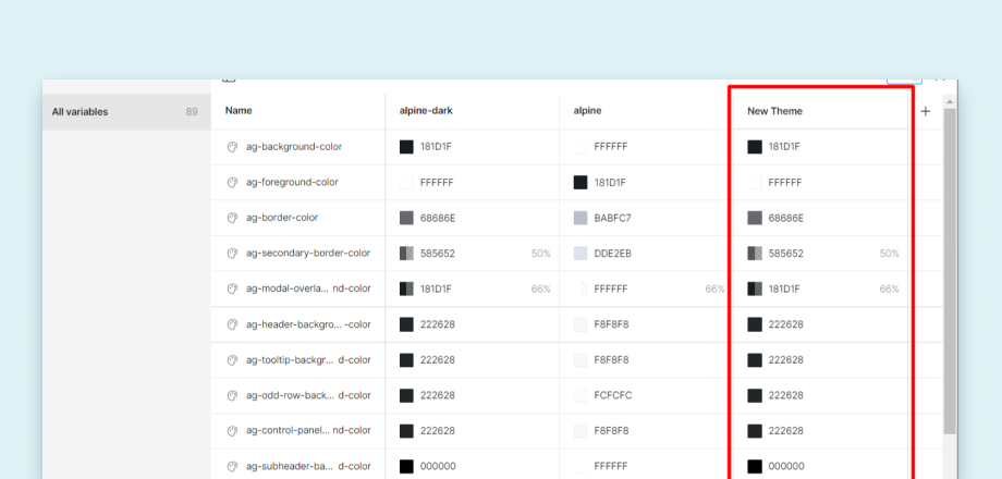
The AG Grid design system utilises Figma's native variables feature for all of its customisable attributes. The majority of the CSS variables used by the Quartz, Alpine, and Material themes are referenced within Figma and can be extended to your own theme.
You can find more information about how to create and manage themes within the Figma file under the Create your own theme page in the Figma file.
Token Studio
We also offer full support for Token studio users. To start using Token studio, open the plugin with the design system document and select a theme, mode, and density in the left hand menu. We also have a full output of our tokens in AG-Grid-Token-Studio.json, available at our design systems Github repo releases page.

Generating AG Grid Themes From Figma Variables
If you have created your own theme in Figma using the variables feature, you can export those variables and use the Style Dictionary NPM package to create an AG Grid CSS theme. An example Style Dictionary project and full instructions are included in our design systems Github repo.
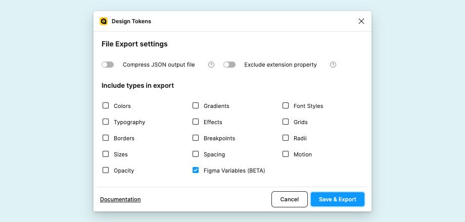
To export your Figma Variables as json...
- In the Resources panel go to the Plugins tab and search for the Design Tokens plugin.
- Click on the Design Tokens plugin and select the "Export Design Token File" option.
- Deselect all include types except for "Figma Variables".
- Click the 'Save & Export' button and save the json to the
./tokens/directory.
Support
AG Grid Enterprise customers can request support or suggest features and improvements via Zendesk. Community users can file bug reports via our design system Github repo issues.